MINI Park Lane
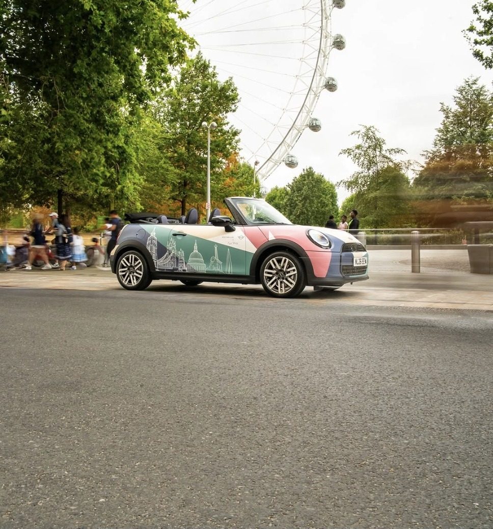
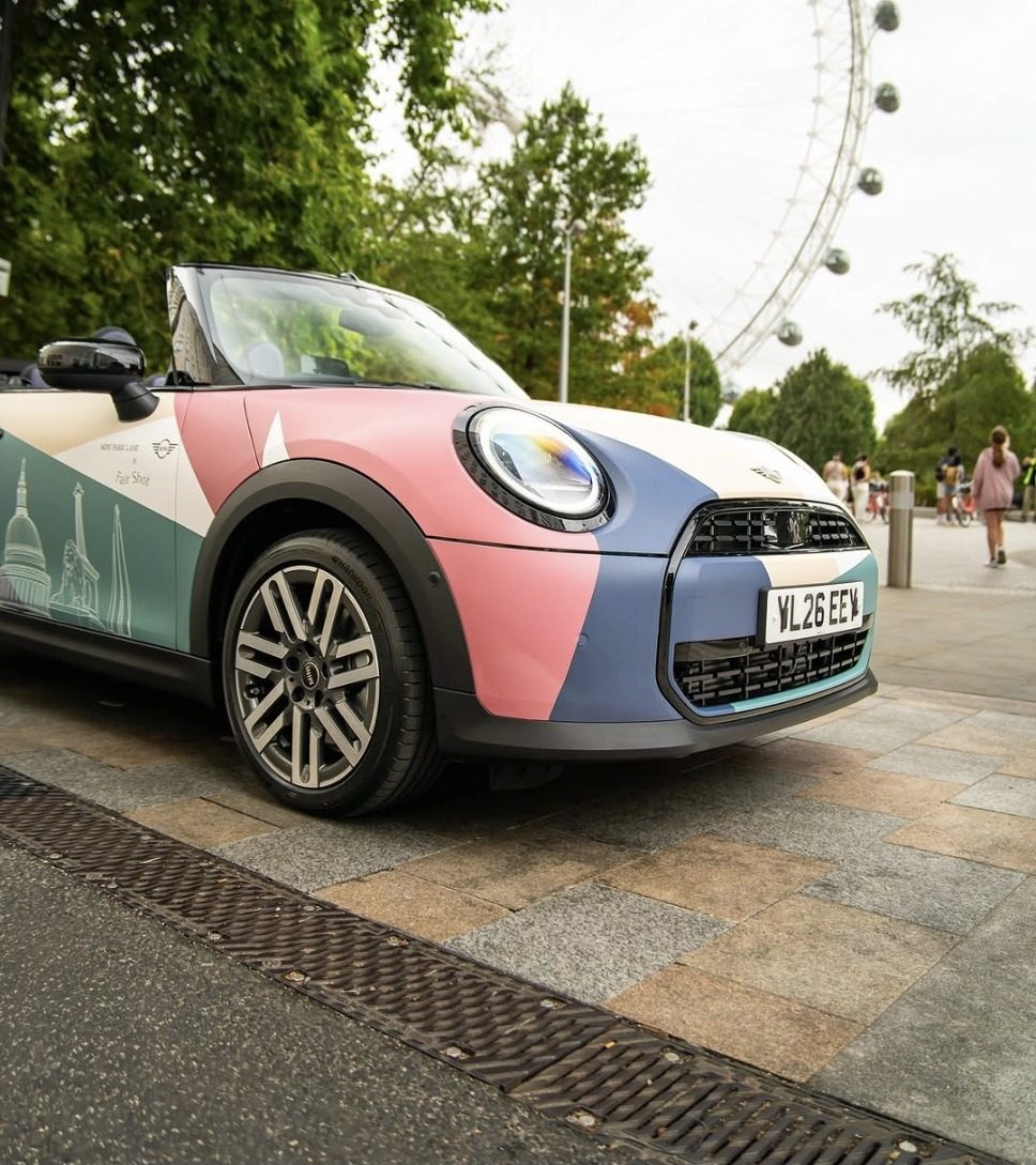
A MINI that wears London, parked outside the cafe that earned it.
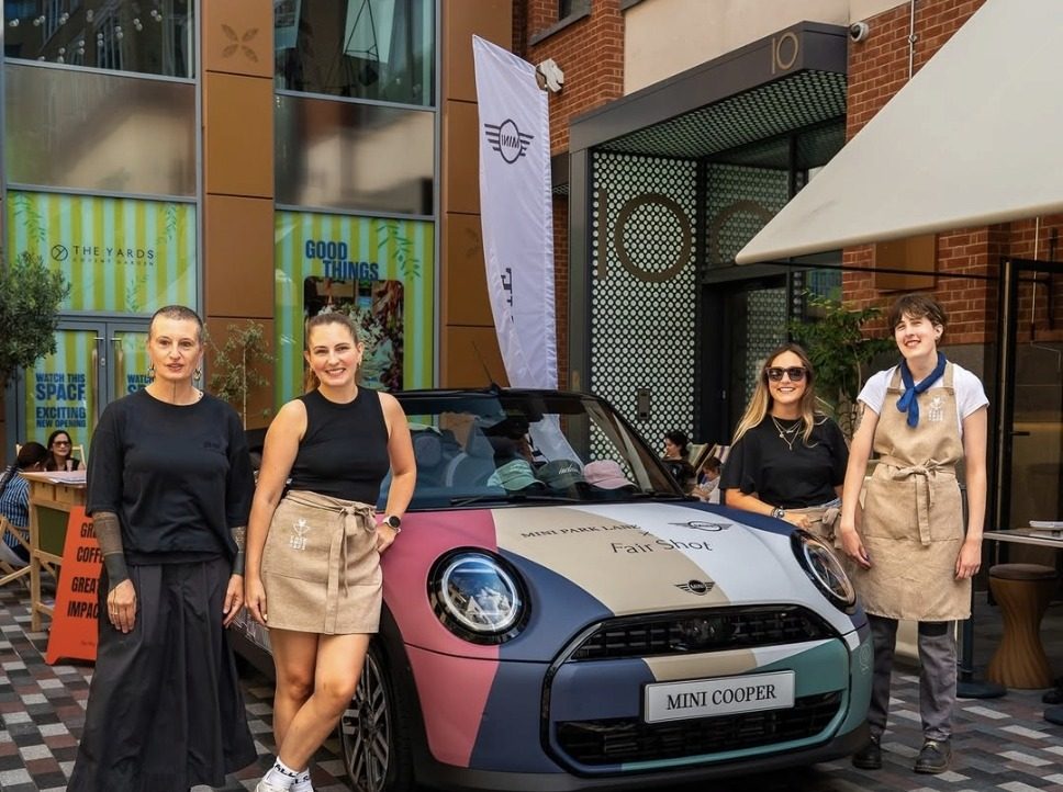
MINI Park Lane took a Cooper Convertible to The Yards in Covent Garden for a single Saturday with Fair Shot, the social enterprise cafe and registered UK charity based there. Pivitt designed the livery and the identity that ran around it, from the boards at the entrances to the stickers on the cups, so one car became the reason to stop, look and stay.
The brief
One car, one day, and a courtyard full of phones.
The car would be parked rather than driven past, so it had to hold attention close up and be worth photographing. That is a different problem from a livery read at speed, and it set every decision that followed.
Three signatures had to land before anything printed: Park Lane, then BMW corporate identity, then Fair Shot. Print and application sat with Park Lane’s own fitter. Twenty-nine days, start to display.
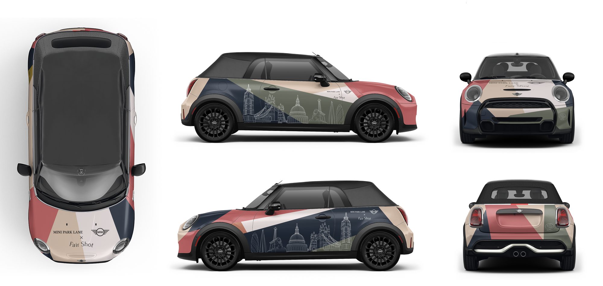
The approved artwork, every face.
The partner
A cafe that trains people into work.
Fair Shot runs a year-long supported internship for young adults with learning disabilities and autism, then places graduates into paid roles with partner employers. That is the organisation the car was carrying. The livery had to read as theirs rather than as a retailer’s promotion with a logo added.
The elements
We wrote the brief the artist drew to.
Fair Shot’s illustrator was going to draw the skyline. Left as one finished scene it could only have been dropped on the car as a picture, so the request went the other way: separate drawings rather than a single scene, black linework with no fills and no backgrounds, vector files where possible.
That is what made the rest possible. Individual elements could be arranged to the body, scaled to the panels and coloured to Fair Shot’s palette. He drew in his style and the system made it work on the car.
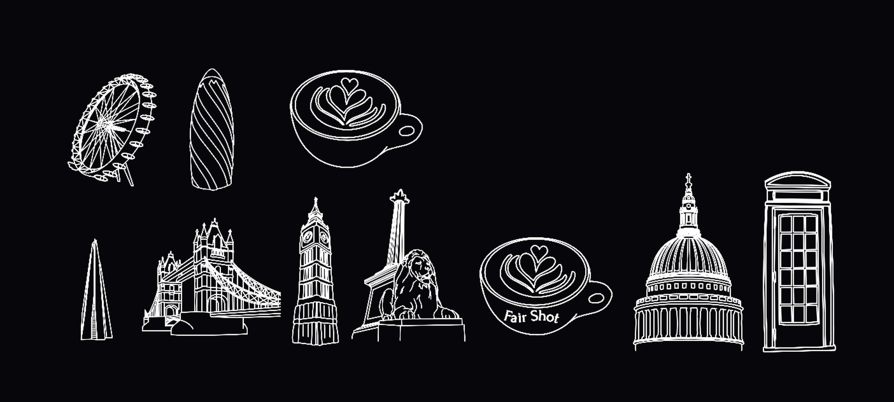
The library as supplied. An eleventh drawing, a classic MINI, was left off because the car is a current one.
The routes
Seven ways to wear a city.
The first round ran four routes, separated by how much of the car was covered and how much drawing the artist would have to do, from fine ink on a white body to a full painted scene edge to edge. The second round narrowed to three, each drawn flat, fitted to the car in studio and placed on a street, so the choice was made against how the car would actually be seen.
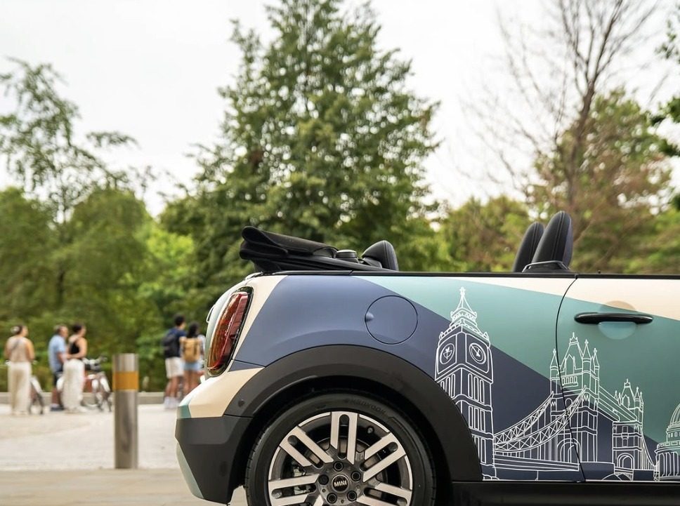
The diagonal won. Colour fields rise across the flank and the skyline runs between the wheel arches as one continuous band.
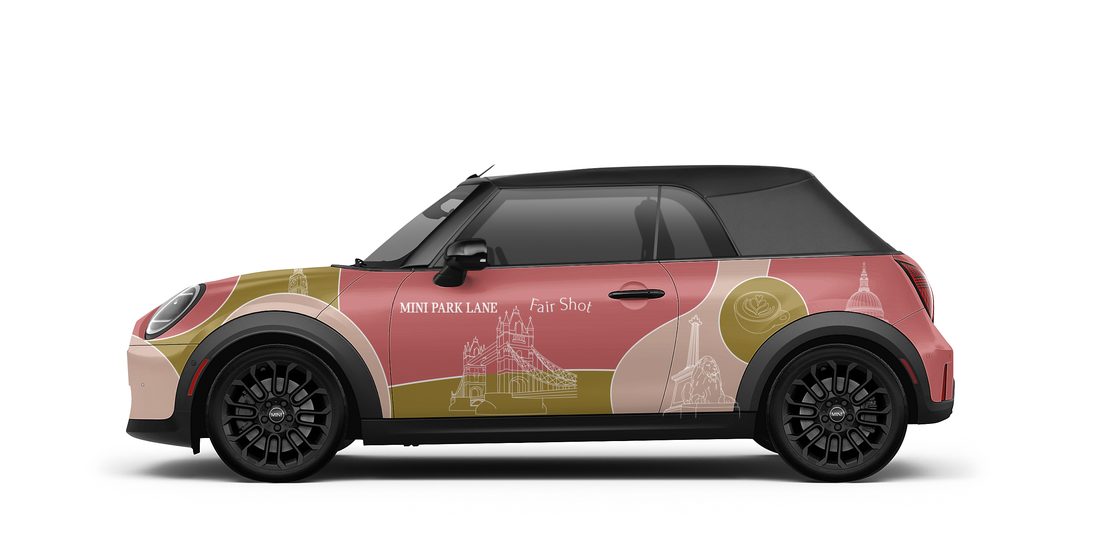
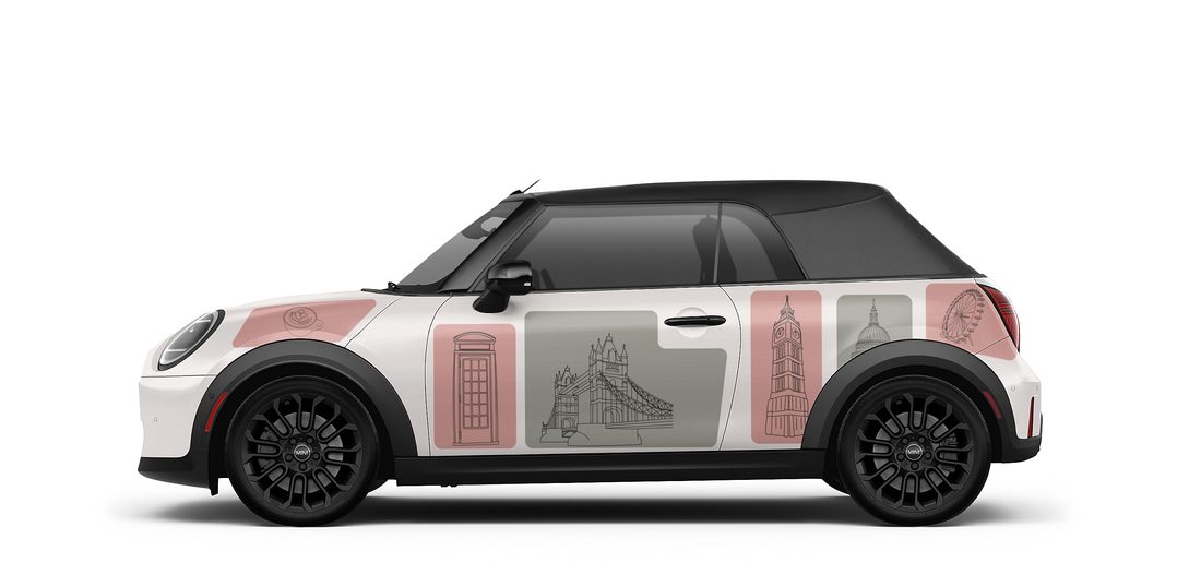
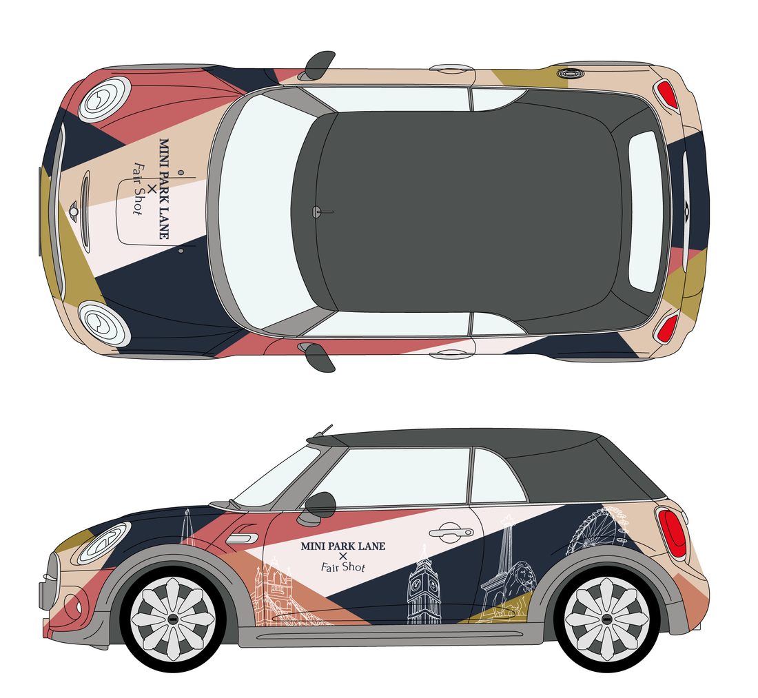
Three of the seven. The right-hand route was chosen and refined; the London Eye came off it later for crowding the elements beside it.
Colour
Their palette, and their rules for it.
Fair Shot’s colour document does not simply list colours, it assigns them. Contessa Red is their public brand colour. Dark Cyan Blue carries corporate partner communications. Willow Grove is their voice on social. Gold is documented as internal, for the team.
The recommendation was argued from those rules rather than from how the routes looked. A vehicle made with a corporate partner and photographed by the public is not the surface for an internal colour. Every colour field was then measured against the nearest palette value, and the one plane that did not match was corrected before the artwork went near print.
Fair Shot’s own feedback, when it came, asked for green in place of gold. The read held.
Contessa Red
public brand
Dark Cyan Blue
partner comms
Willow Grove
social voice
Grey Orange
cafe and learners
Off-white
ground
Gold
internal only
The skyline
Drawn by hand, then made to read.
Placing the elements was the work. St Paul’s was raised so the dome cleared the body line. The London Eye came out for crowding everything beside it. The Gherkin came out, then went back in once the colour fields were angled to make room. The band was held between the wheel arches so the run reads as one skyline rather than shapes cut by an arch.
The boot carries the Fair Shot coffee cup alone. A skyline there would have been read from too close and too low.
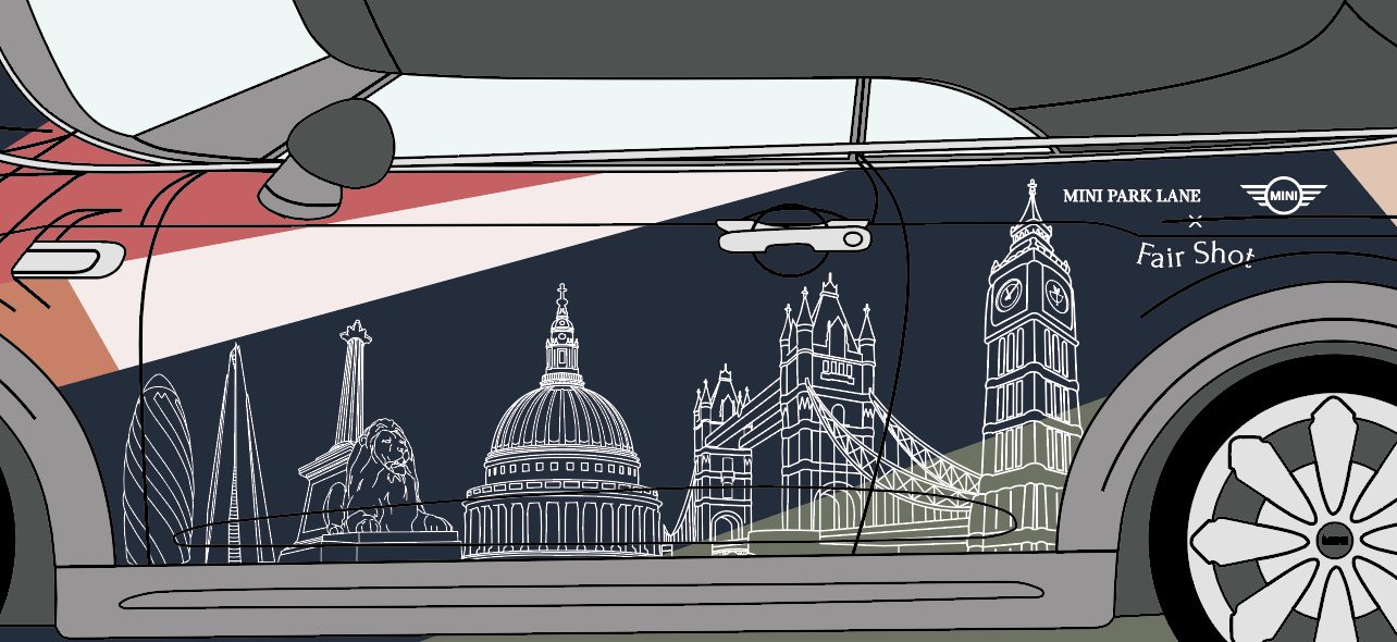
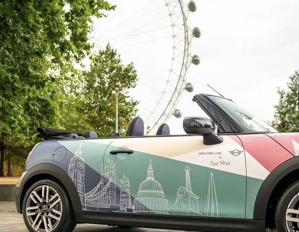
Artwork and application.
The signature
Two marks, one construction, no compromise on either.
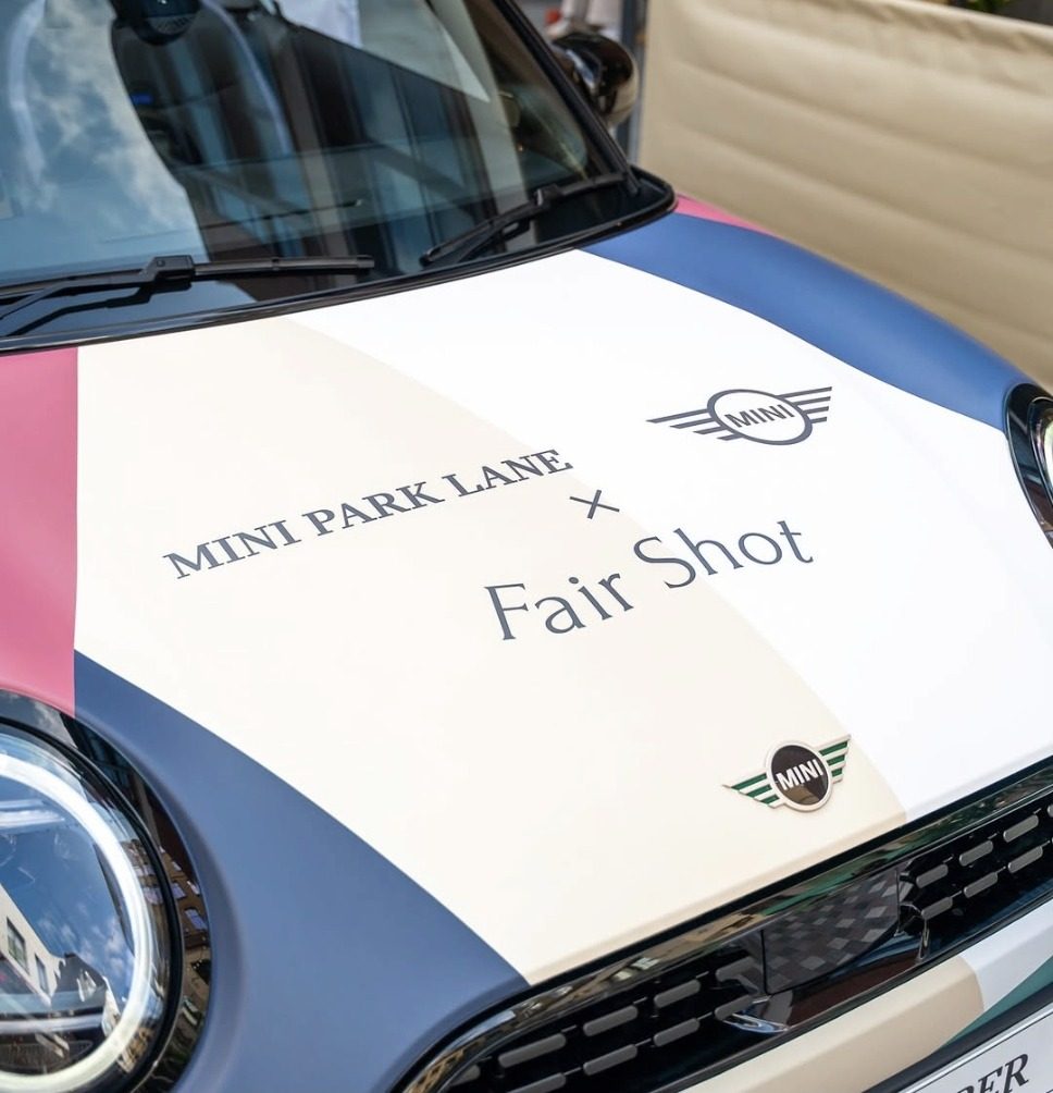
BMW’s retail signature has a fixed build: the retailer name, clear space, then the wings, with the partner beneath on the cross. Fair Shot asked to appear at equal size to MINI Park Lane. Both asks were reasonable and both could not be met.
The work went to the closest compliant option and the conflict went back to Park Lane in writing rather than being solved quietly in the artwork. Corporate identity rules on a marque vehicle are not a matter of preference, and a partner deserves to know where the limit sits.
Around the car
Carried to the boards and the cups.
A car on its own is an object in a courtyard. The same system was extended so the whole space belonged to the partnership: boards at the entrances, at the car and at the serve point, four faces in all, and round stickers for the cups so the drink in someone’s hand matched the car they had just photographed.
The day
Busy enough to stop serving.
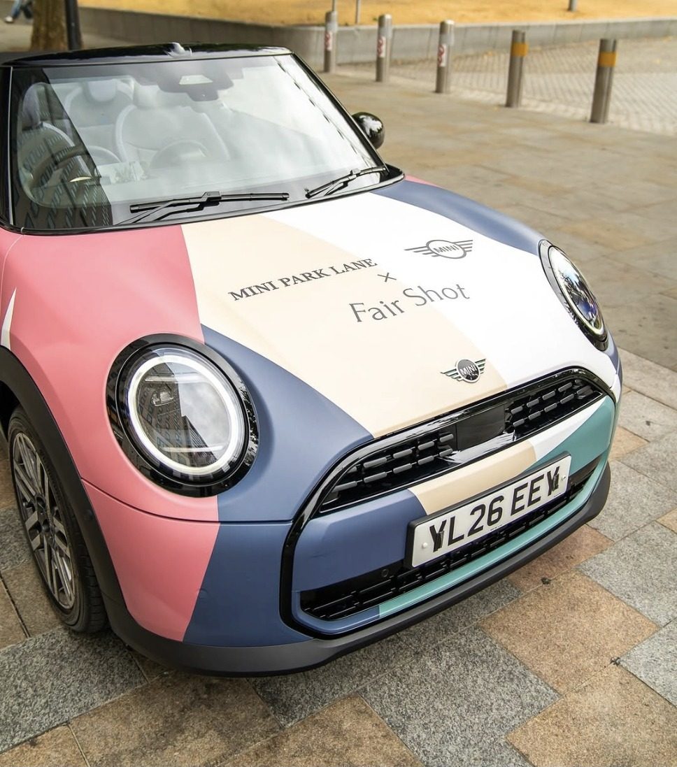
The car went on display at The Yards on Saturday 15 August. Park Lane reported the courtyard busy enough that drinks service had to be paused more than once to manage the crowd, with people photographing the car throughout and conversations about it happening on the spot.
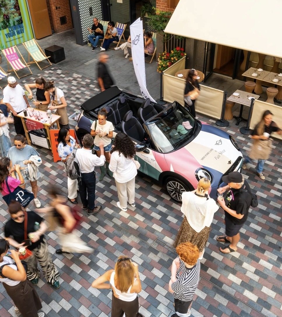
Event went really well! Loads of people taking pictures of the car and loving the livery! It was really busy we had to pause serving drinks multiple times to manage the crowds, which was great!
Emily Barrow, Head of Marketing, BMW Park Lane