Trade-show artwork for an industrial AI company. A brief taken apart into the jobs a stand wall has to do, four concepts on one scale so the choice rested on evidence, and a final image taken from the technology itself, so the stand shows what the software does before anyone speaks.
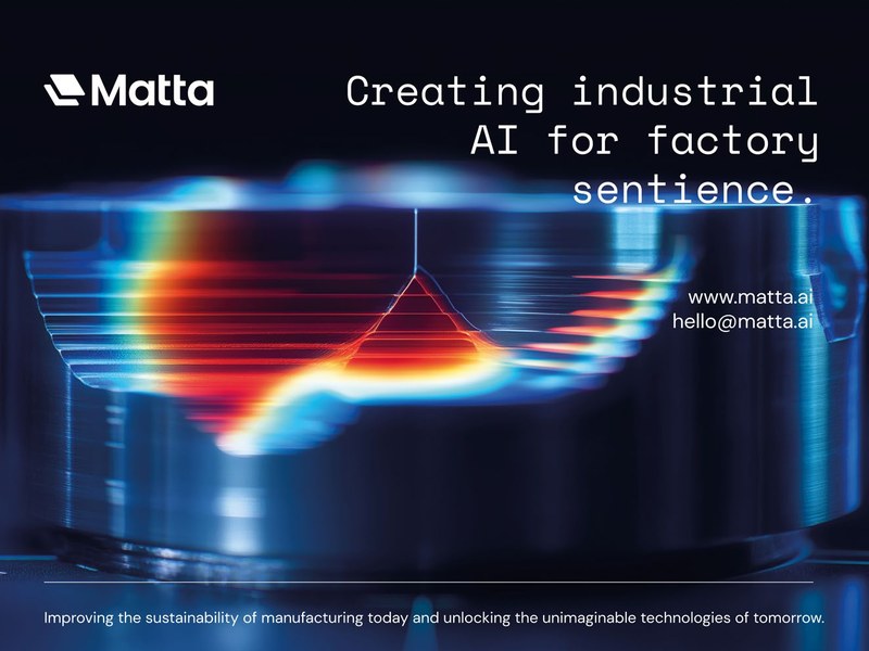
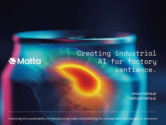
Final artwork V6.1, shown whole, as delivered in July 2025.
One stand graphic, engineered to show what the technology does.
Matta builds industrial AI that learns about the fundamentals of manufacturing and detects defects in production. Its trade-show stand needed one lightbox, three metres wide, that could stop people walking past and give the team something to talk from. We treated it as an engineering problem: the jobs a stand wall has to do, four keywords from what makes Matta unique, four concepts on one scale from on-brand to pushing the boat, a chosen direction refined to its middle ground, and a final image taken from the heatmap Matta’s own technology generates, with every line of type sized for the distance it is read from.
The Challenge
Industrial AI tends to look like every other AI.
Most technology brands on a show floor reach for the same abstract circuitry and glowing nodes, and a visitor walking past cannot tell one from the next. Matta’s technology produces something specific and visible: a heatmap. The lightbox had to read as Matta, and say what Matta does, from across the hall.
What Was At Stake
The largest piece of the brand on the stand.
The lightbox is the biggest physical expression of Matta at a show and the backdrop to every conversation the team has there. It had to work at three distances: as a hook from across the hall, as a clear statement of who Matta is on approach, and as a visual aid at the stand while the team explains the product.
The Brief
Bring one touchpoint forward, and stay true to the identity.
A single artwork at 3000 by 2250 mm, built on Matta’s existing brand rather than around it, carrying the brand statement and contact details clearly at scale, and delivered as print-ready files.
4
Concepts placed on one design scale, from on-brand minimalism to pushing boundaries.
19
Designs across three rounds: ten concepts, four evolved, five finals.
30
Days from the brief call to final artwork, 23 June to 23 July 2025.
1
Day from Matta choosing a direction to the evolved round on it.
From Pivitt’s lightbox concepts (2 July 2025), evolved concepts (8 July 2025) and final artworks (23 July 2025). Letter heights, edges and colours measured from the delivered artwork.
01
Chapter 01
Engineering the brief
Before a single concept: what the wall has to do, and what makes Matta unique.
The Brief’s Logic
What a trade-show wall has to do.
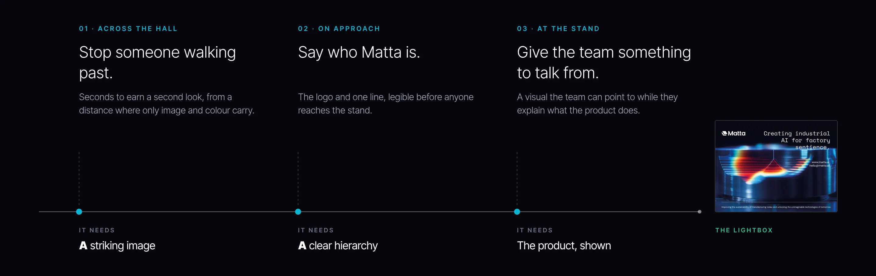
A stand graphic is seen long before it is read. We set out its jobs at three distances before any design: across the hall it has seconds to stop someone walking past, and only image and colour carry that far; on approach it has to say who Matta is; at the stand it has to give the team something to point to while they explain the product. Each job asks for something different, and the artwork had to do all three.
THE LIGHTBOX
01 · ACROSS THE HALL
Stop someone walking past.
Seconds to earn a second look, from a distance where only image and colour carry.
IT NEEDS
A striking image
02 · ON APPROACH
Say who Matta is.
The logo and one line, legible before anyone reaches the stand.
IT NEEDS
A clear hierarchy
03 · AT THE STAND
Give the team something to talk from.
A visual the team can point to while they explain what the product does.
Three jobs at three distances, and what each one needs from the artwork.
The Running Thread
Four keywords, one question.
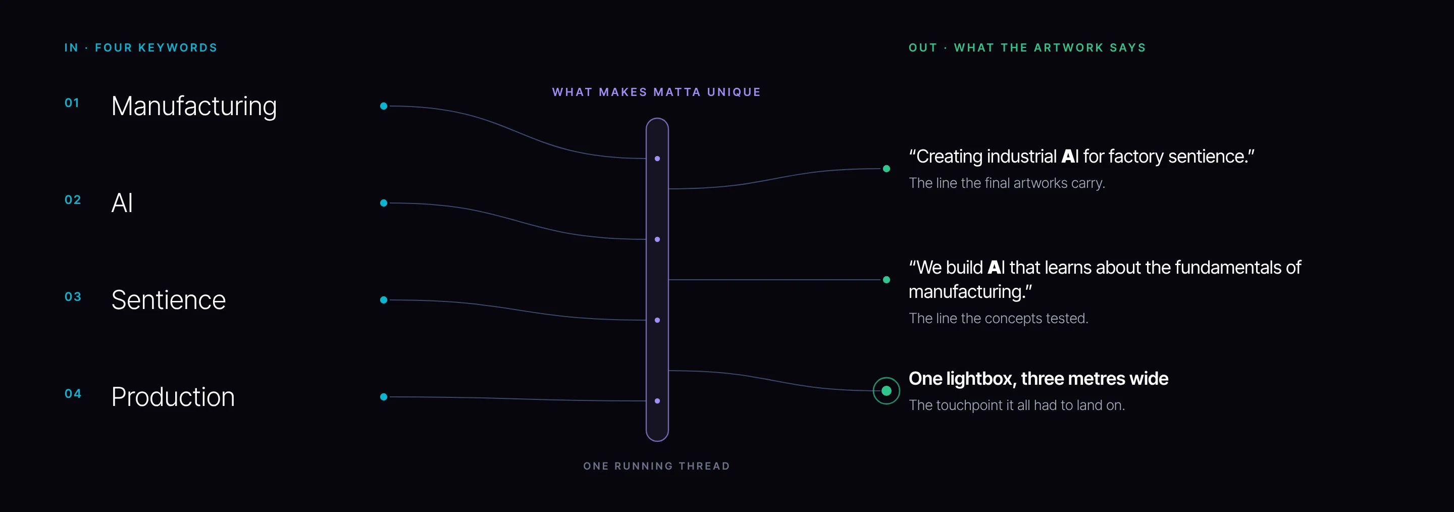
Every concept started from the same question: what makes Matta unique in its positioning? We worked it through four keywords, manufacturing, AI, sentience and production, and held each idea against them. The outputs were fixed early: the brand statement the artwork would carry, and the one surface it all had to land on.
IN · FOUR KEYWORDS
01
Manufacturing
02
AI
03
Sentience
04
Production
WHAT MAKES MATTA UNIQUE
ONE RUNNING THREAD
OUT · WHAT THE ARTWORK SAYS
“Creating industrial AI for factory sentience.”
The line the final artworks carry.
“We build AI that learns about the fundamentals of manufacturing.”
The brief taken apart: four keywords in, one running thread at the waist, the artwork’s lines and the lightbox out.
The Keywords, Traced
Each keyword became something you can see.
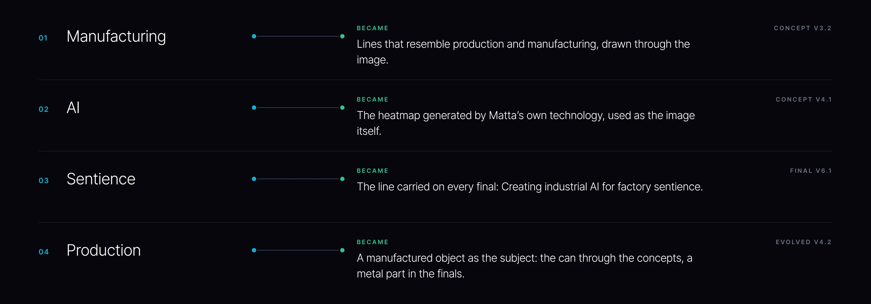
Keywords only matter if they reach the image. Manufacturing became lines that resemble production; AI became the heatmap Matta’s technology generates; sentience became the line every final carries; production became a manufactured object as the subject.
01
Manufacturing
BECAME
Lines that resemble production and manufacturing, drawn through the image.
CONCEPT V3.2
02
AI
BECAME
The heatmap generated by Matta’s own technology, used as the image itself.
CONCEPT V4.1
03
Sentience
BECAME
The line carried on every final: Creating industrial AI for factory sentience.
FINAL V6.1
04
Production
BECAME
A manufactured object as the subject: the can through the concepts, a metal part in the finals.
The four keywords traced to the work, with the version where each first appears.
02
Chapter 02
Engineering the concepts
Four directions on one scale, so the choice was about how far to go, not which guess to back.
The Design Scale
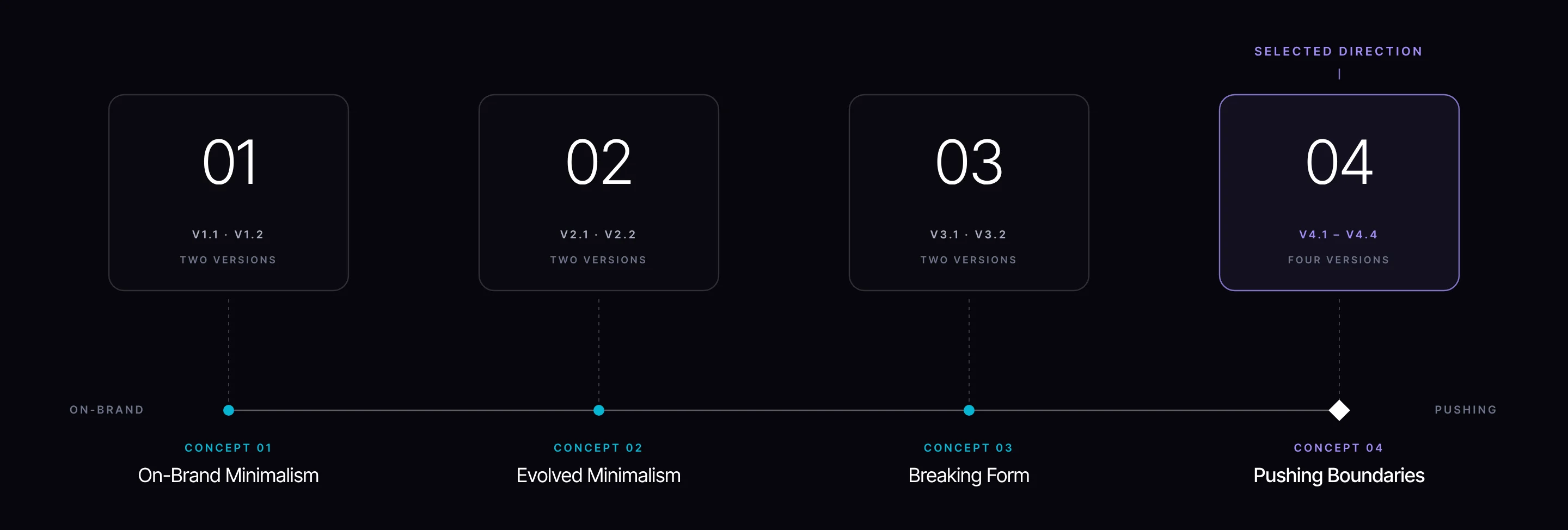
Four concepts, placed on one scale.
Rather than four unrelated ideas, we built four points on a scale from what would be considered on-brand to pushing the boat in design. Each concept sat at a deliberate point, and each had two versions, so Matta could see the range inside every step as well as between them.
The four concepts on the design scale, with the direction Matta selected.
De-risking the Choice
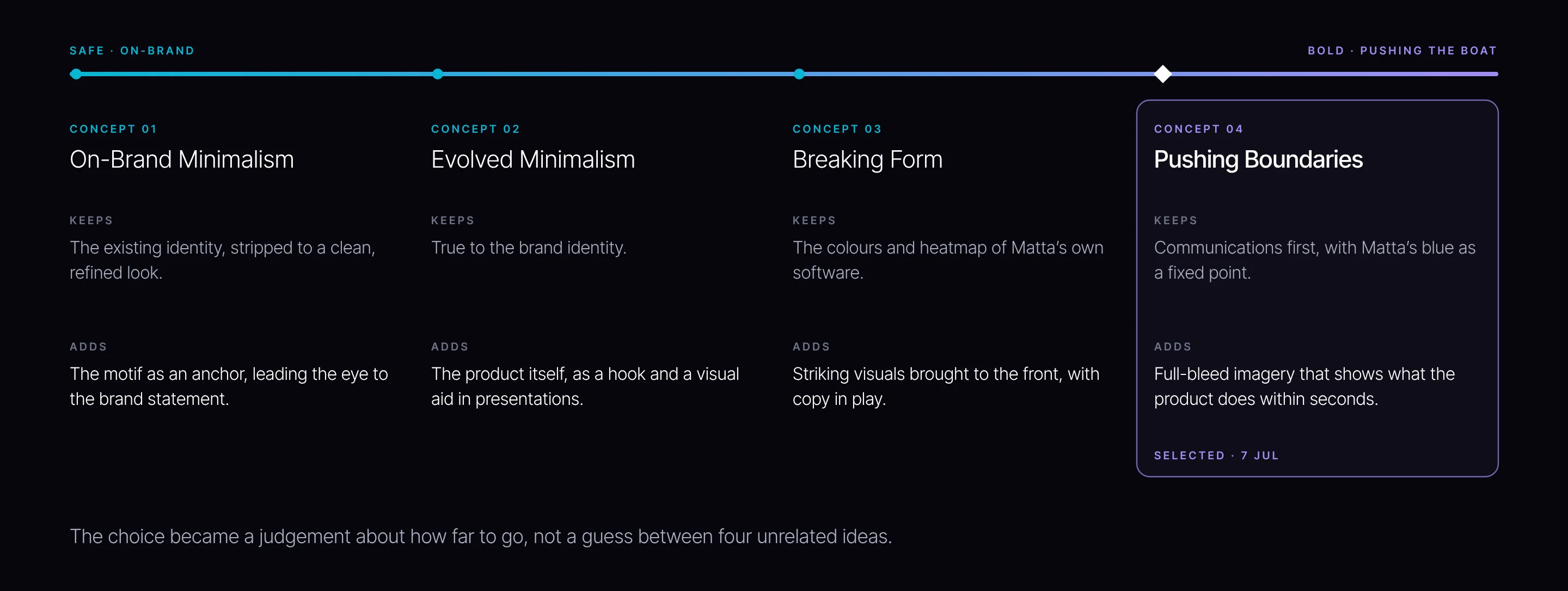
A scale, so the choice rests on evidence.
Four unrelated concepts ask a client to back a guess. Four points on one scale ask a better question: how far should the brand go? Matta could see what each step kept from the existing identity and what it added, and choose with every option in view. That is how a bold direction gets chosen with confidence rather than nerve.
SAFE · ON-BRAND
BOLD · PUSHING THE BOAT
CONCEPT 01
On-Brand Minimalism
KEEPS
The existing identity, stripped to a clean, refined look.
ADDS
The motif as an anchor, leading the eye to the brand statement.
CONCEPT 02
Evolved Minimalism
KEEPS
True to the brand identity.
ADDS
The product itself, as a hook and a visual aid in presentations.
CONCEPT 03
Breaking Form
KEEPS
The colours and heatmap of Matta’s own software.
ADDS
Striking visuals brought to the front, with copy in play.
CONCEPT 04
Pushing Boundaries
KEEPS
Communications first, with Matta’s blue as a fixed point.
ADDS
Full-bleed imagery that shows what the product does within seconds.
SELECTED · 7 JUL
The choice became a judgement about how far to go, not a guess between four unrelated ideas.
What each concept keeps and what it adds, from our concept deck.
Concept 01
On-Brand Minimalism.
V1.1Every unnecessary element stripped back, for a clean, refined and on-brand look.V1.2The Matta motif used as an anchor, leading the eye to the brand statement and the contact details.
Concept 02
Evolved Minimalism.
V2.1True to the identity and featuring the product utility: the image sparks curiosity, so the team can use the graphic as a visual aid in presentations.V2.2A decorative, abstract 3D image in striking colour, positioning Matta as a forward-thinking brand.
Concept 03
Breaking Form.
V3.1Striking visuals brought to the forefront, rich and visually appealing, with copy set in play around them.V3.2Colour and heatmap taken from Matta’s software, with lines resembling production and manufacturing.
Concept 04
Pushing Boundaries.
V4.1Full-bleed imagery that brings the product utility to life, so prospects understand what the product does within seconds: a demonstrative tool for the stand.V4.2The forward-thinking route, built on current graphic design thinking.
V4.3Simplified, striking and minimal, communications first, with a gradient drawn from the blue of Matta’s website.V4.4Gradient enhancement: the gradient anchored as a fixed point, with manufacturing, AI and technology explored through abstraction.
03
Chapter 03
Engineering the direction
Matta chose to push the boat. The next round found where to stop.
The Middle Ground
Three pulls, held in balance.
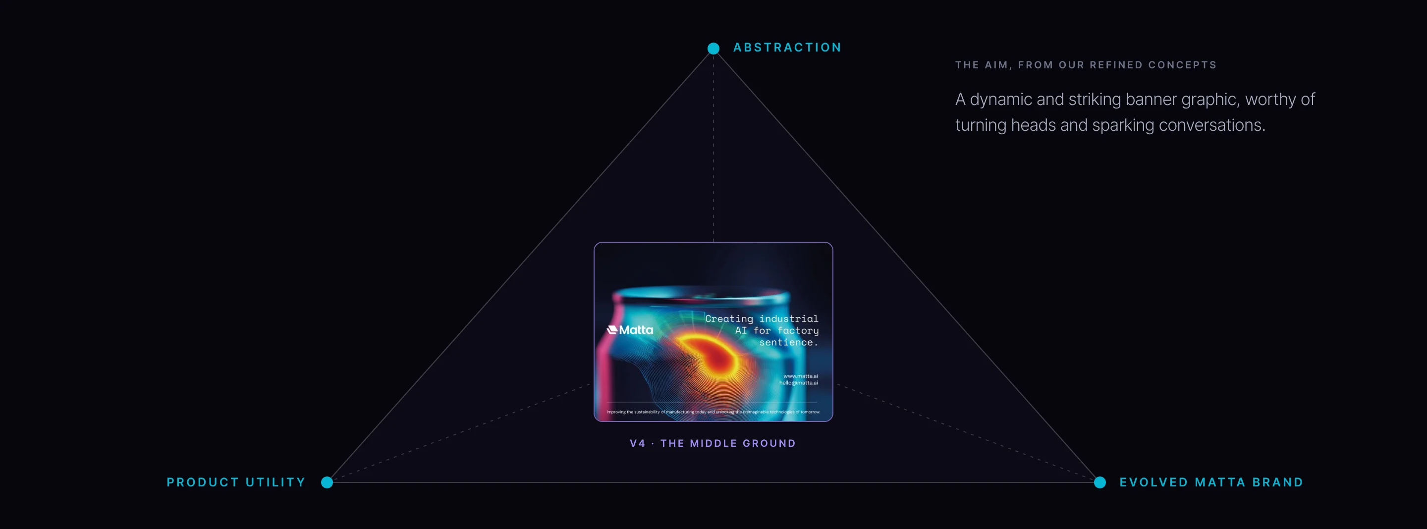
Matta chose Pushing Boundaries on 7 July, and the evolved round was in front of them the next day. Pushed too far, a trade-show graphic stops explaining anything; held back, it disappears. Based on Matta’s feedback, the round explored the middle ground between abstraction, product utility and an evolved Matta brand, with one aim: a dynamic, striking banner graphic worthy of turning heads and sparking conversations.
V4 · THE MIDDLE GROUND
ABSTRACTION
PRODUCT UTILITY
EVOLVED MATTA BRAND
A dynamic and striking banner graphic, worthy of turning heads and sparking conversations.
The refined round: the middle ground between abstraction, product utility and the evolved Matta brand.
The Engineering Core
The product’s own visual language.
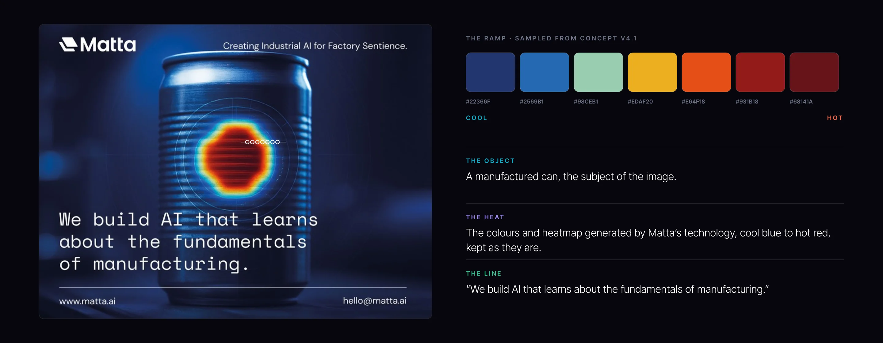
Matta’s technology generates a heatmap. That visualisation is the most honest picture of what the company does, so we kept its colours, cool blue to hot red, as the image itself. The value is simple: the stand demonstrates the software before anyone speaks, and every conversation starts from the product rather than from a metaphor for it.
#22366F
#2569B1
#98CEB1
#EDAF20
#E64F18
#931B18
#68141A
THE RAMP · SAMPLED FROM CONCEPT V4.1
COOL
HOT
THE OBJECT
A manufactured can, the subject of the image.
THE HEAT
The colours and heatmap generated by Matta’s technology, cool blue to hot red, kept as they are.
THE LINE
“We build AI that learns about the fundamentals of manufacturing.”
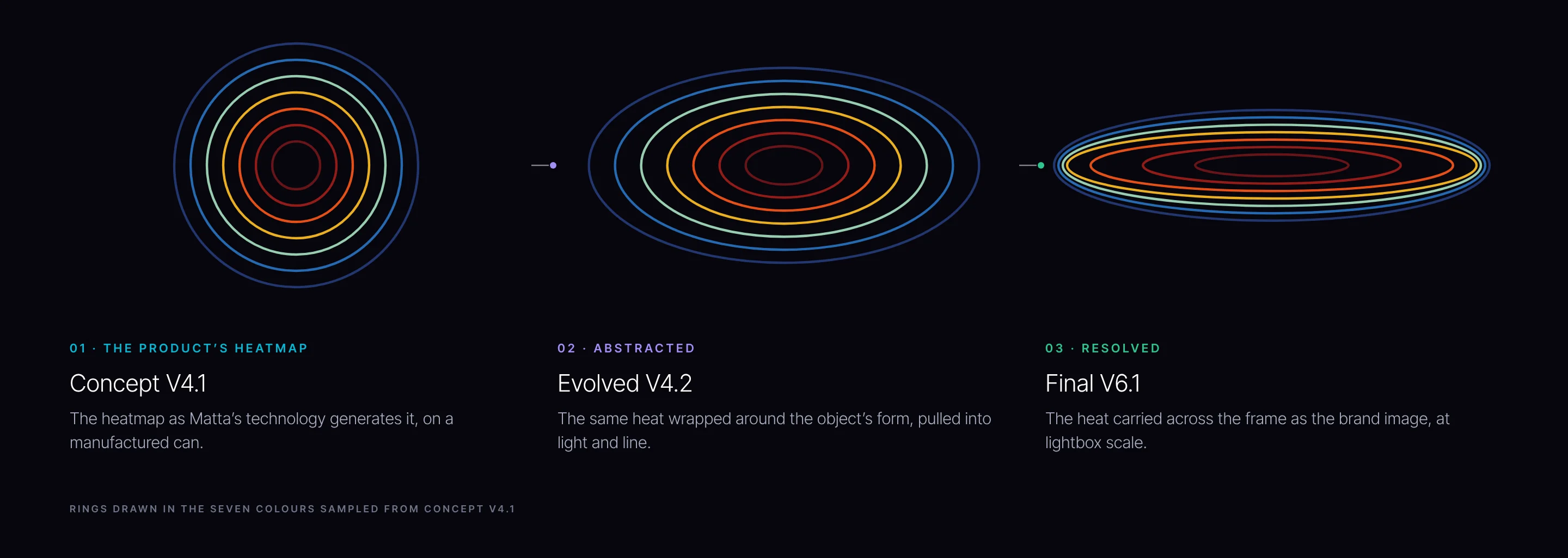
Concept V4.1, evolved V4.2 and final V6.1: the same heat, drawn in the colours sampled from the product’s heatmap. Each artwork appears in full, full bleed, on this page.
The Evolved Round
Four ways to hold the middle ground.
Four designs on the chosen direction, each balancing the product against a dynamic, striking image in a different way.
V4.1The heat seen from above, rippling out across the surface, with the line set low.V4.2The heatmap’s rings wrapped around the can’s form, the line set beneath.
V4.3A softer heat on the can in pink and teal, the line set across the middle.V4.4The heat at full strength on the can, the line set high on the right.
04
Chapter 04
Engineering the artwork
Three rounds of development in the last phase, every line sized for the distance it is read from.
Round by Round
Every round answered the last.
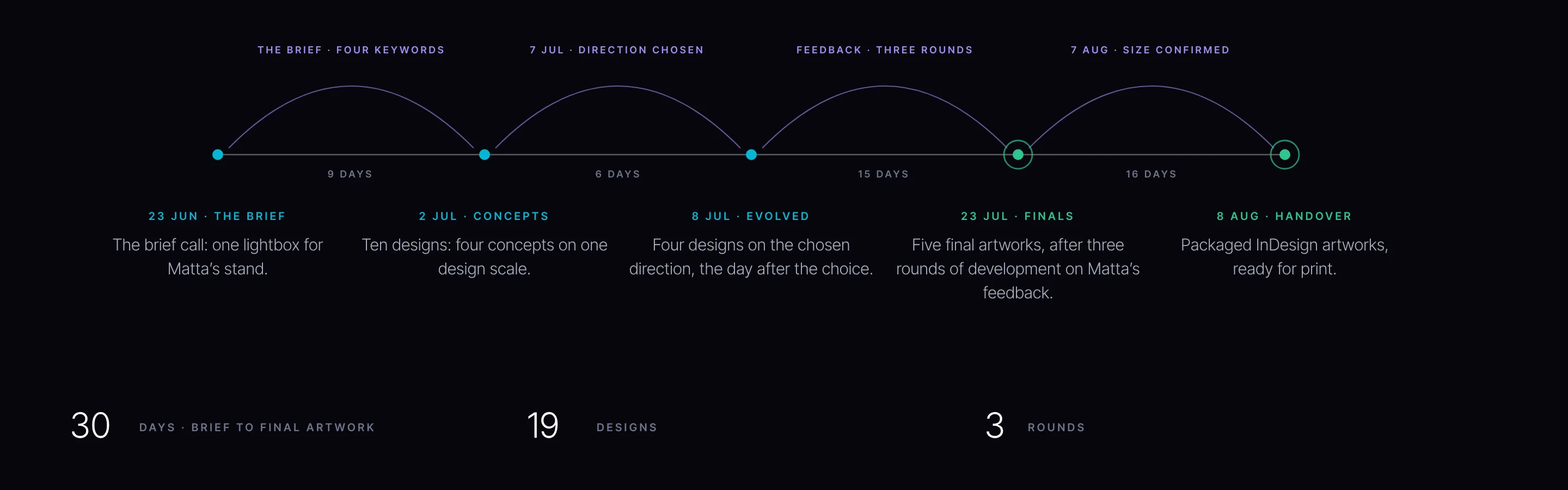
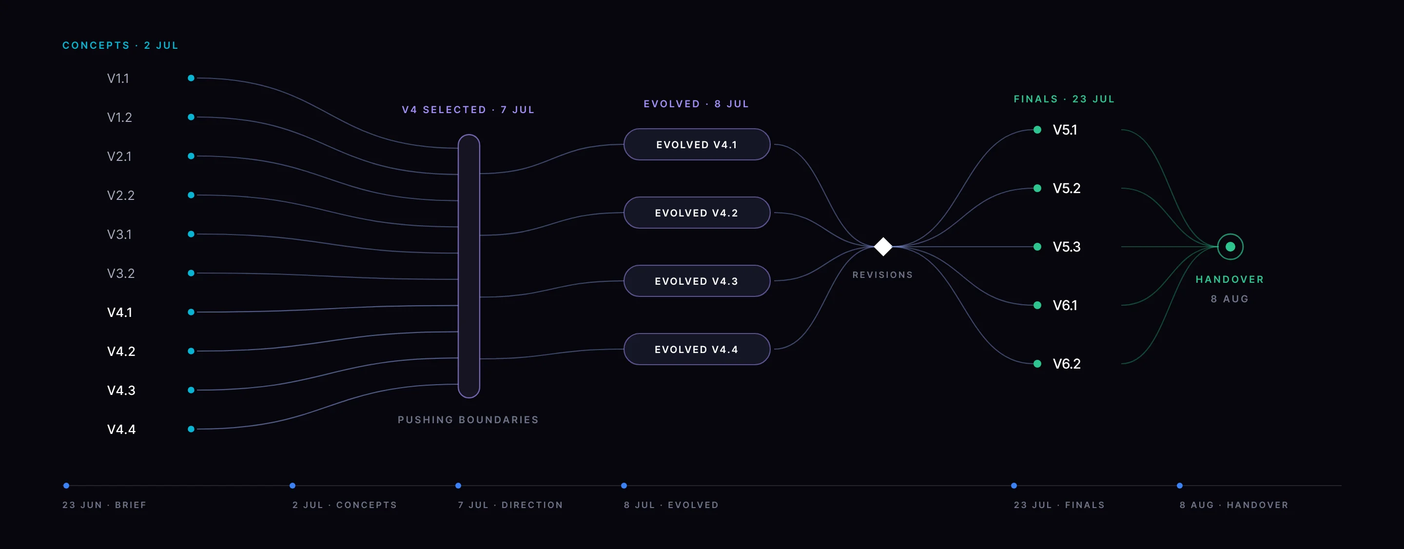
Each of our decks opened with the feedback it was answering, so nothing was redesigned twice. Ten designs nine days after the brief call; four evolved designs the day after Matta chose a direction; three rounds of development on Matta’s feedback to five finals; dimensions confirmed and packaged artworks handed over in August.
THE BRIEF · FOUR KEYWORDS
9 DAYS
7 JUL · DIRECTION CHOSEN
6 DAYS
FEEDBACK · THREE ROUNDS
15 DAYS
7 AUG · SIZE CONFIRMED
16 DAYS
23 JUN · THE BRIEF
The brief call: one lightbox for Matta’s stand.
2 JUL · CONCEPTS
Ten designs: four concepts on one design scale.
8 JUL · EVOLVED
Four designs on the chosen direction, the day after the choice.
23 JUL · FINALS
Five final artworks, after three rounds of development on Matta’s feedback.
How the work narrowed, with the dates of each round.
The Finals
Five final artworks.
Two families from the same heat: a landscape of line in three colourways, and the heatmap rendered across a metal part.
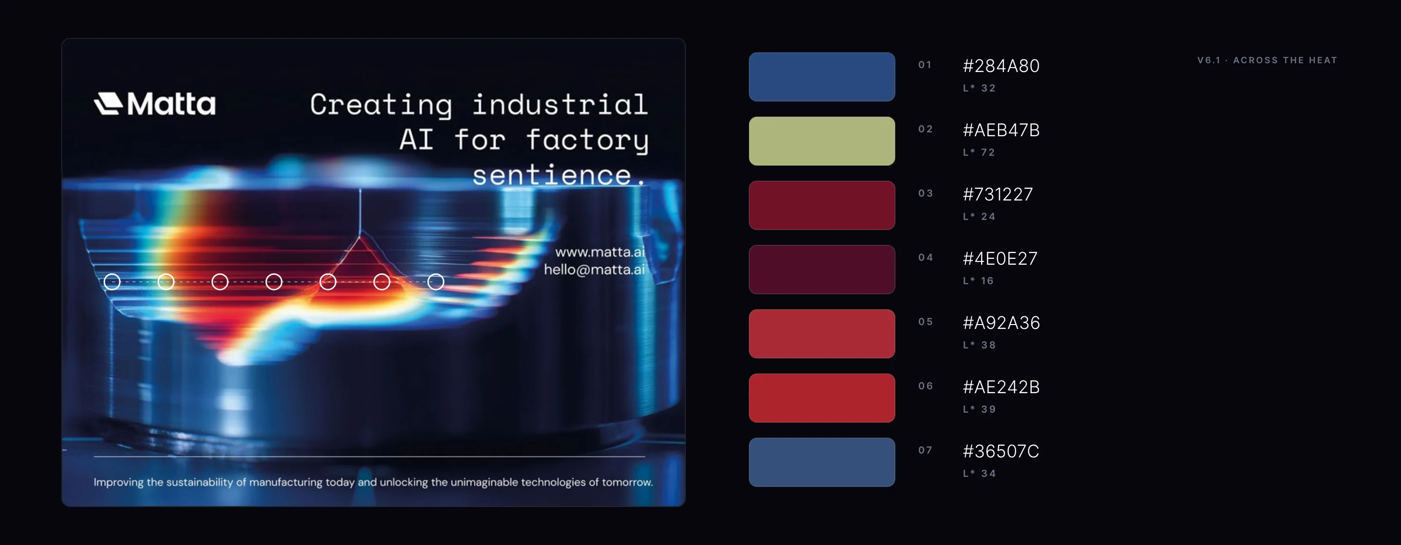
V6.1Final V6.1: the heatmap rendered across a metal part, the line set across the top.V6.2The same heat, carried wider across the frame.
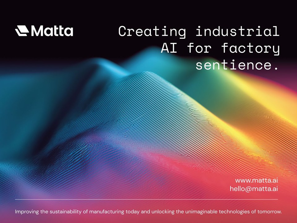
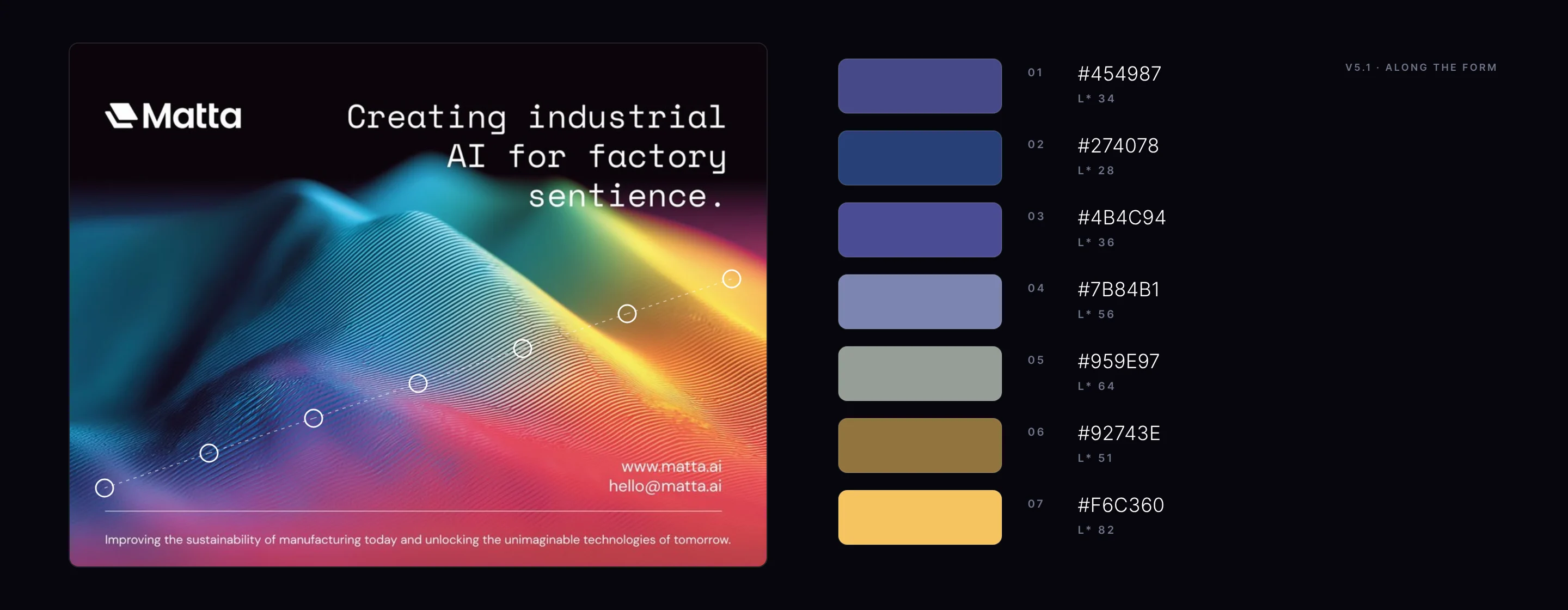
V5.1A landscape of line in heat colours.V5.2The landscape warmed to amber, red and pink.
V5.3The landscape cooled towards blue and teal.
The Message, Measured
Three reading distances, one hierarchy.
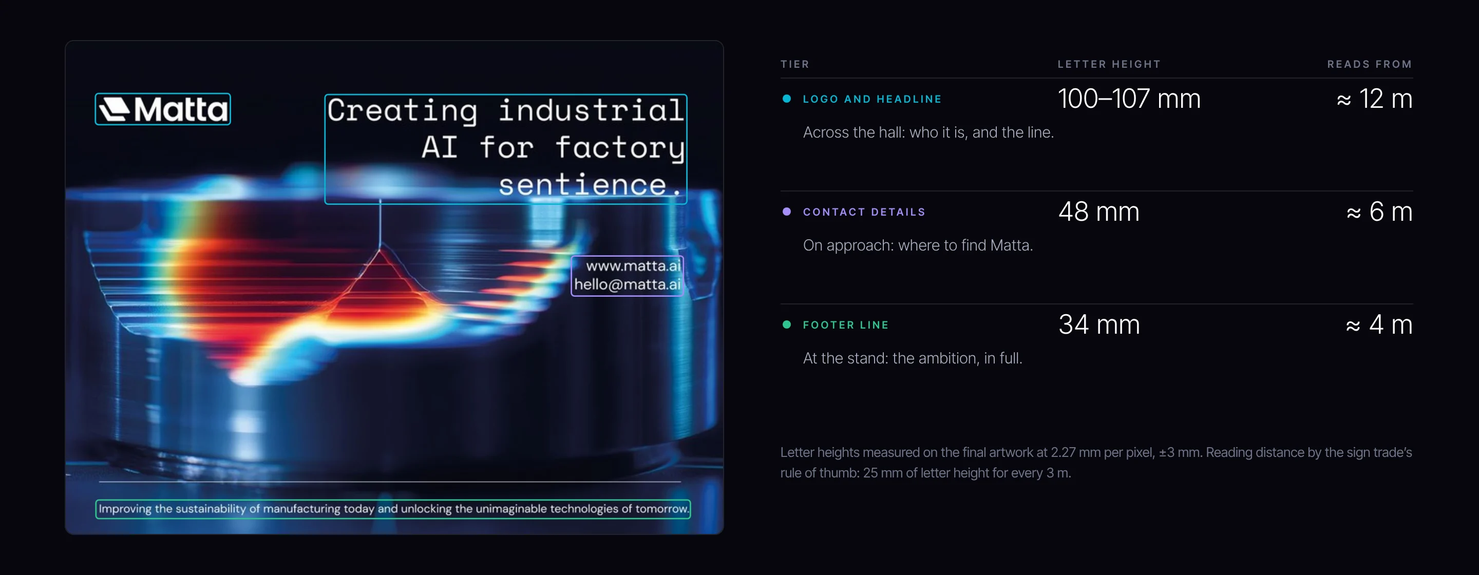
A three-metre wall is read from three places, so its type is sized in three tiers. Measured on final V6.1 at its printed size: the logo and headline stand 100 to 107 mm tall, readable from about 12 m; the contact details 48 mm, about 6 m; the footer line 34 mm, about 4 m. Who Matta is reaches across the hall; the detail waits for the people who walk over.
TIER
LETTER HEIGHT
READS FROM
LOGO AND HEADLINE
100–107 mm
≈ 12 m
Across the hall: who it is, and the line.
CONTACT DETAILS
48 mm
≈ 6 m
On approach: where to find Matta.
FOOTER LINE
34 mm
≈ 4 m
At the stand: the ambition, in full.
Letter heights measured on the final artwork at 2.27 mm per pixel, ±3 mm. Reading distance by the sign trade’s rule of thumb: 25 mm of letter height for every 3 m.
Letter heights measured from the final artwork, with reading distance by the sign trade’s rule of thumb of 25 mm per 3 m.
The Frame
Composed for a 4 : 3 frame.
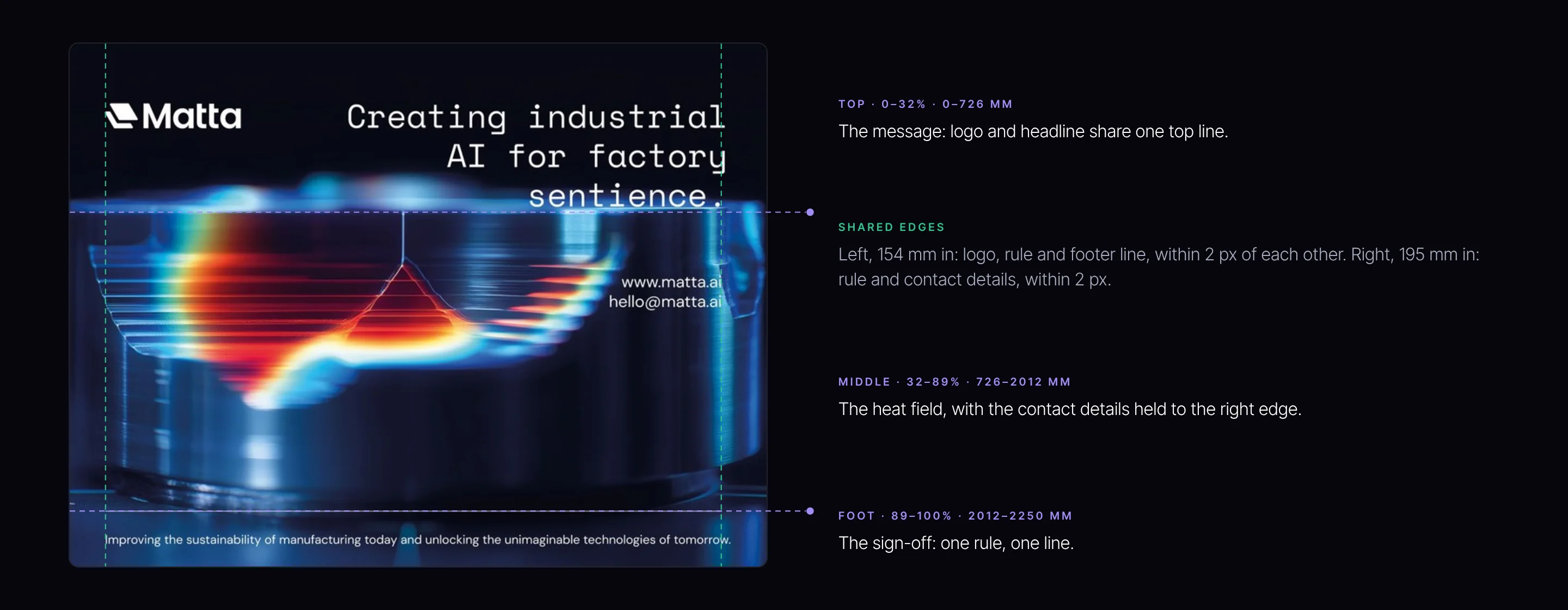
The lightbox is 4 : 3, so the composition was set for it rather than adapted to it: the message across the top third, the heat field through the middle, the sign-off on one rule at the foot. Shared edges hold it together, so the wall reads as one designed object at any distance.
TOP · 0–32% · 0–726 MM
The message: logo and headline share one top line.
MIDDLE · 32–89% · 726–2012 MM
The heat field, with the contact details held to the right edge.
FOOT · 89–100% · 2012–2250 MM
The sign-off: one rule, one line.
SHARED EDGES
Left, 154 mm in: logo, rule and footer line, within 2 px of each other. Right, 195 mm in: rule and contact details, within 2 px.
Seven points across the heat of V6.1, with lightness (L*) for each.
The Scale
Designed at three metres wide.
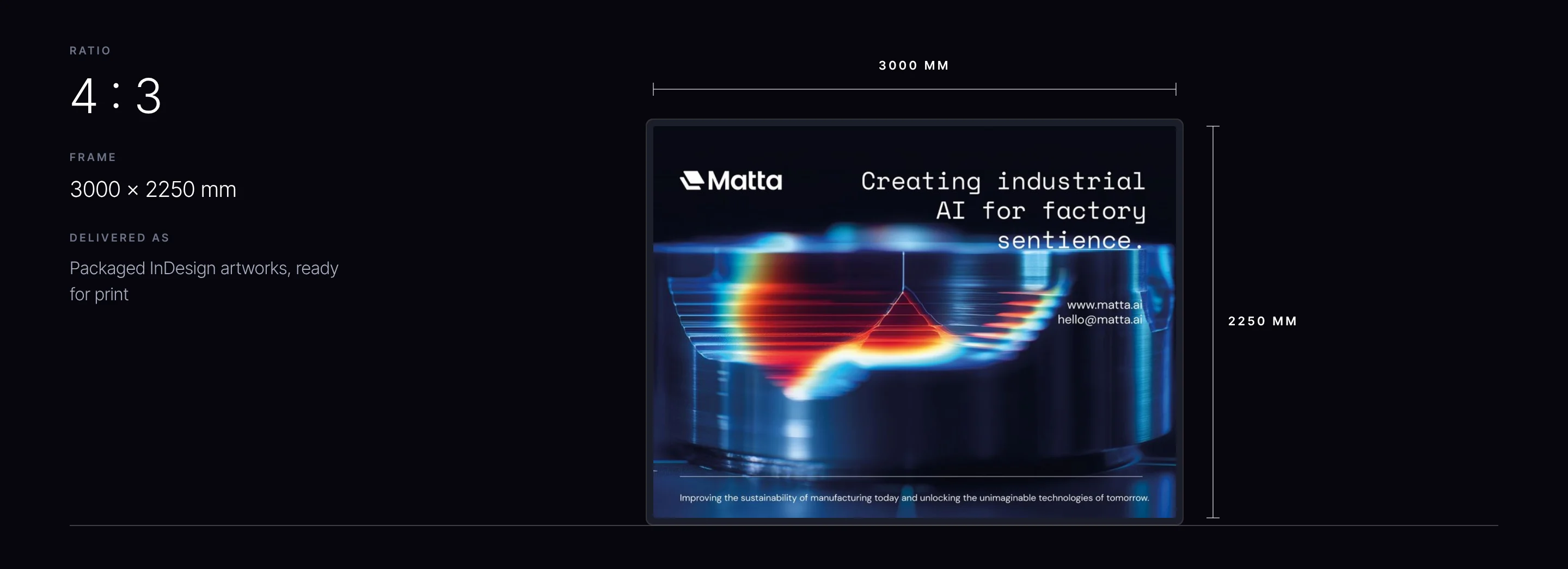
Every artwork was built to the lightbox’s true proportions, 3000 by 2250 mm, confirmed with Matta before handover, so nothing is cropped or reflowed when it goes to print.
The final artwork at the lightbox’s true proportions, 3000 by 2250 mm.
Beyond the Stand
One artwork, several jobs.
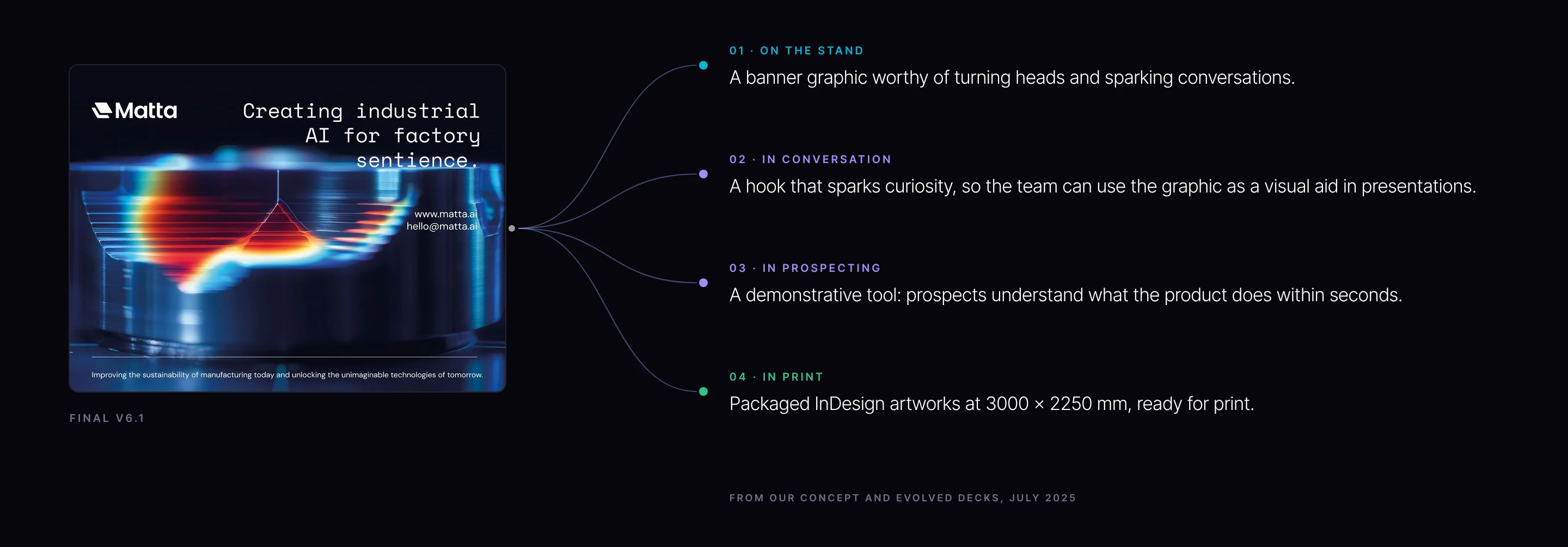
Because the image is the product, it keeps working wherever the team takes it: on the stand, as a visual aid in presentations, as a demonstration in prospecting, and in print.
FINAL V6.1
01 · ON THE STAND
A banner graphic worthy of turning heads and sparking conversations.
02 · IN CONVERSATION
A hook that sparks curiosity, so the team can use the graphic as a visual aid in presentations.
03 · IN PROSPECTING
A demonstrative tool: prospects understand what the product does within seconds.
04 · IN PRINT
Packaged InDesign artworks at 3000 × 2250 mm, ready for print.
The uses our concept deck set out for an image built from the product.
The Spec
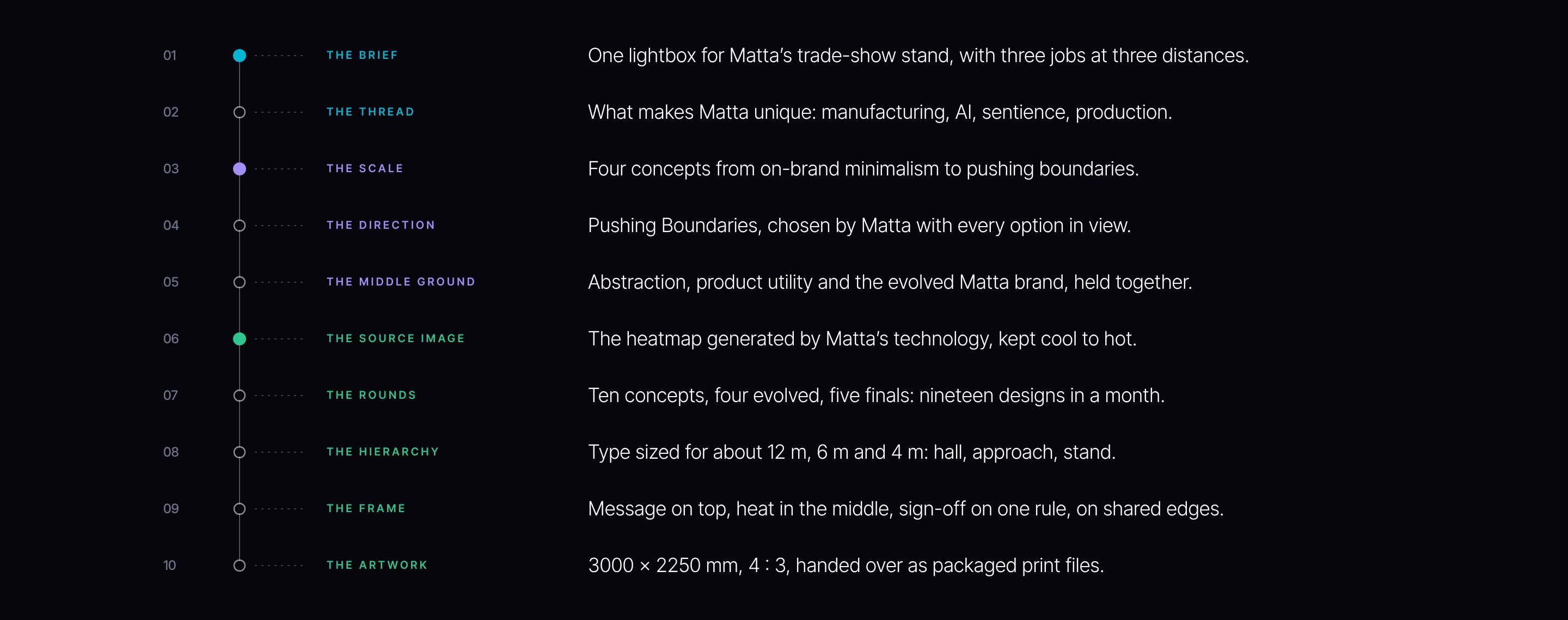
The engineered brief, on one page.
Every decision on the stand can be written down and traced back to the brief. That is the difference between a graphic that is engineered and one that is decorated.
01
THE BRIEF
One lightbox for Matta’s trade-show stand, with three jobs at three distances.
02
THE THREAD
What makes Matta unique: manufacturing, AI, sentience, production.
03
THE SCALE
Four concepts from on-brand minimalism to pushing boundaries.
04
THE DIRECTION
Pushing Boundaries, chosen by Matta with every option in view.
05
THE MIDDLE GROUND
Abstraction, product utility and the evolved Matta brand, held together.
06
THE SOURCE IMAGE
The heatmap generated by Matta’s technology, kept cool to hot.
07
THE ROUNDS
Ten concepts, four evolved, five finals: nineteen designs in a month.
08
THE HIERARCHY
Type sized for about 12 m, 6 m and 4 m: hall, approach, stand.
09
THE FRAME
Message on top, heat in the middle, sign-off on one rule, on shared edges.
10
THE ARTWORK
3000 × 2250 mm, 4 : 3, handed over as packaged print files.
Every engagement starts with the Brand Alignment Diagnostic, a fixed first step that scores your brand against the business and shows what to fix first.