Scale ceiling
It sounds like a single practice or a small chain, which caps how far it can stretch.
Eight websites, eight ad accounts. One brand, engineered to carry them all.
Naming, identity, system and voice for an Irish dental group, built part by part to a measure.

One name, engineered to carry eight practices as one national brand.
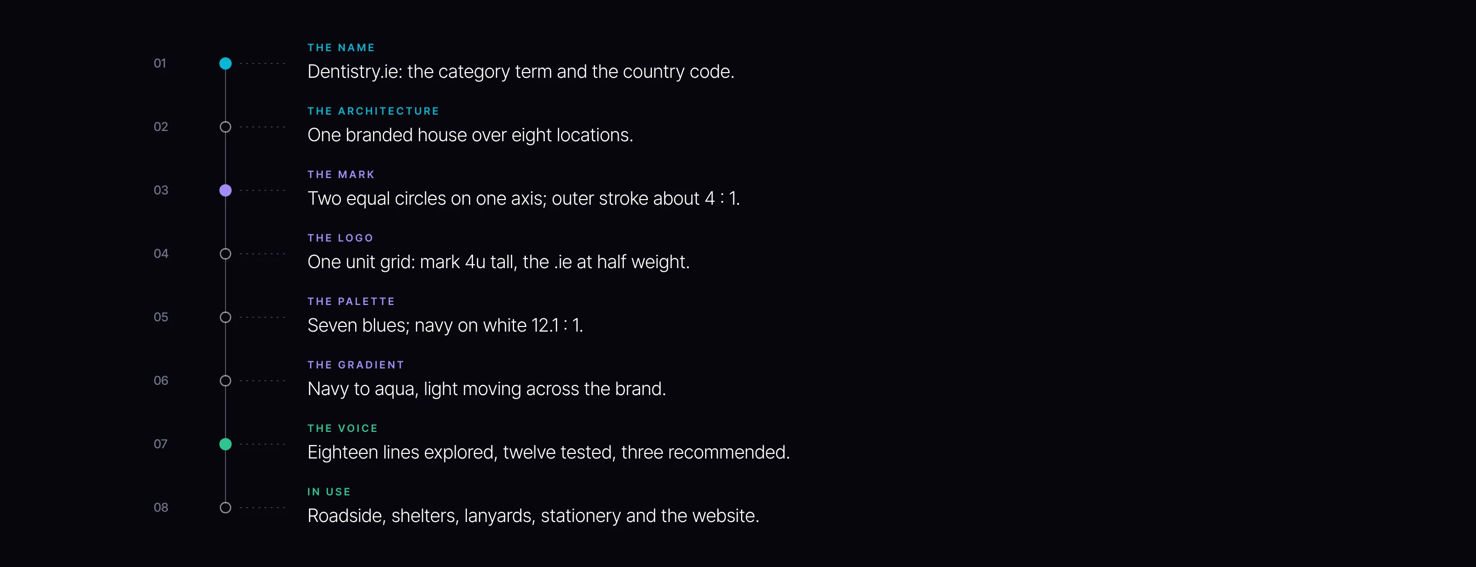
An Irish dental group came to us running eight practices with eight websites and eight advertising accounts. It needed one name above all of them and an identity that could hold every practice to one standard. We engineered the brand from the name up: a naming decision scored on nine criteria, colour worked from theory and then measured, three identity directions taken all the way to the street, a mark constructed from circles on one axis, a logo locked to a unit grid, and a tagline narrowed from eighteen lines to three against what the group has to promise.
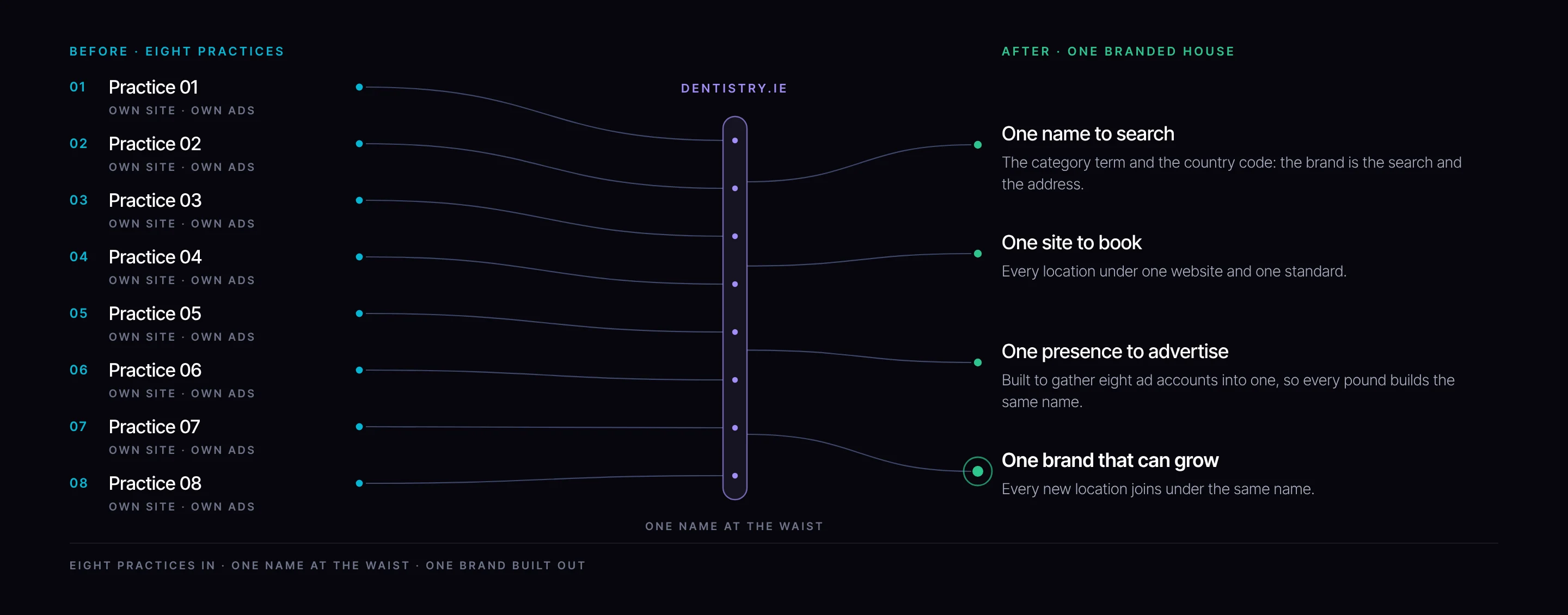
Each practice had grown with its own website and its own advertising account. The group’s search presence, its spend and its reputation were divided eight ways, and a patient had no way to tell that the practice in the next town held exactly the same standard of care.
A group grows on the strength of its name. Split across eight brands, every new patient, review and search started from zero. One brand lets each of them build on the last. That is the commercial case for engineering this properly rather than decorating it: every later decision either compounds the name or competes with it.
Three things had to be true. A name that could carry every practice, current and future. An identity that read as clinical excellence and warmth in the same moment. And a voice the whole network could speak in, with trust above everything and no reference to price.
From Pivitt’s naming recommendation (18 August 2025), identity concepts (22 August 2025) and tagline development (10 September 2025). Colour and stroke measures taken from the delivered files.
Settle the name first. The logo, the signs, the adverts and the booking journey all sit on it.
Naming was a structural decision before it was a creative one. A house of eight brands splits every asset eight ways; a branded house lets every practice borrow the strength of all the others. The name had to make that move possible, and keep making it possible as the group adds locations.
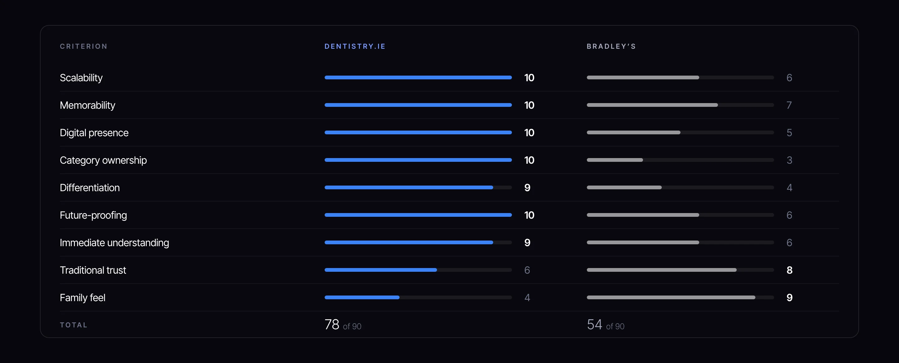
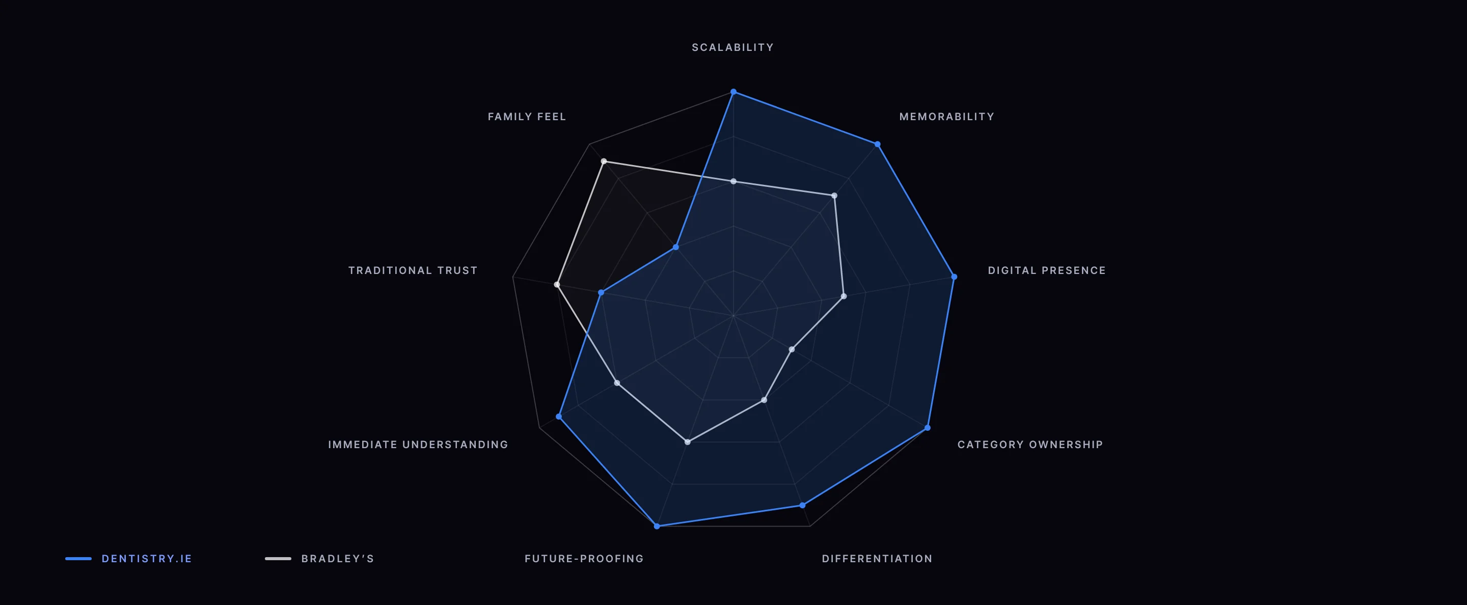
Two candidates were on the table: Bradley’s, a family name with real warmth, and Dentistry.ie. We did not choose on taste. We scored both against nine criteria that a group name has to meet, and showed the criteria Bradley’s won as plainly as the ones it lost. A recommendation is only as strong as its honesty about the trade-off.
Drawn as a shape, the difference is structural. Dentistry.ie covers the field, at nine or ten on seven of the nine criteria. Bradley’s leans one way: it is strongest on traditional trust and family feel, the two qualities a single, local practice needs most, and weakest on category ownership, the quality a national network needs most.
Bradley’s was a good name. That was the point worth testing: good for what? Our recommendation set out four limits, each one about scale rather than quality.
It sounds like a single practice or a small chain, which caps how far it can stretch.
It feels local, not national, in a group built to be everywhere.
Every new patient needs to be told who Bradley is before the name works.
A personal name owns nothing in search. The category is left to whoever claims it.
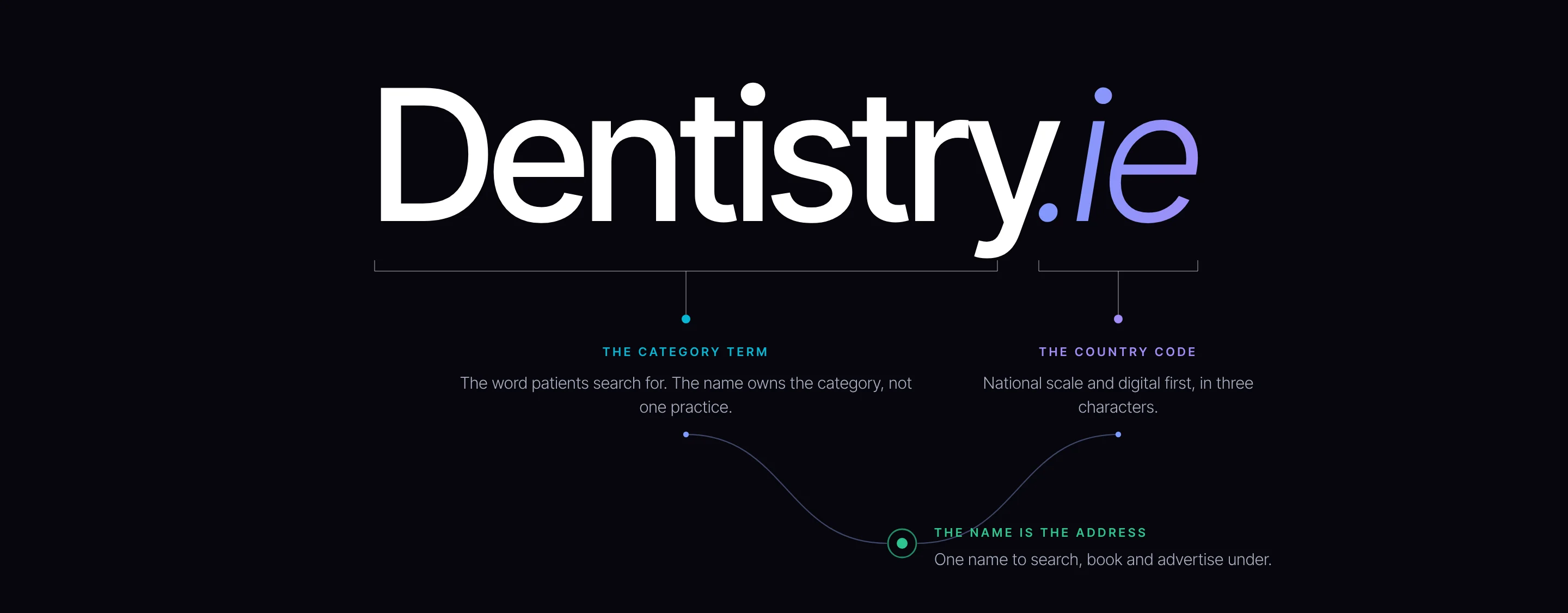
Dentistry.ie is engineered rather than invented. The first half is the category term, the second is the country code, and together they make the brand its own address: the name a patient remembers is the name they type.
Why a category term rather than a coined word? Because a group with eight locations, and more to come, gains most from being found by people who do not yet know it. Why the country code rather than a town or a founder? Because nothing in it ties the brand to one place, which is exactly what a national network needs.
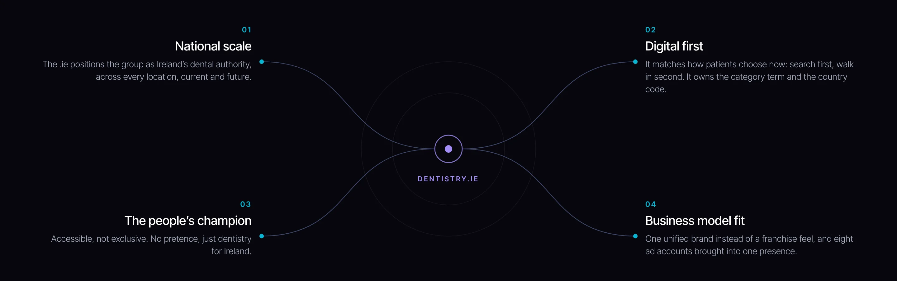
It owns the category term and the country code together: the strongest search position a dental name in Ireland can hold.
It is hard to forget and hard to misspell. “Just go to Dentistry.ie” is the instruction a patient passes on.
Generic names become powerful at scale. A pharmacy name can come to mean the category; this one is built to do the same for Irish dentistry.
Set in bold above the door, the name reads as a statement of confidence, and it joins the website to the building.
The recommendation rested on four arguments, each tied to how the group intends to grow. Together they made the case that the name is not a description of the group today but the structure it will grow into.
“In a market where everyone is trying to be premium but accessible, Dentistry.ie doesn’t try. It simply is Irish dentistry.”
From our naming recommendation
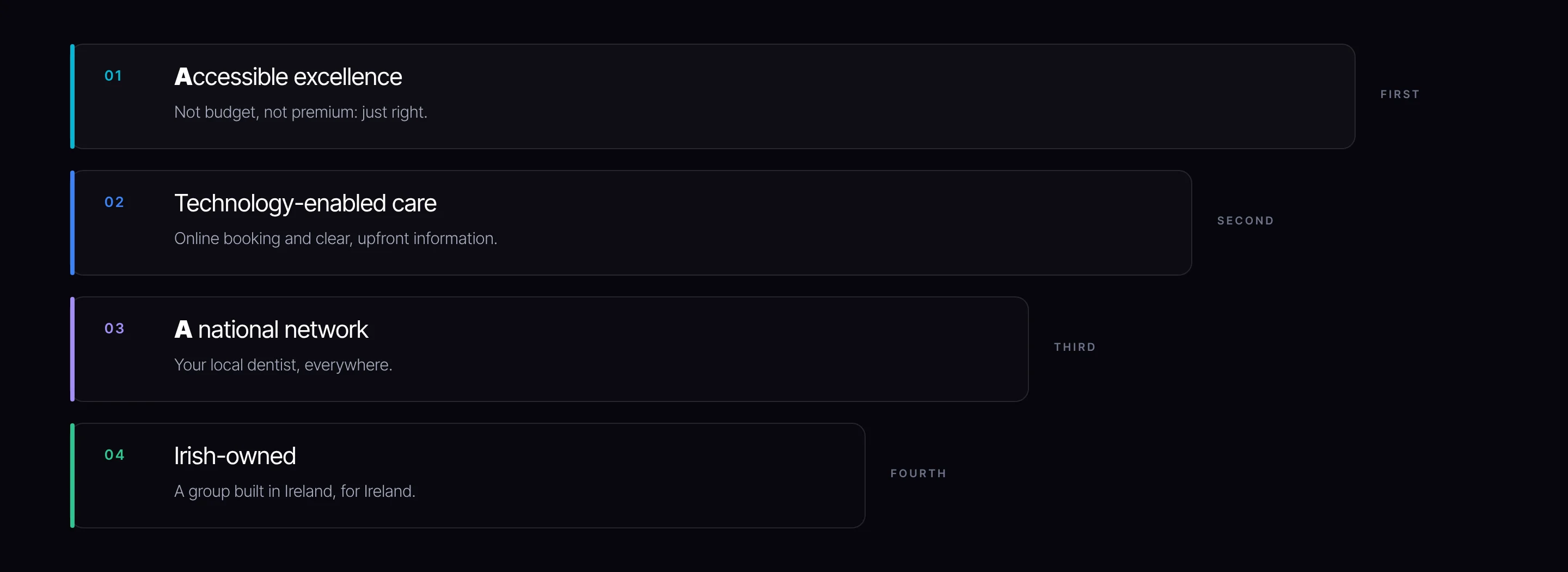
A name carries a promise. We ranked what Dentistry.ie had to mean, so every later decision on colour, type and line could be checked against the list, starting from the top.
Colour worked from theory, three directions built in full, then every colour measured.
Before drawing a mark we worked the colour from theory: monochromatic, analogous, triad, complementary and cubed schemes, each tested against the sector’s habit of flat clinical blue. Ireland’s own colour got its own study, three explorations of the green range, because a national brand should at least test its national colour.
The studies set the boundaries the three directions were built inside: one stays in a single family, one spans the wheel, one commits to the colour of trust.


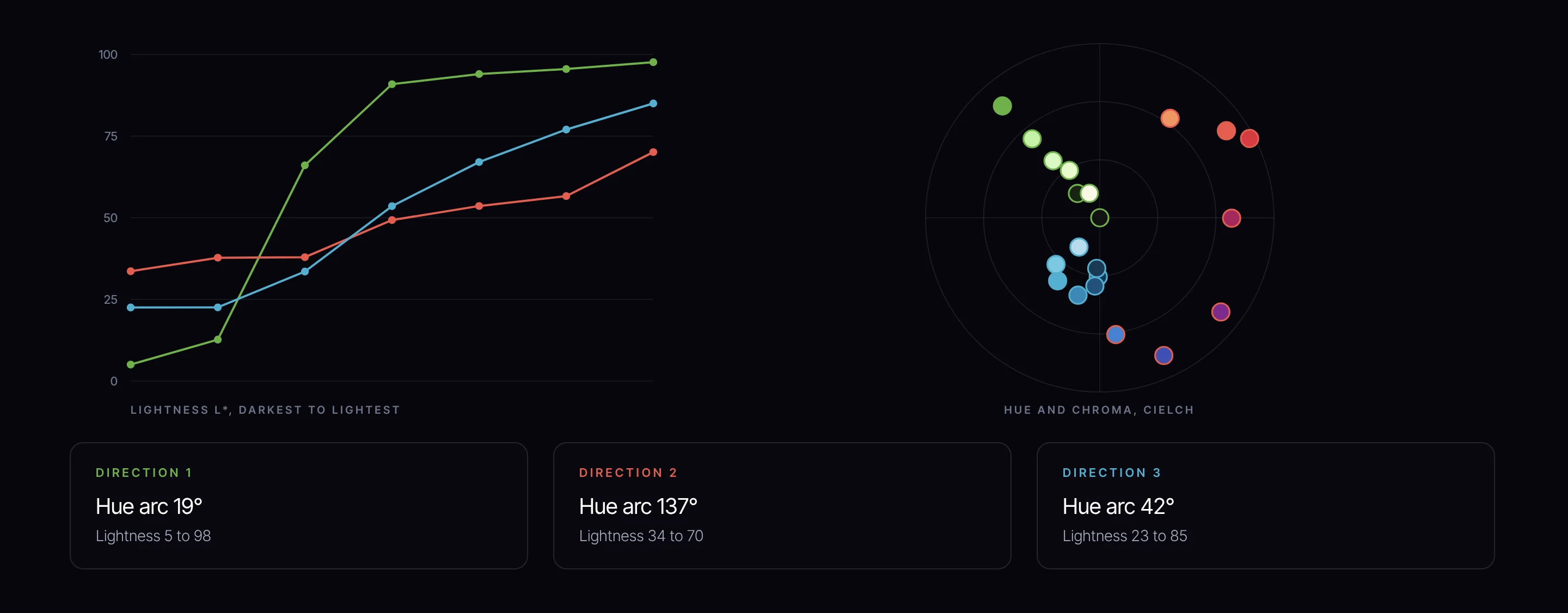
A palette is a set of decisions about light and hue, and both can be measured. We plotted every colour in the three directions in CIELCh, the colour space built to match how people see: lightness from 0 to 100, chroma as distance from grey, hue as an angle.
The measures show what each direction was really testing before a word is read. Direction 1 is one green family split into darks and tints. Direction 2 spends its energy on hue and holds lightness in the middle. Direction 3 is one family of blues with a full ladder of light, which is what a system needs to set text, grounds and accents from one source.
We built three complete directions from the same strategy and took each far enough to judge in the real world: mark, logo, palette, key visual, shelter posters, building-scale posters and the lanyards the teams would wear. Each was built to test a different answer to the brief, so the group could choose from the work rather than from a description of it.
Can Ireland’s national colour carry a healthcare brand, and set the group apart from the flat clinical blues and whites of its competitors?


A classic serif with an italicised .ie, balancing authority and tradition with a digital-forward touch.
Interlocking shapes that suggest both a flower and a four-leaf motif, a subtle nod to Ireland, with symmetry, care and precision.
A fresh green gradient, light to deep: health, renewal and vitality, tied to the national colour. A patterned texture adds movement and depth.


How far can warmth and people carry the brand? Vibrant colour and expressive portraits, to present a disruptive network rather than a traditional clinic.


A crisp sans-serif; the angled cut through the y leading into the .ie gives a forward-looking, digital-first impression.
Clean geometric forms that read as both a tooth and a protective shield: care, strength and reliability.
Rich blends of purple, blue, red and orange, signalling energy and modernity, away from the sector’s usual blues.


Can trust and efficiency lead? A streamlined, professional system built on the line “Dentistry Without the Wait”: speed, simplicity and patients first.


A clear, accessible sans-serif, with the .ie emphasised to highlight the Irish identity of the brand.
A heart-shaped outline that doubles as a stylised tooth. Its symmetry suggests balance and consistency across the network.
Cool blues from light aqua to deep navy: trust, professionalism and calm. Gradients add dimension without losing the clean, corporate feel.


Trust was the group’s first value and, later, the tagline’s first requirement. Direction 3 is the one built on it, and the measures back the instinct. It is the only palette that is both one family and a full ladder of light: navy for text, mid blues for accents, pale aqua for grounds, all within 42° of hue. Direction 1 has the family but not the middle; Direction 2 has the energy but holds its light in one band.
The mark carries the same logic. Its symmetry is the network promise drawn: the same standard on either side, in every practice. And the voice work that followed landed on the same ground. All three recommended lines come from the trust and consistency pairings, the territory Direction 3 already occupied visually.
The chosen mark, constructed, gridded, scaled, measured and handed over as one system.
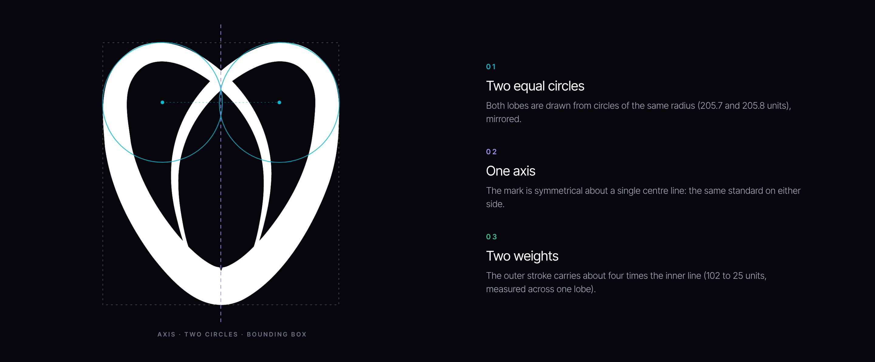
A mark that is engineered can be redrawn by anyone, at any size, in any material, and come out the same. We rebuilt Direction 3’s mark as a construction: two circles, one axis, two weights. Scroll it into view and it draws itself in that order.
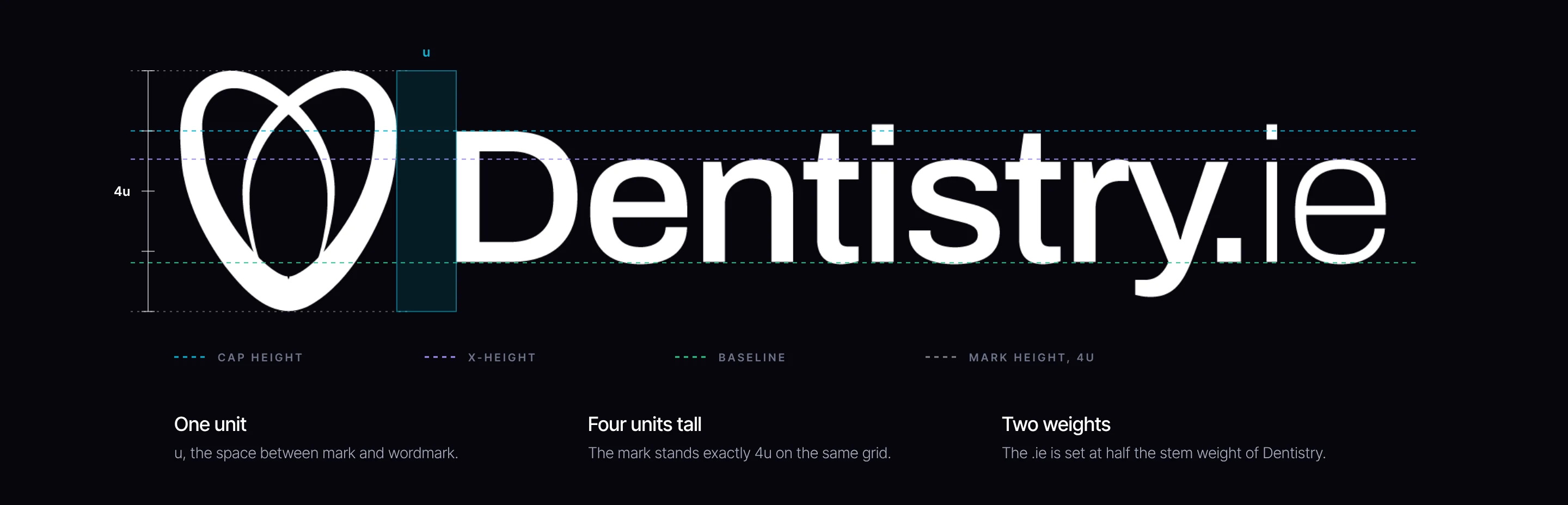
A lockup that is engineered can be placed by anyone without drift. The logo sits on a single unit taken from its own spacing, so its proportions are fixed by rule rather than by whoever sets it next. Toggle the grid to see the logo with and without its scaffolding.
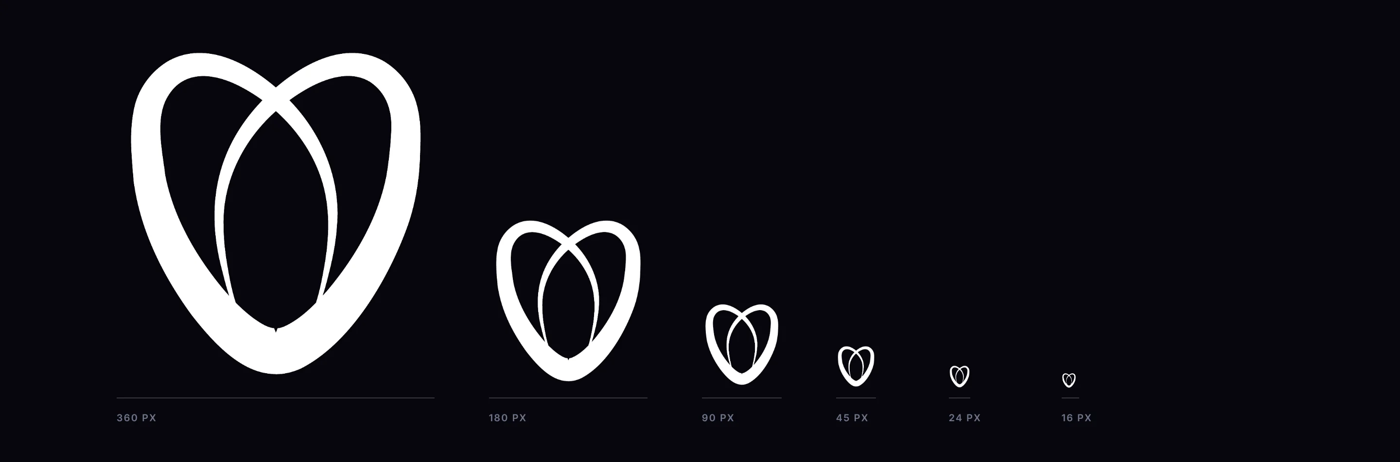
A national brand lives at every size at once: building wraps, shelter posters, lanyards, app icons and the tab in a patient’s browser. We ran the mark down the scale from 360 pixels to 16. The two equal circles and the heavy outer stroke keep the silhouette whole long after the fine inner lines have gone, which is exactly what the 4:1 weight ratio is for.
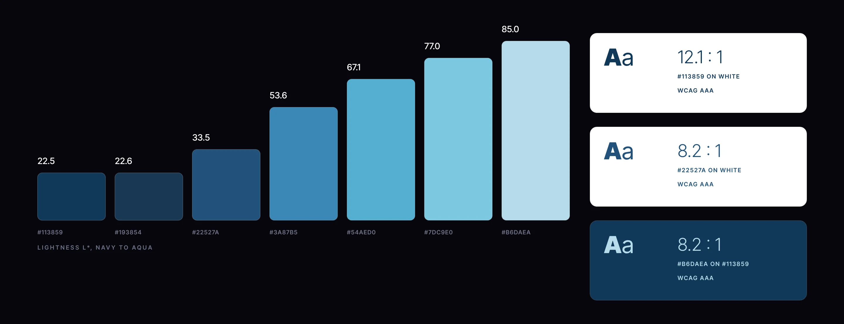
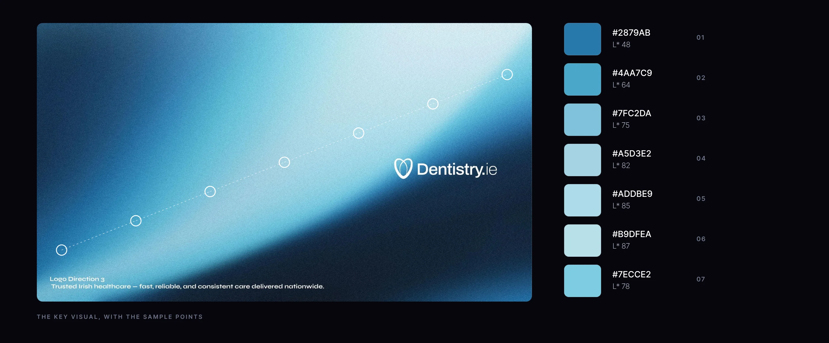
Healthcare lives or dies on legibility: appointment details, opening hours, directions to the door. We checked the chosen palette the way an engineer would. The seven blues climb in lightness from navy to aqua, and the darkest and lightest clear the strictest contrast standard both ways round, so the brand reads first time for every patient, in print and on screen.
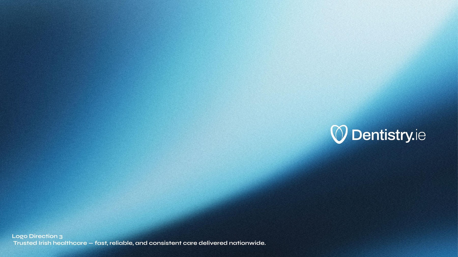
The gradient is the brand’s light, so we treated it as data rather than a picture. We sampled the key visual at seven even points along its diagonal and rebuilt it as a specification any screen, printer or developer can reproduce. The key visual at the top of this page is the original artwork; the field below is the gradient rebuilt from its numbers.
We handed over the full logo system: the hero logo, the brand mark and the word mark in SVG, PNG and source files, with the brand font, the gradient and logo guidance, so every practice and every supplier works from the same masters.


A specification first, then a wide exploration, then three lines chosen on the evidence.
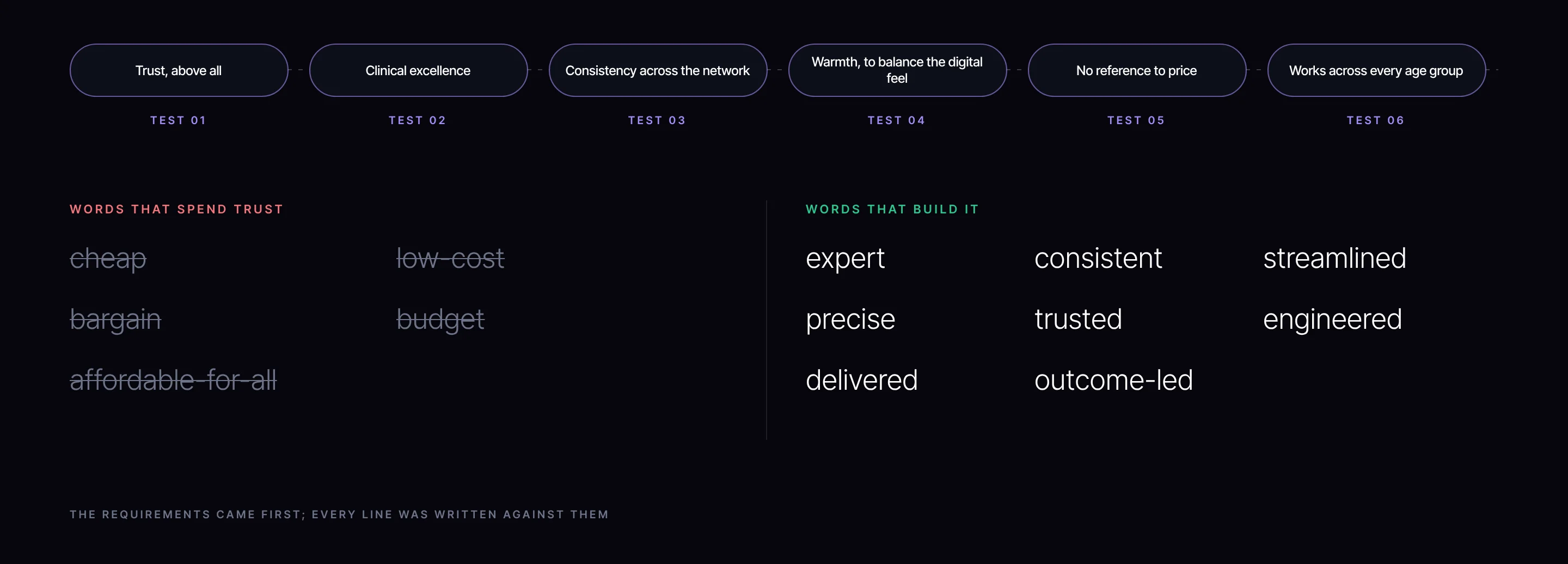
A tagline sits above every practice, so we wrote the specification before the lines. Six requirements, ranked, taken from the group’s own priorities and from what the name already does: the .ie brings the modernity, so the line has to bring the warmth.
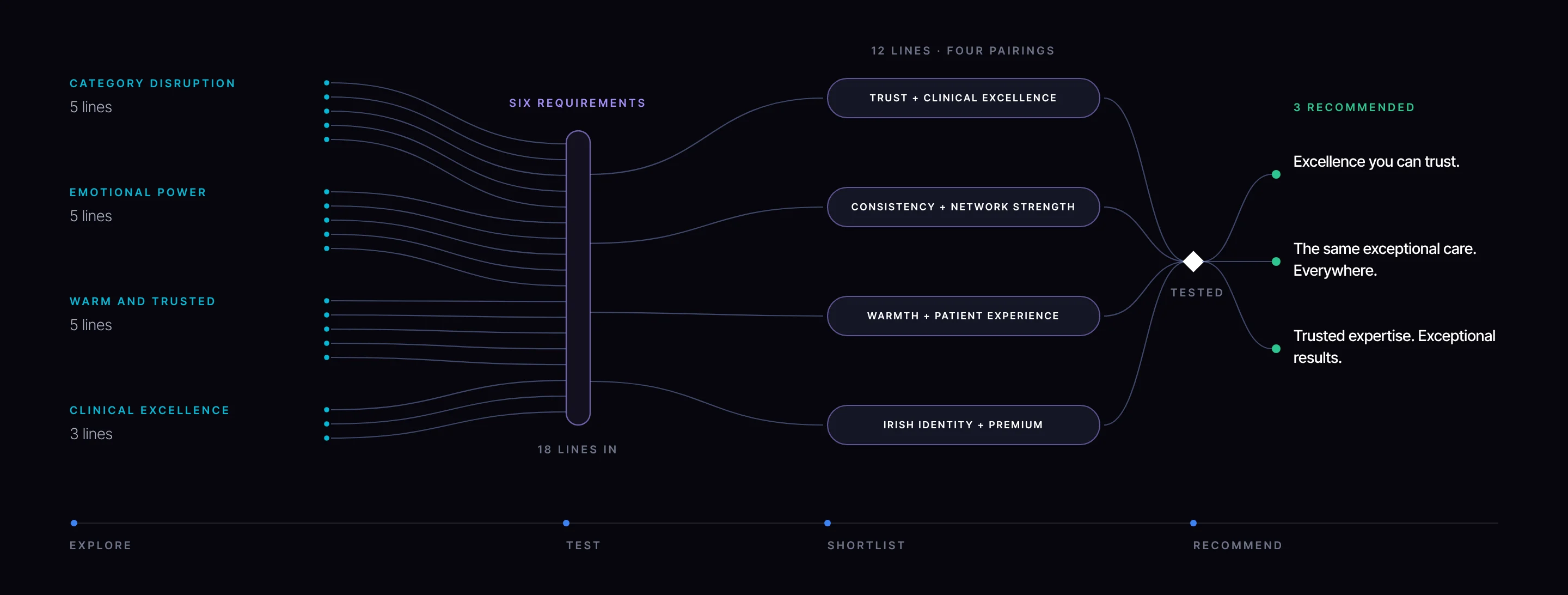
We explored wide before narrowing: eighteen lines across four territories, laid out on one axis from bold and distinctive at the top to safe and traditional at the bottom, each annotated with the job it does. Mapping them this way shows the range of voices the group could own, and what each one would cost in boldness or in warmth.
Alongside the map we set language guardrails. They keep every line on the right side of value without ever implying cheap.
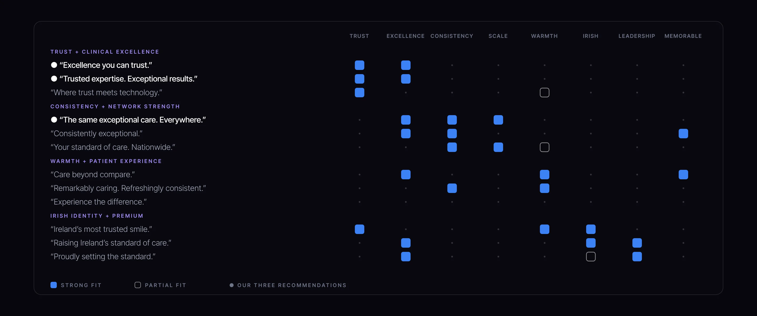
The exploration set the range. The specification then decided what each line had to carry, so we paired the requirements into four strategic pairings and wrote three lines for each: twelve lines, every one tagged against the attributes it carries. The recommendation was read off the evidence.
Each of the twelve lines was tagged against the attributes it carries: filled for a strong fit, outlined for a partial one. Read across a row to see what a line does; read down a column to see which lines carry a quality. Between them, the three we recommended carry trust, excellence and consistency, the top of the specification, and none of them has a partial fit.
We recommended three lines and showed each one locked up with the logo, so the group could judge them as they would appear on a sign and a shelter poster, not as words in a document.

Pairs the group’s two highest priorities, trust and excellence, in four words. It works for every age group and carries no reference to price.

Makes the consistency promise outright: one standard in every practice, the reason the group became one brand.

Balances the process, the expertise, with the outcome, the results, as the specification asked.
The name we recommended became the brand, carried by the mark the group chose. Eight locations now sit under one name: one site to search and book, and one identity that holds every practice to the same standard. That is what the engineering was for, a structure in which every patient, review and search builds the same brand.

The point of engineering a brand is what it lets the business do. Every part above was built to make one of four things possible for the group, and each can be traced back to the decisions that deliver it.
The name is the category term and the country code, so a patient searching for a dentist in Ireland is searching for the brand. One name to find, remember and pass on.
Built from: The nameOne branded house puts every location behind one front door: one website where any practice can be found and booked, under one standard.
Built from: The architecture, The nameOne name and one identity give the group a single presence to advertise under, built to replace eight separate accounts, so every campaign builds the same brand.
Built from: The architecture, The nameA constructed mark, a unit grid, a measured palette and logo masters mean every practice and every supplier reproduces the brand the same way, at every size.
Built from: The mark and grid, The palette and gradient, The voiceEvery part of Dentistry.ie can be written down as a specification and rebuilt from it. That is the difference between a brand that is engineered and one that is decorated: the first can be run by anyone, in any practice, for years, without drift.
Brands are engineered, not decorated. Name the group for what it has to carry, then build every part to a measure.
Every engagement starts with the Brand Alignment Diagnostic, a fixed first step that scores your brand against the business and shows what to fix first.