Black Mule
Built to command its market.
The Strategy
A redevelopment specialist, beside a crowded development market.
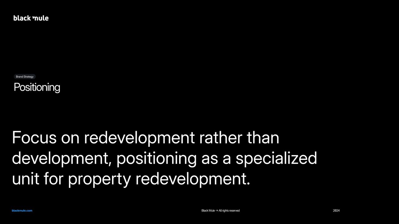
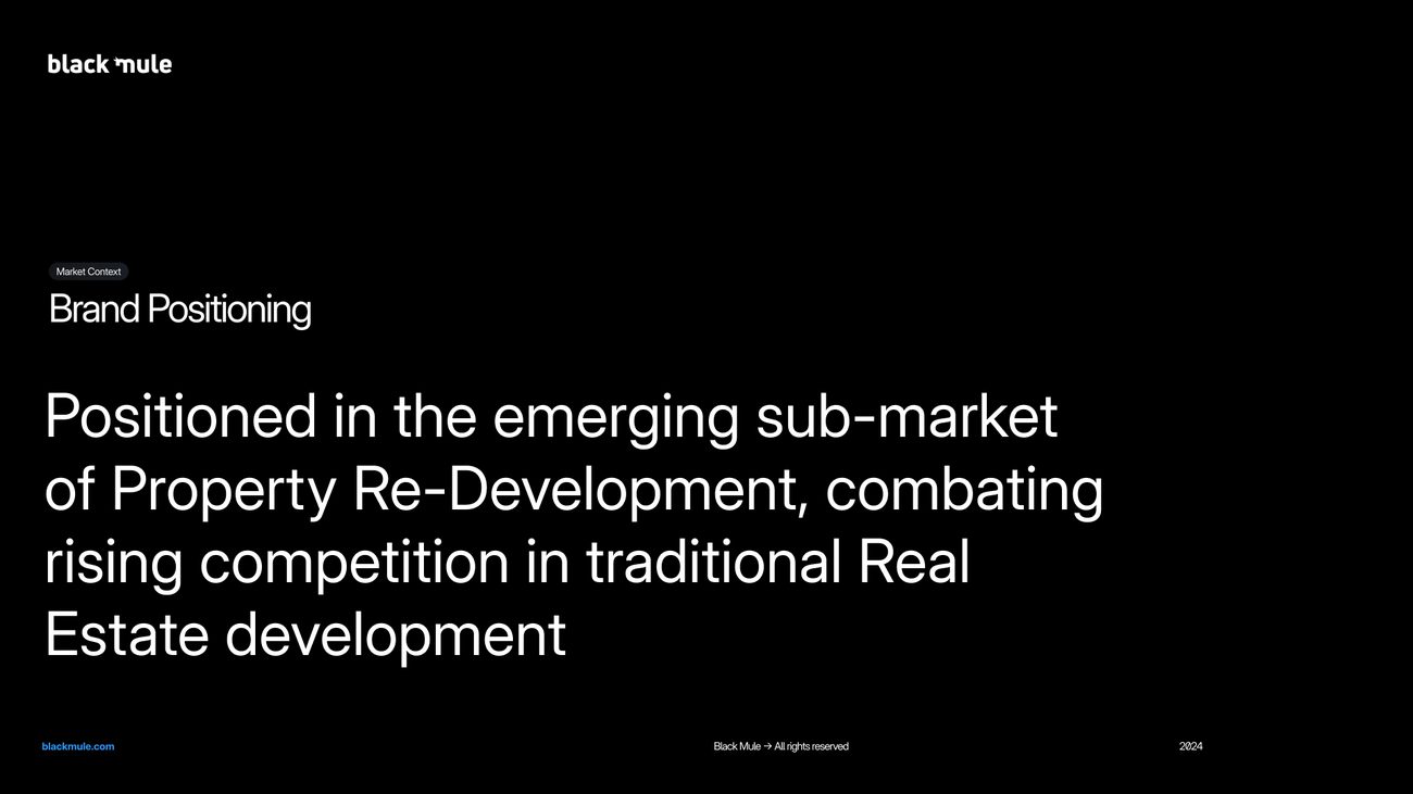
Black Mule invests in stalled and abandoned real estate projects across the GCC. Traditional development in the region was growing more competitive, and the opening sat in the market beside it: projects that had stalled or were underperforming. The strategy positioned Black Mule as a specialist redevelopment unit, a concentrated team that finds the value left in those assets and realises it, backed by the network and resources of KEO International Consultants.
A competitive audit, against seven investors and redevelopers.
Before any design work, we audited Black Mule’s brand beside Matthews Southwest, Tishman Speyer, Greystar, Artemis, H.I.G. Realty, Dune and Abacus, across identity, values, tone of voice, brand architecture, markets, asset types, audience and content. The report was delivered in May 2024, and its gaps set the brief for the platform. The report is shown below, followed by three of its findings redrawn.
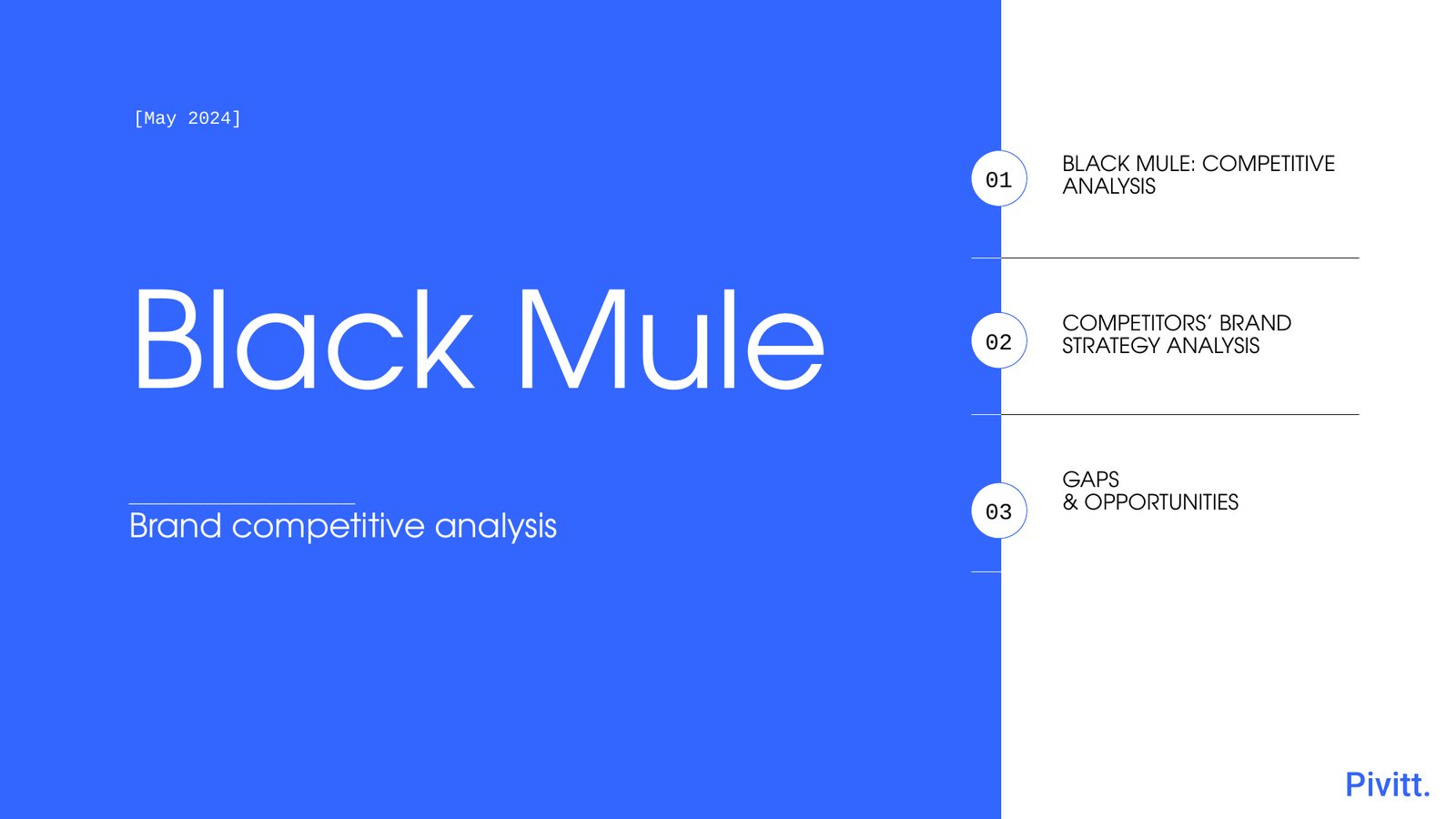
Three of the report’s findings, made easy to read.
Brand foundations
Black Mule was the only brand in the set without a stated mission or vision, and one of four without stated values.
Asset specialism
Every competitor named the asset types it works in. Black Mule named none.
Where the brands sat
The audit placed each brand on three scales. Black Mule sat at the premium end and left of centre on innovation, yet its brand made no case for innovation, one of the gaps the platform closed.
Black Mule sat at the premium end, beside Tishman Speyer.
Only Tishman Speyer sat further towards innovation.
Black Mule sat in the middle, between the placemakers and the pure asset investors.
Five gaps, and what answered each.
Capabilities described, with no mission, vision or values stated and no tagline.
A purpose, vision and mission, and five values, set out at the front of the guidelines.
Positioning spread across investment, redevelopment and advisory.
Redevelopment named as the specialism: a specialised unit in the sub-market beside traditional development.
No angle on innovation or sustainability, where competitors such as Tishman Speyer led with both.
Innovation among the values, and sustainability and innovation written into the differentiation.
The depth of KEO’s expertise implied more than shown.
KEO’s network and resources made part of the differentiation, with the allied practices given their own page in the capability statement.
Few success stories, and almost no content or social presence.
A website, a social system and a capability statement built to put the work in front of investors.
What the brand stands on.
A specialised unit for property redevelopment, in the emerging sub-market beside traditional development.
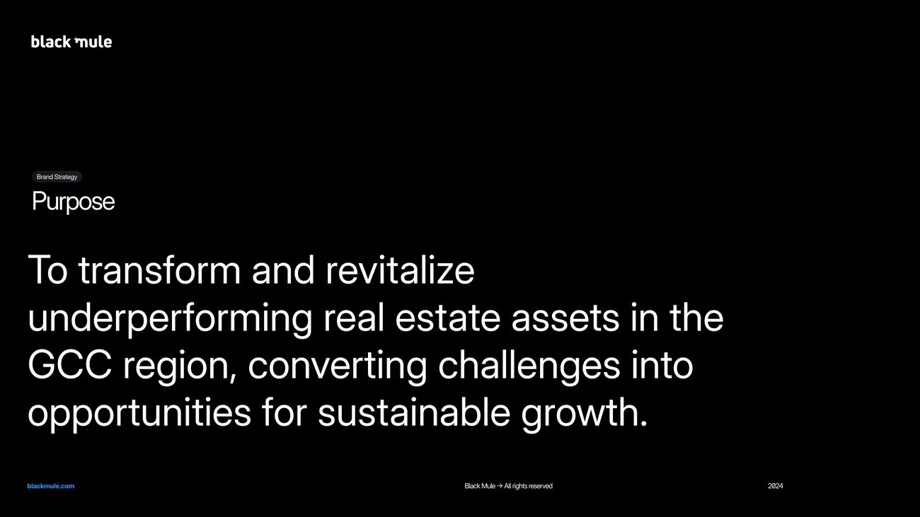
To transform and revitalise underperforming real estate assets in the GCC, turning challenges into opportunities for sustainable growth.
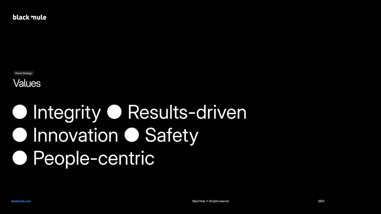
Integrity, results-driven, innovation, safety and people-centric.
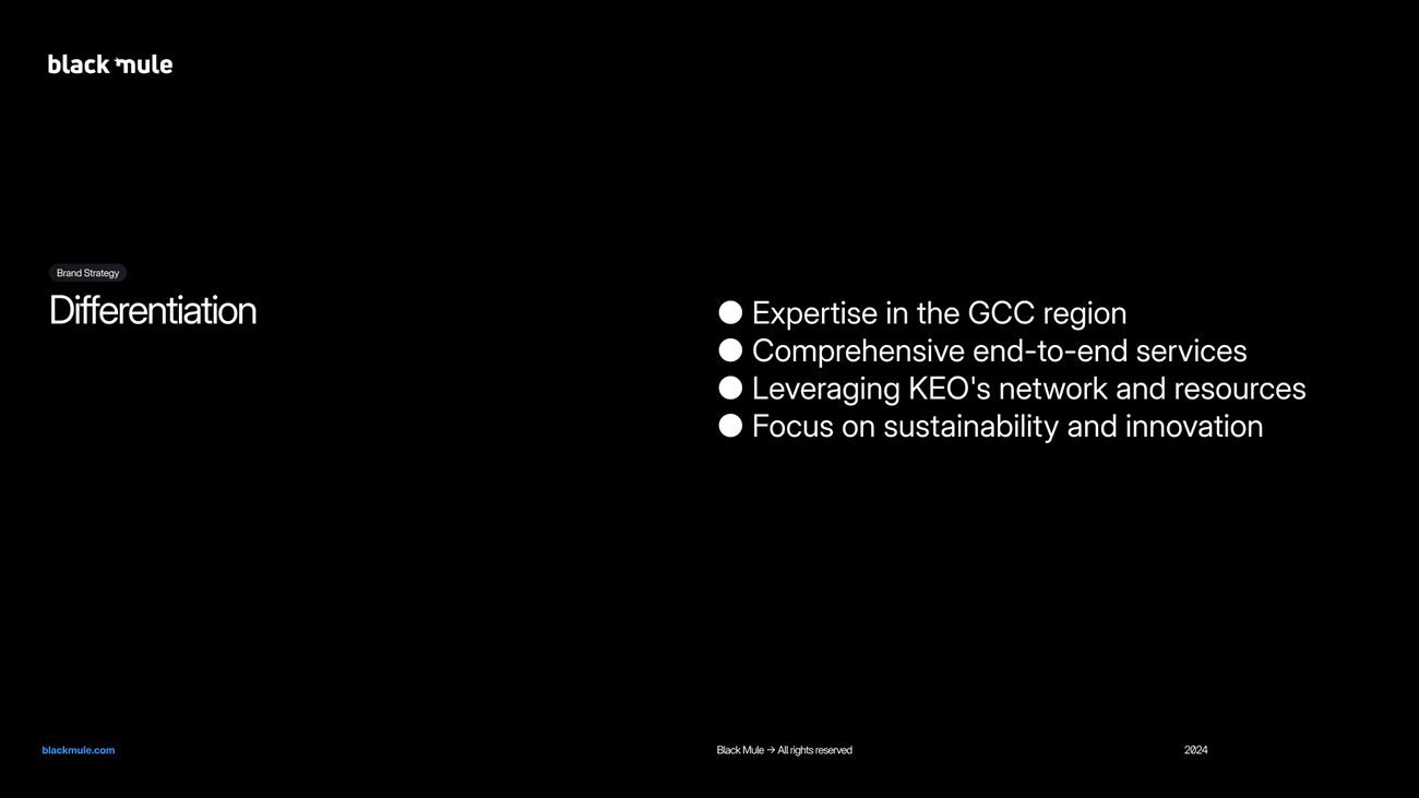
Expertise in the GCC, end-to-end services, the network and resources of KEO, and a focus on sustainability and innovation.
The brand platform, as set out in the guidelines delivered in 2024.
Finding The Direction
Three rounds, from three routes to one system.
The brand had to establish Black Mule as the region’s redevelopment experts. We worked from strategy through to website between May and August 2024, and the identity was settled over three rounds of concept work, 93 boards in all. Every route was built out as a complete system and tested in application before a choice was made, and every round is shown here, including the routes that were not taken forward.
- ROUND 01Three concepts
Three complete systems from one strategy, each tested in application.
29 boards - ROUND 02Three blues
One layout, with colour as the only thing being judged.
30 boards - ROUND 03Three refinements
Every route rebuilt in the blue family and read side by side.
34 boards - SELECTEDOne system
The mule monogram on black, with Electric Blue as the accent.
17 boards
Three initial concepts.
Three routes from the same strategy, each with its own mark, typeface and palette, carried into web, social, print and outdoor application so they could be judged in use.
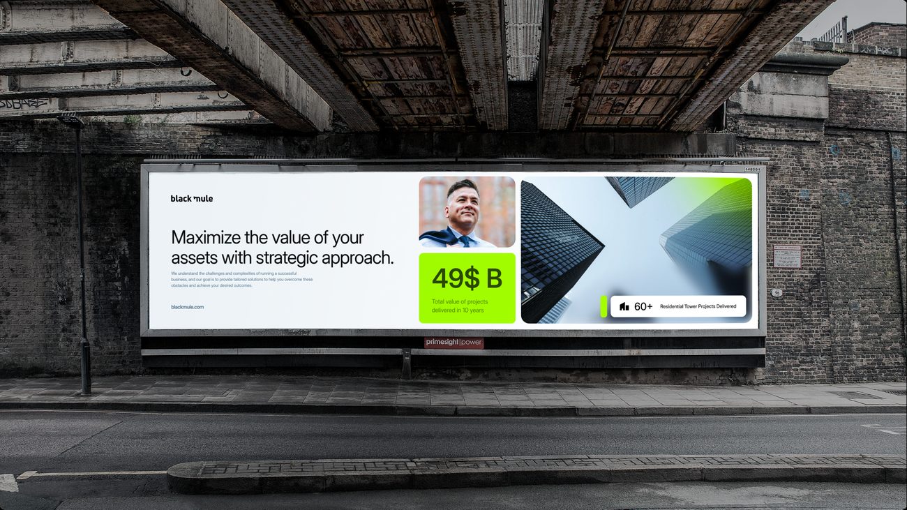
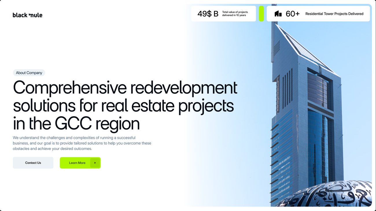
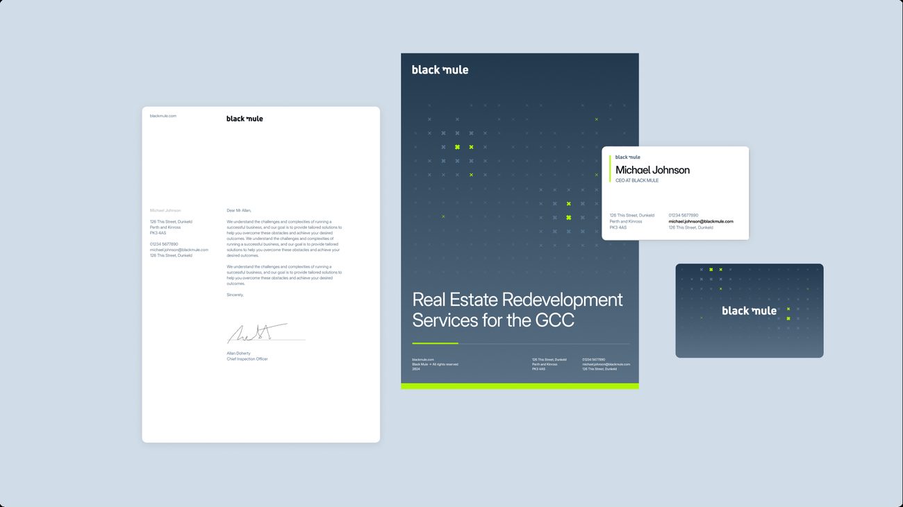
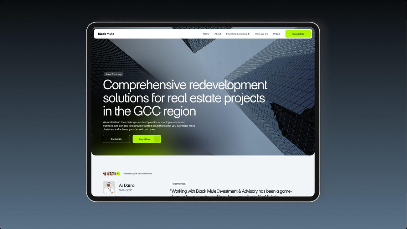
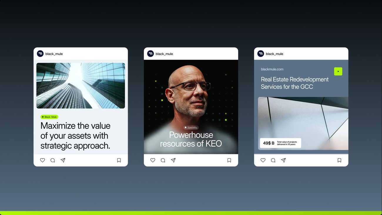
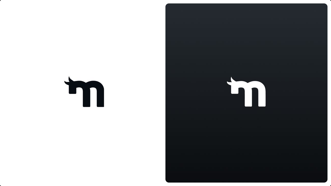
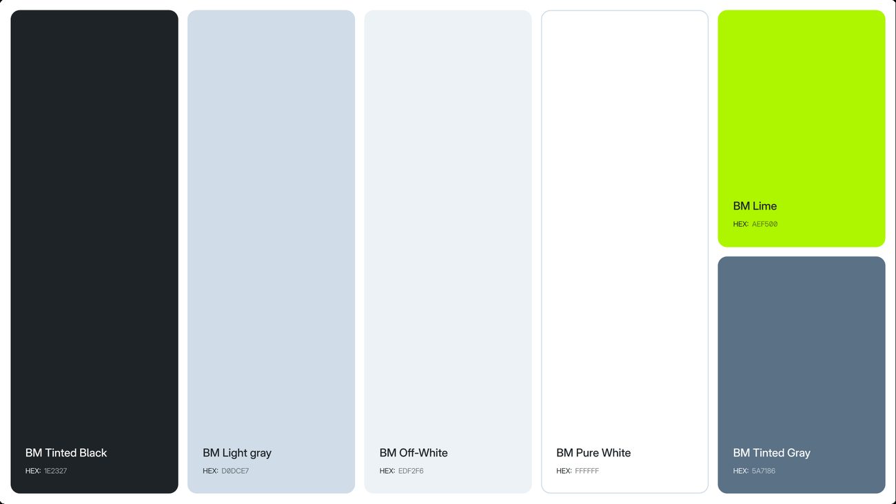
Lime on tinted black, with the mule drawn into the monogram.
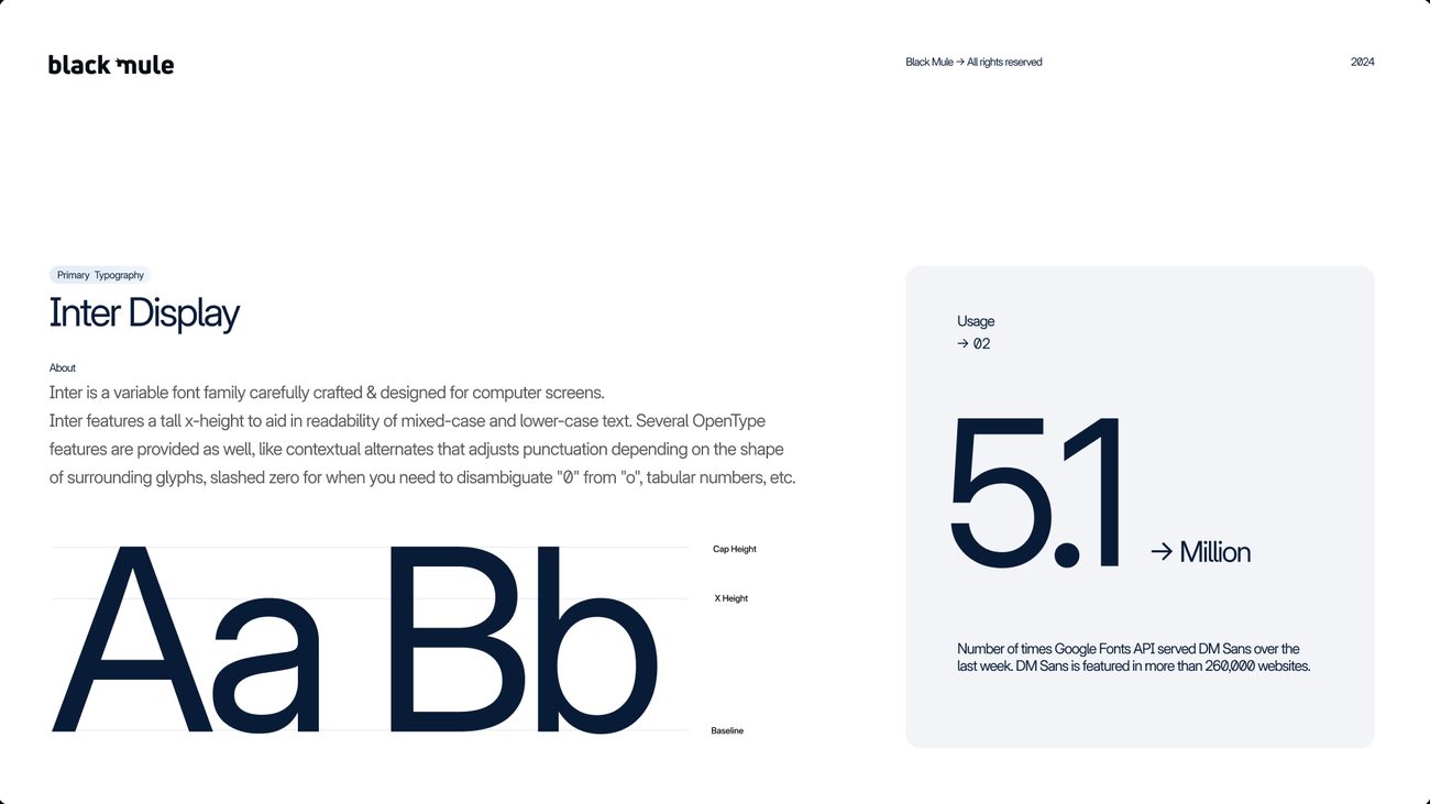
An m monogram with the mule’s ears drawn into it, set in Inter Display, with a lime accent on tinted black and a dot grid built from the palette. The scale of the portfolio does the persuading: the headline figure sits on the billboard beside the proposition.
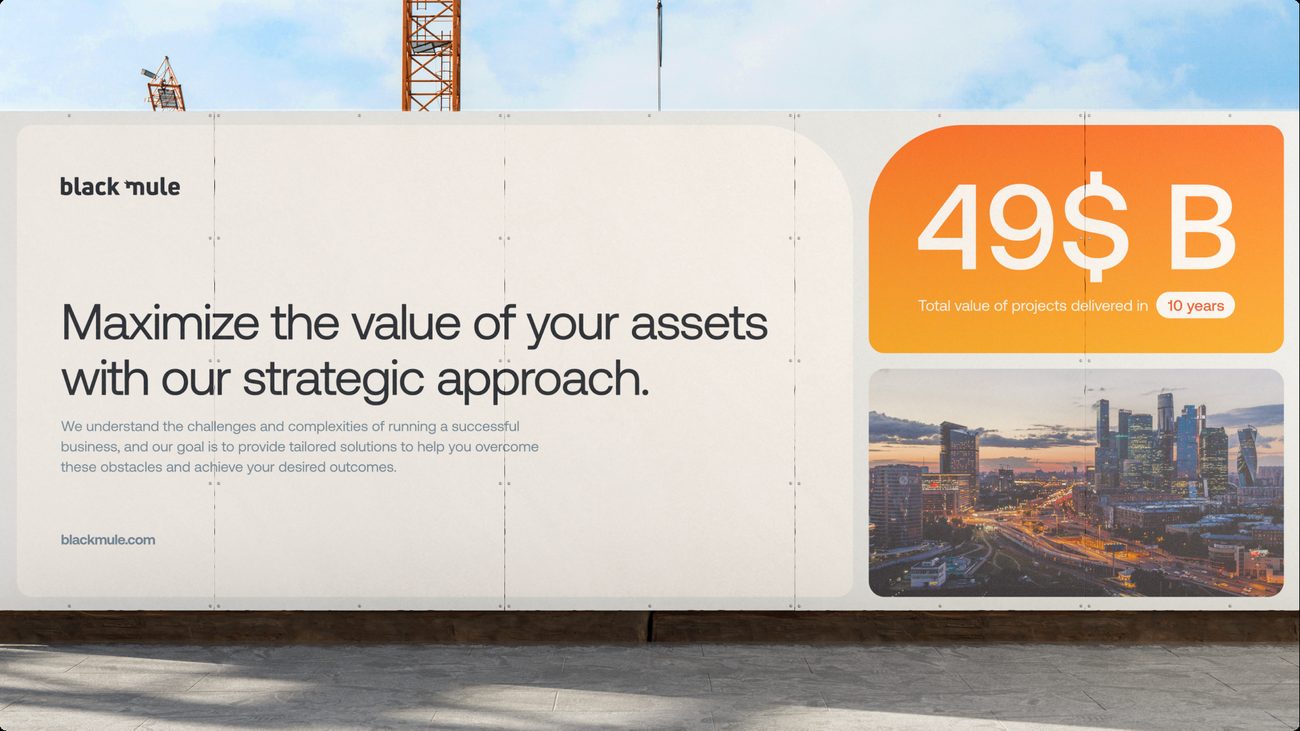
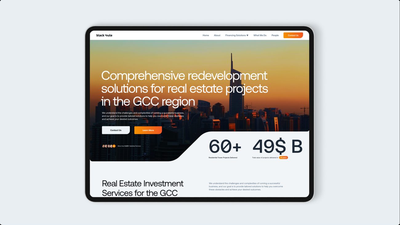
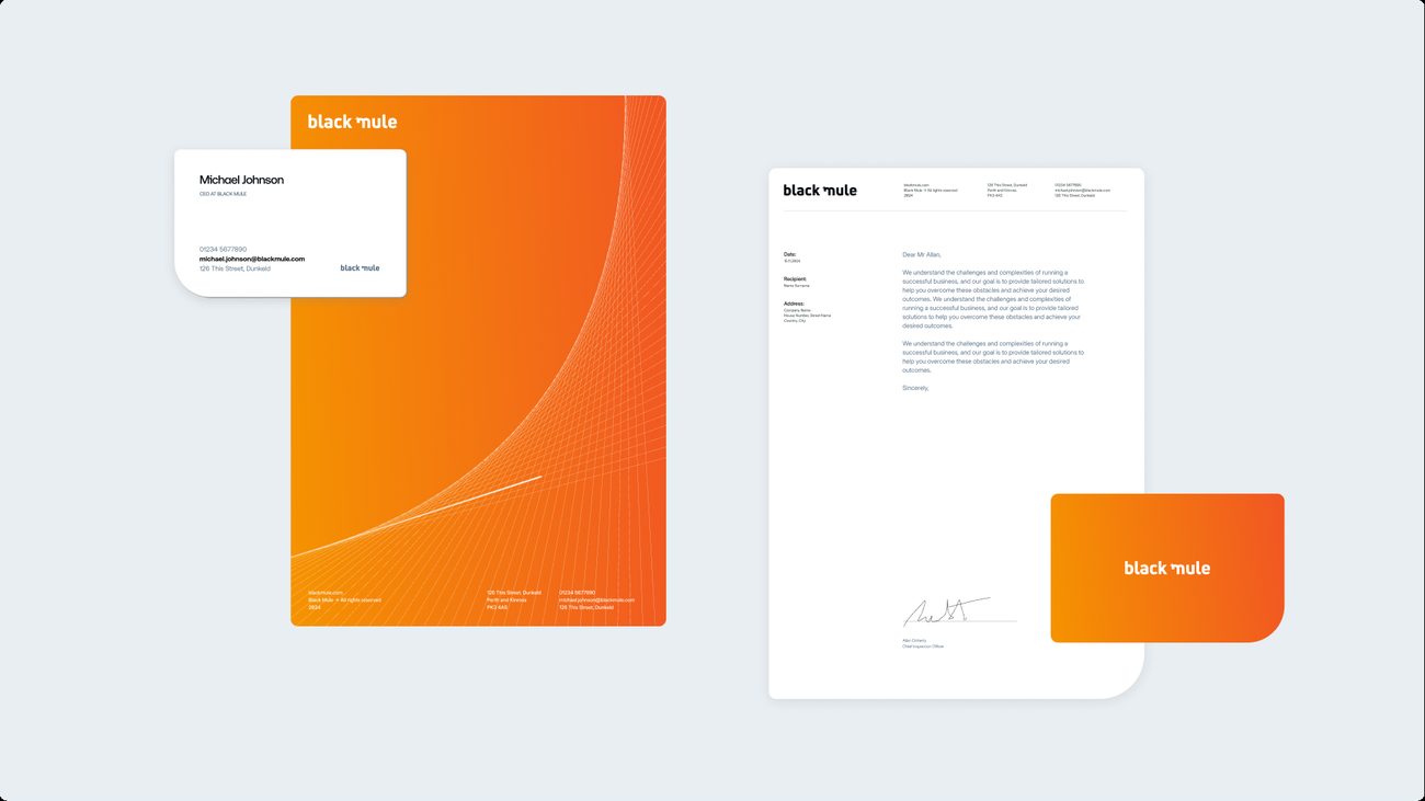
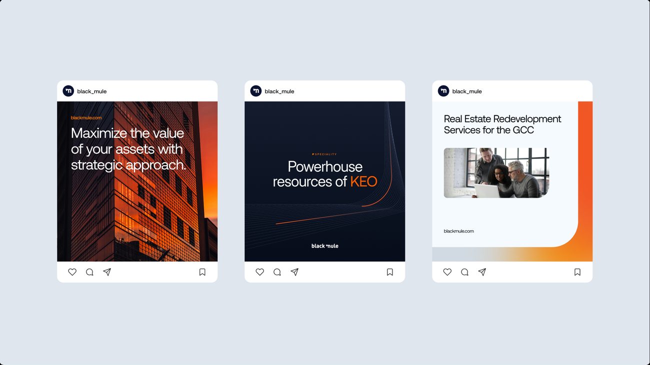
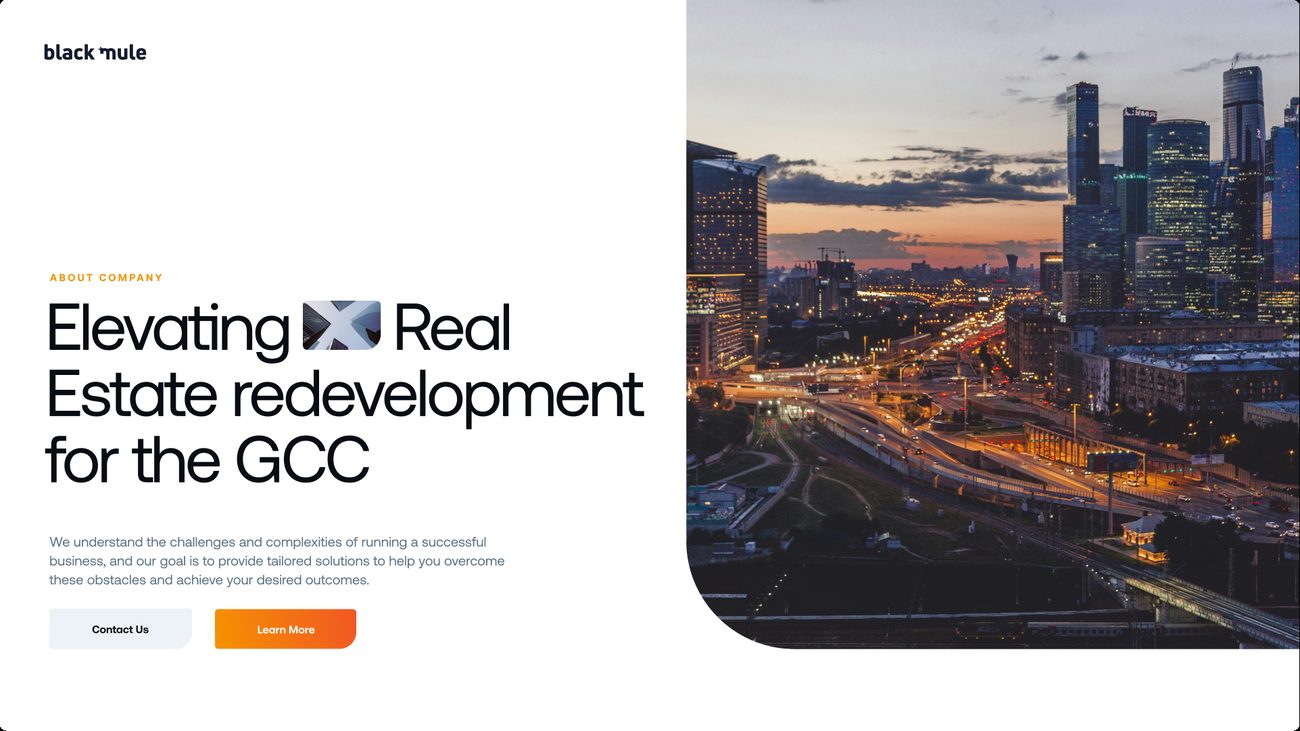
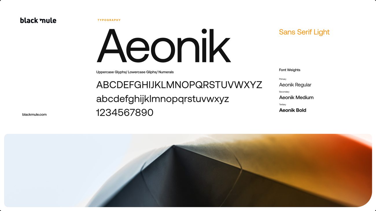
Fire orange on tinted black, with a monogram drawn in one continuous line.
A monogram drawn in a single unbroken line, set in Aeonik, with fire orange against tinted black and dusk photography of the Gulf skyline. Scale figures are set large on the hoarding and the website, and the warmth of the palette carries through to the stationery.


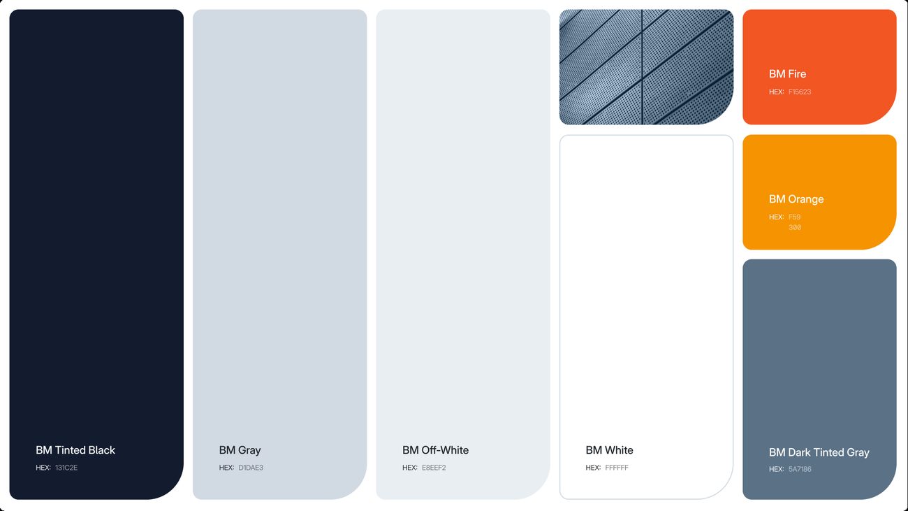
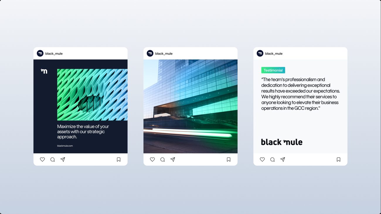
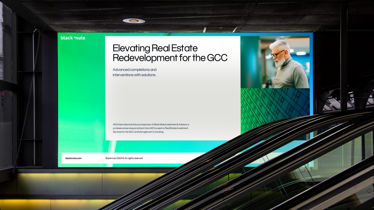
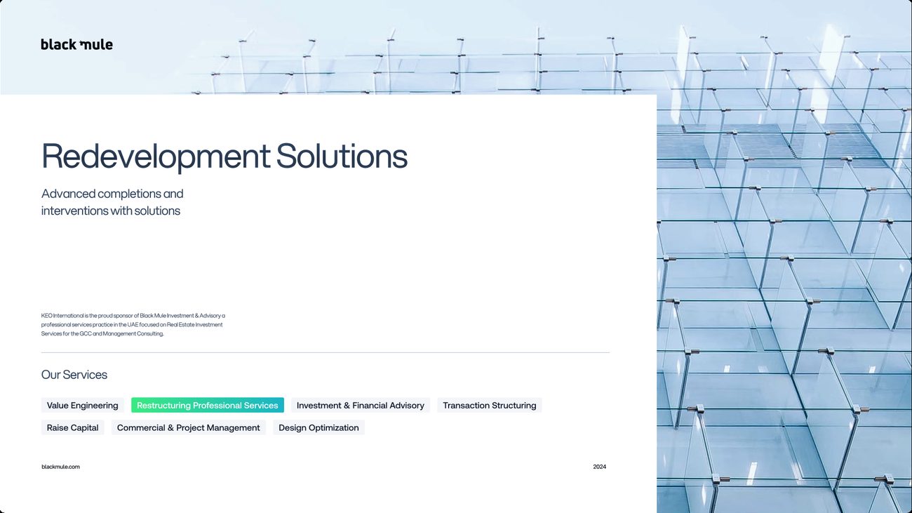
Green into blue, with a gradient carried through every surface.
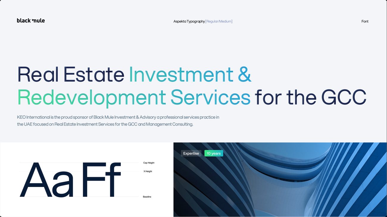
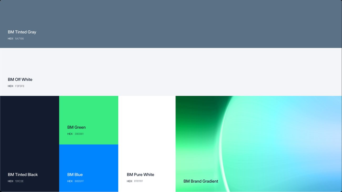
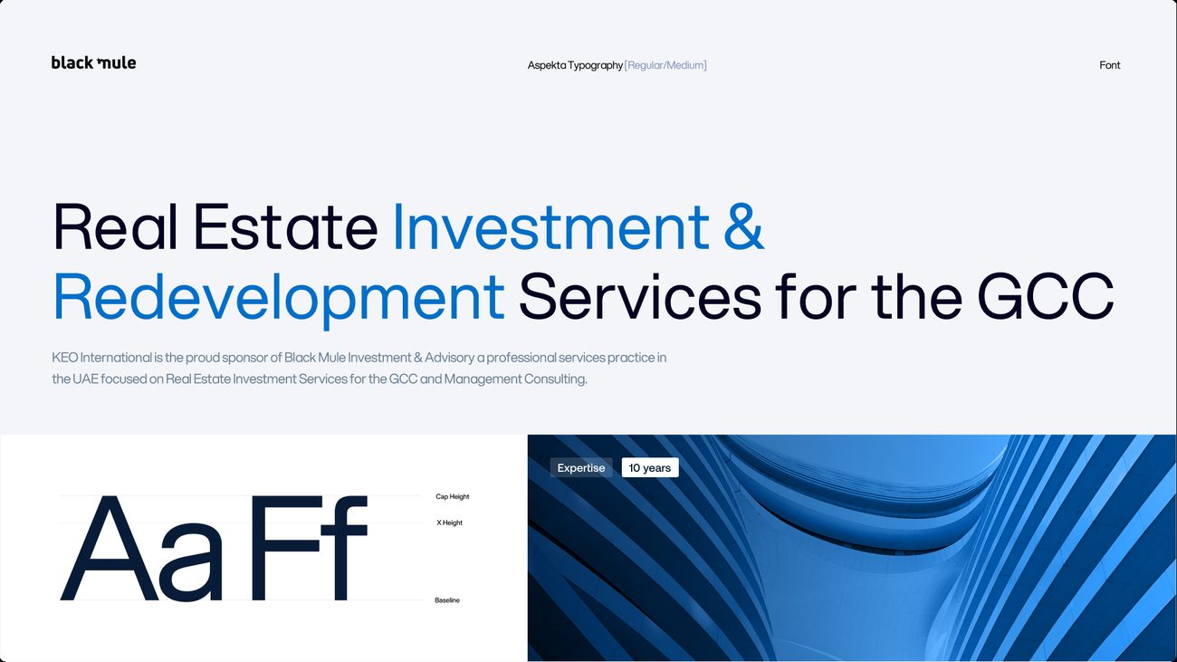
A wordmark-led route in Aspekta, with a green-to-blue gradient running through every surface and glass-and-steel architecture as its image language. It carried the fullest set of page layouts of the three, and its layout system went forward into Round 02.
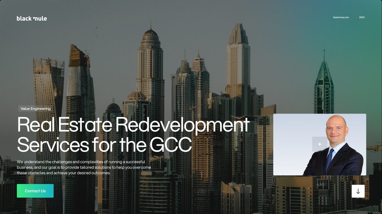
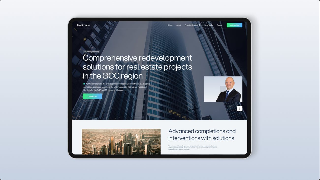
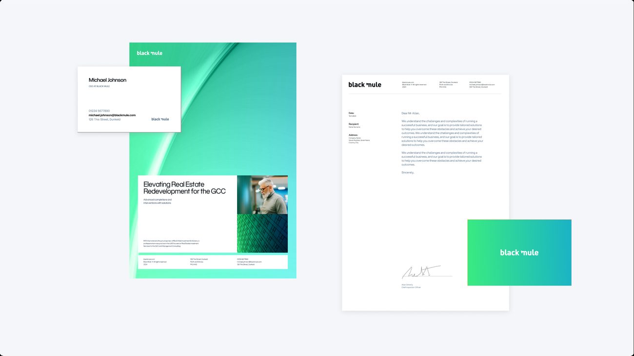
What went forwardThe layout system of Concept 03, and the question of colour. Blue was the common ground, so Round 02 held one layout still and changed only the blue.
One system, three blues.
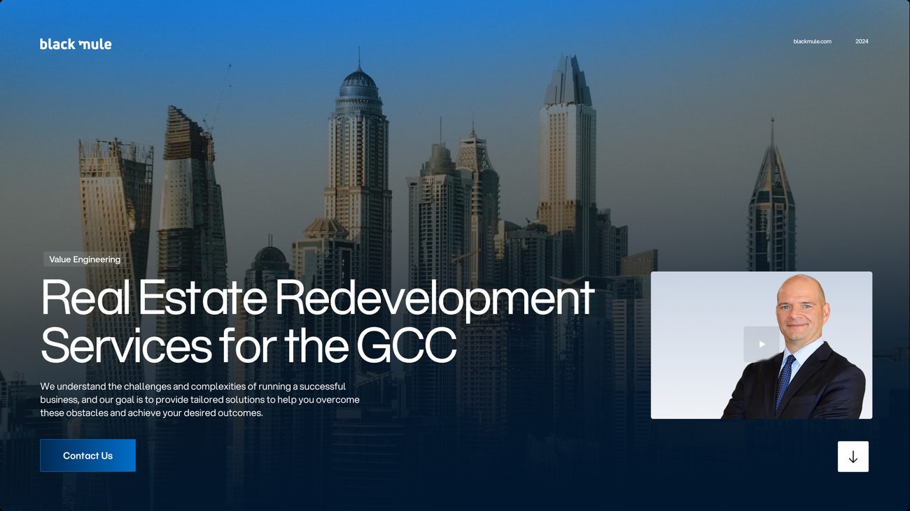
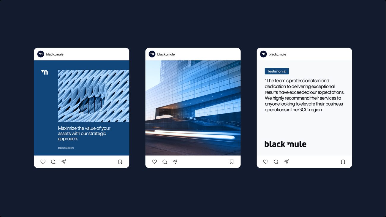
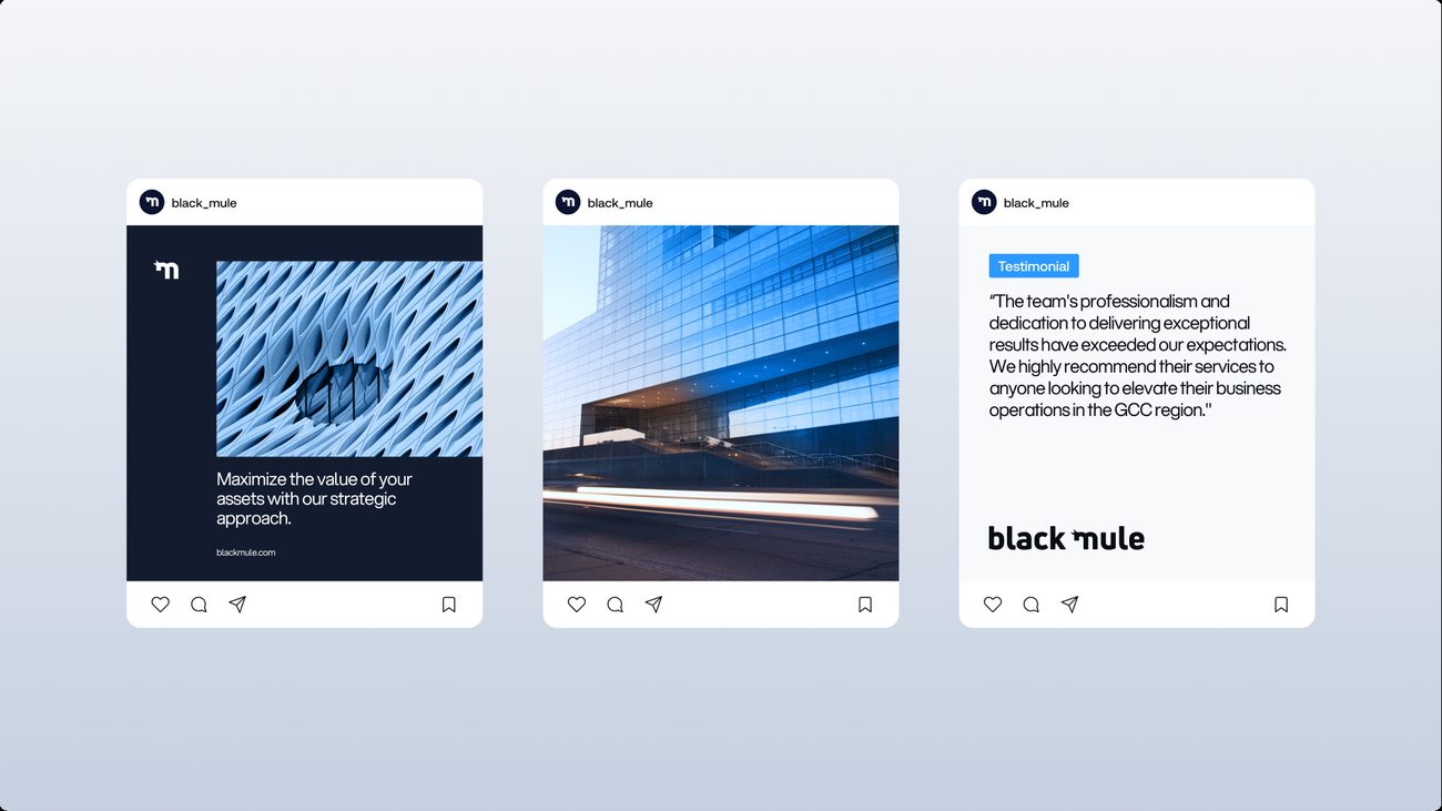
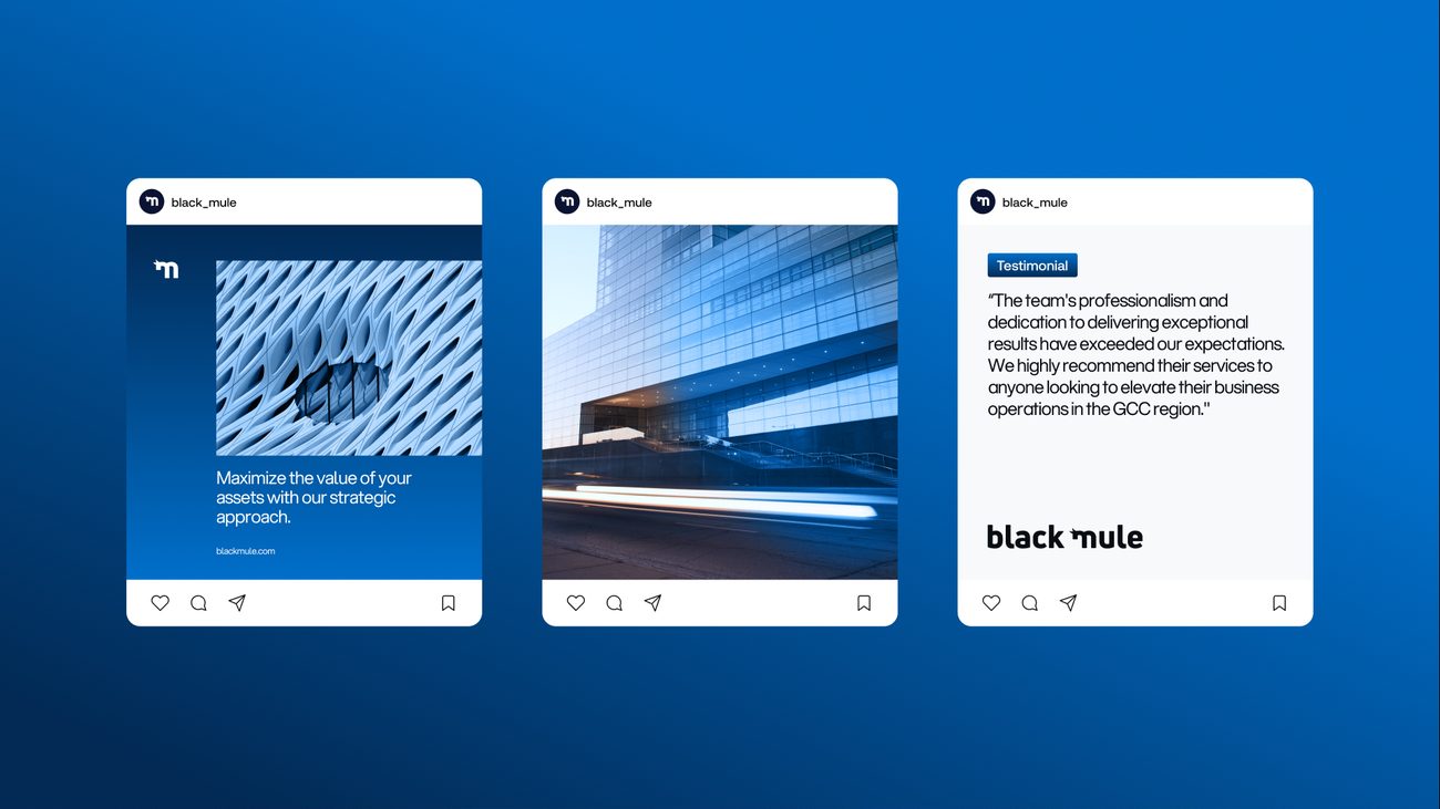
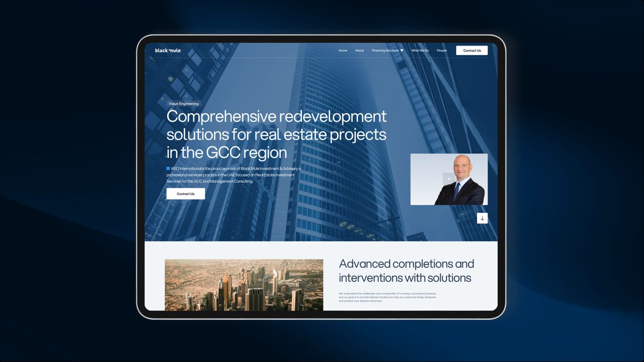
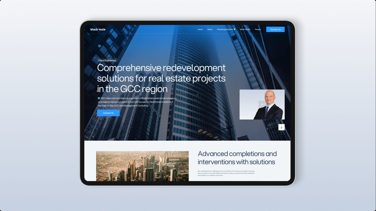
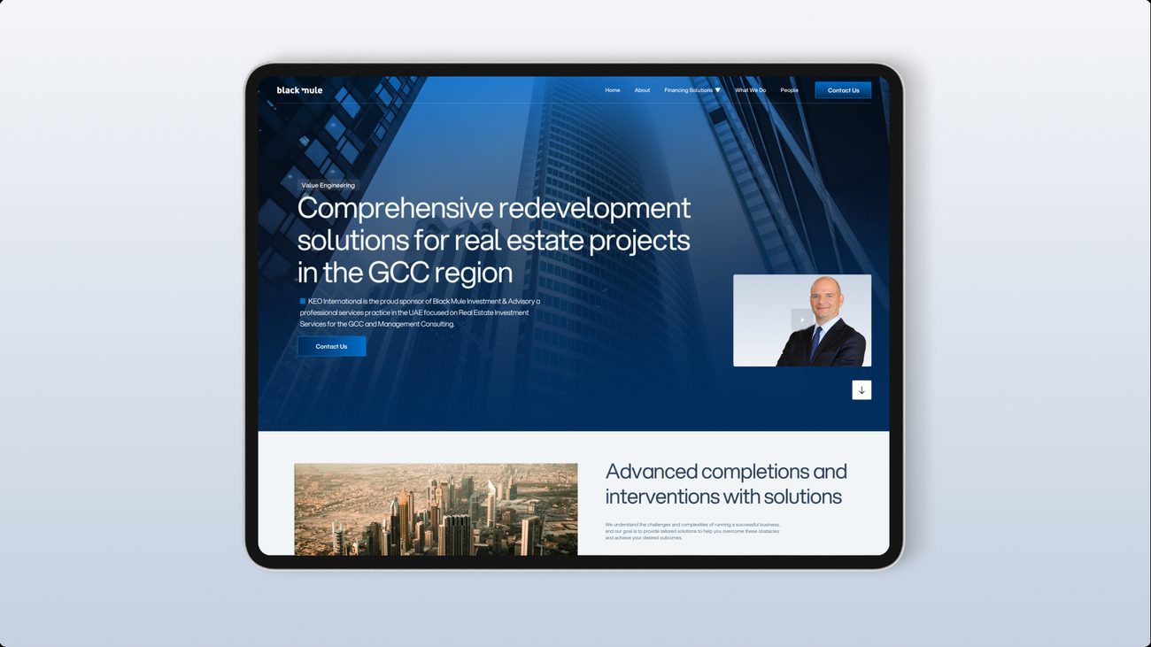
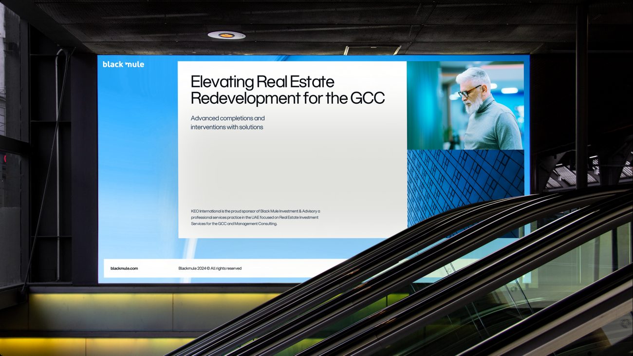
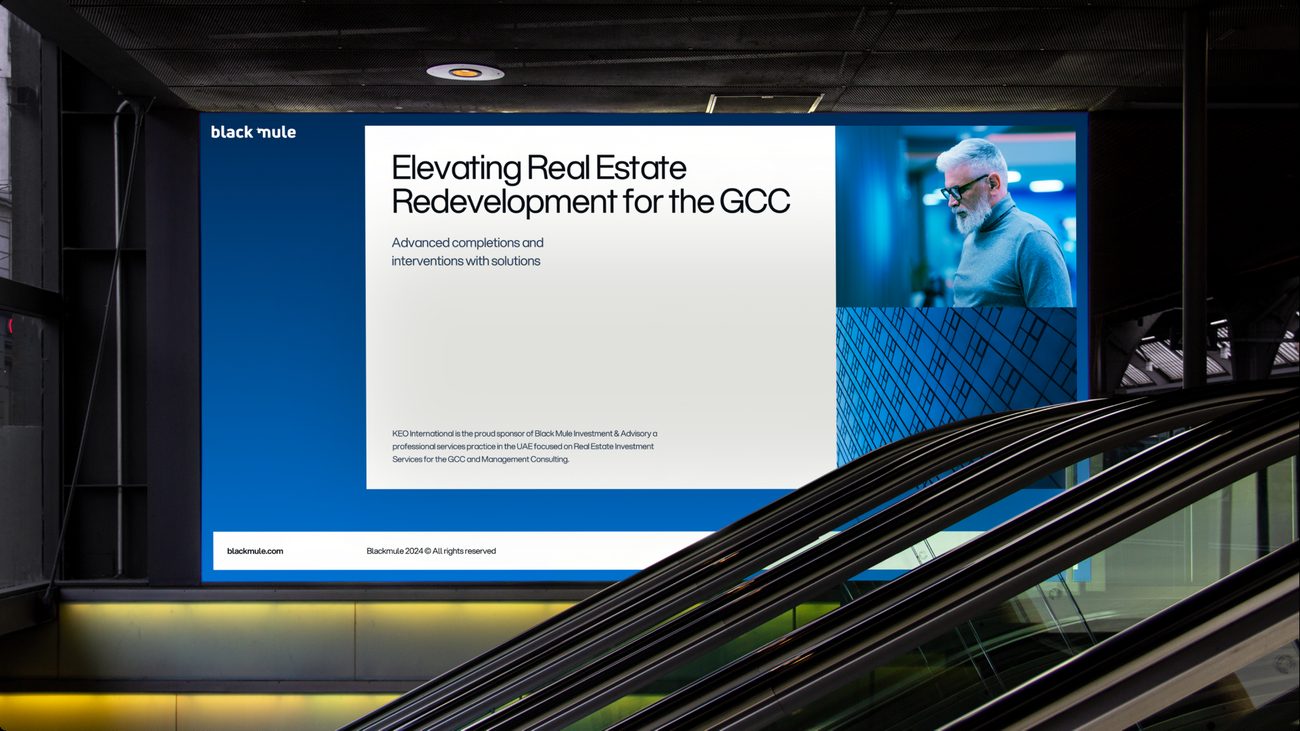
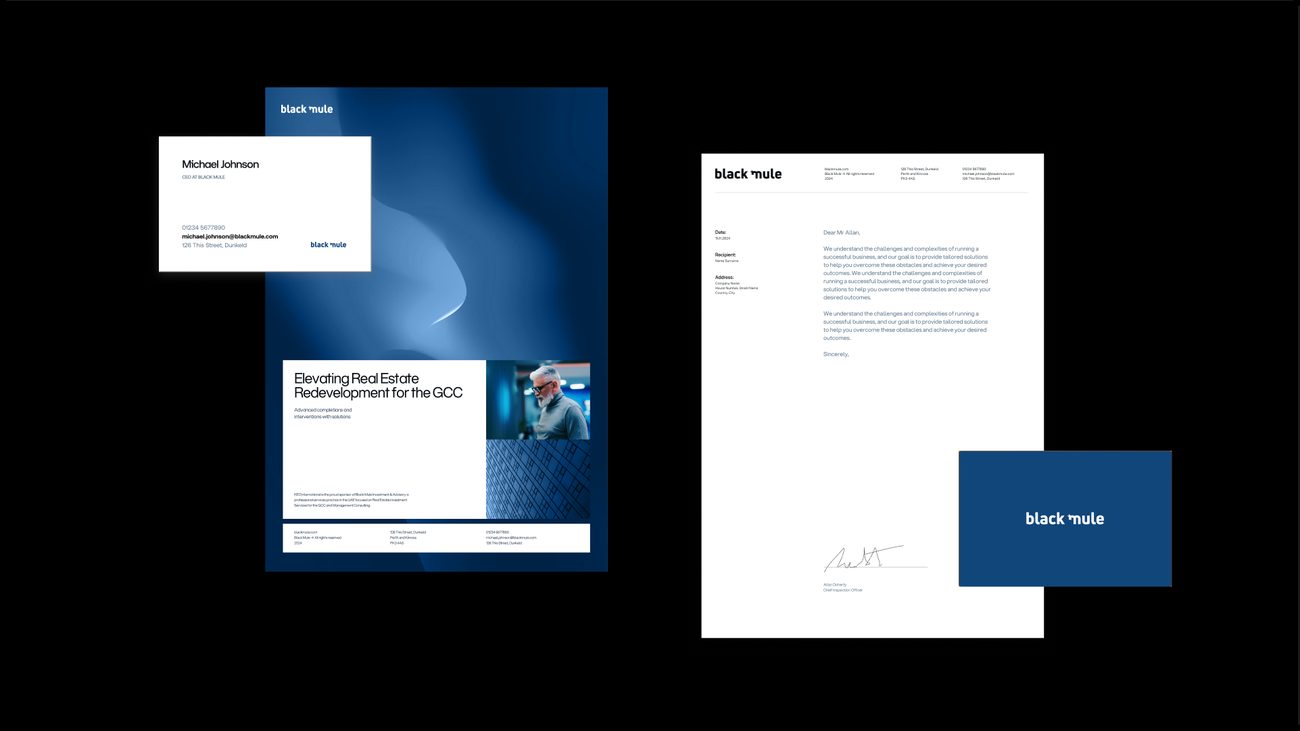
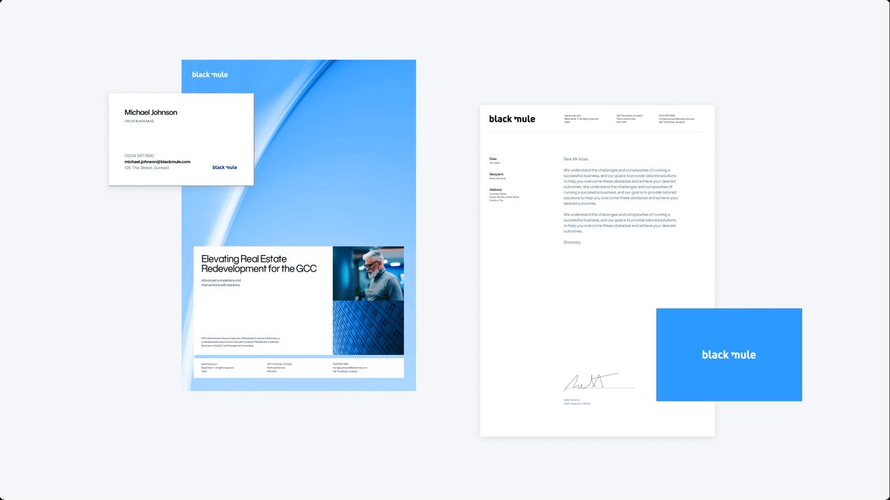
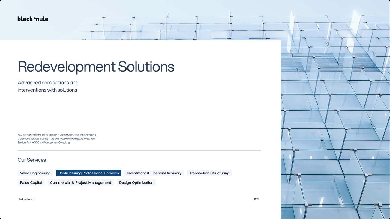
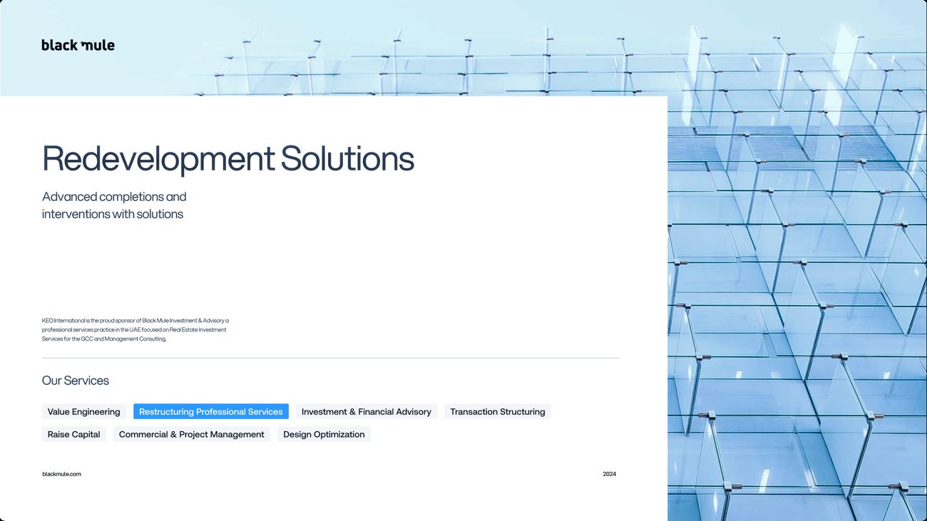
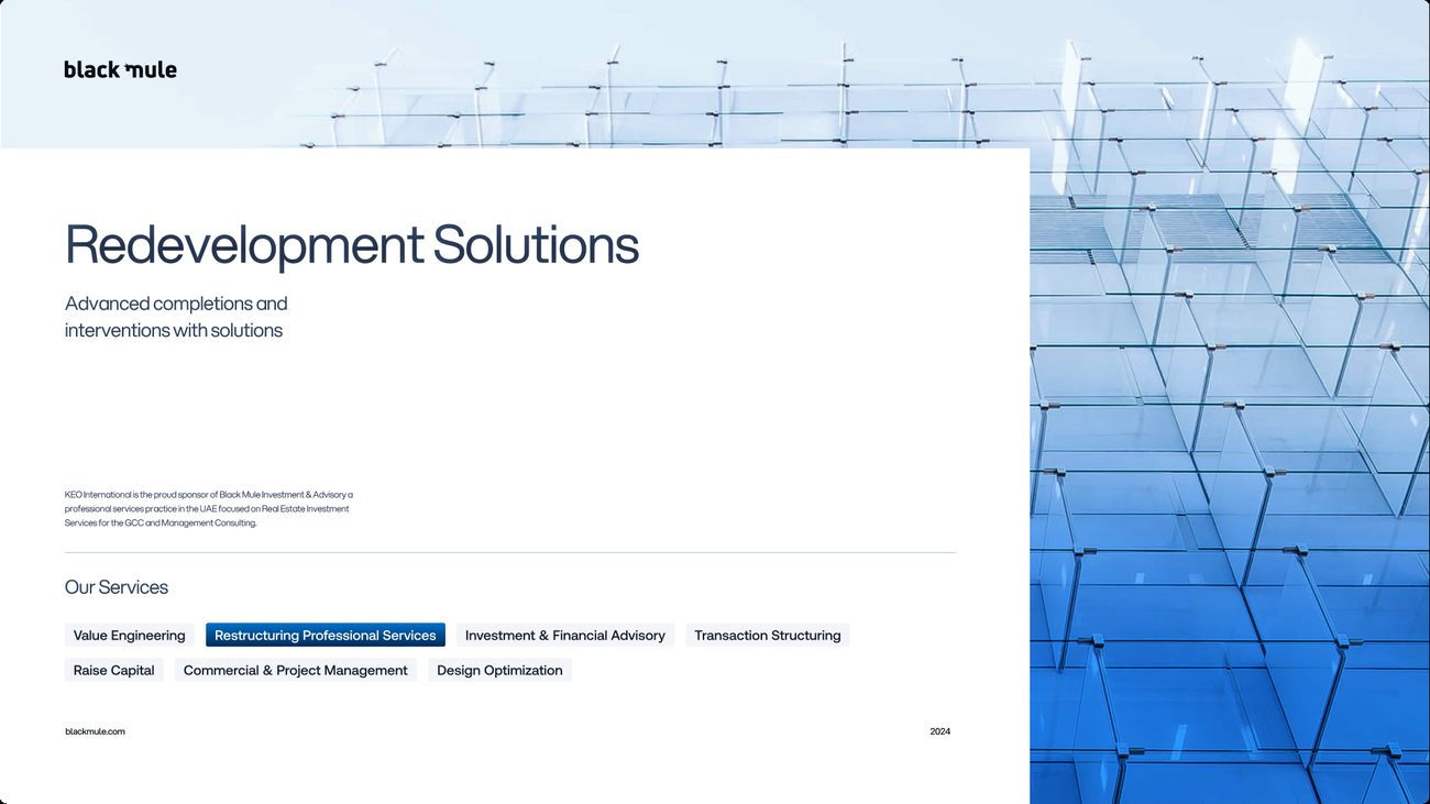
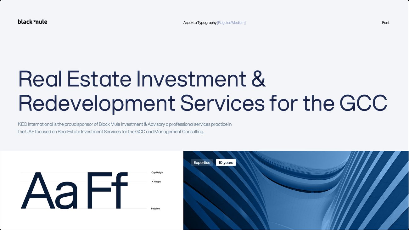
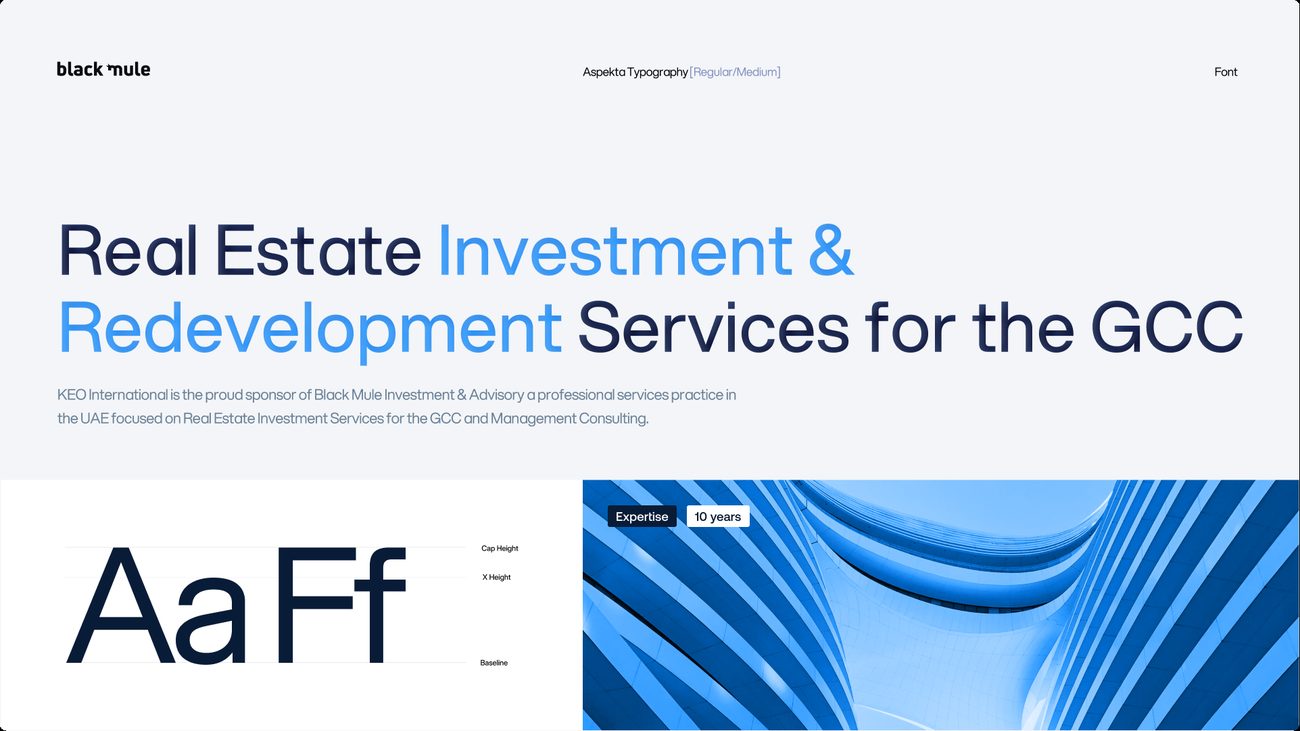
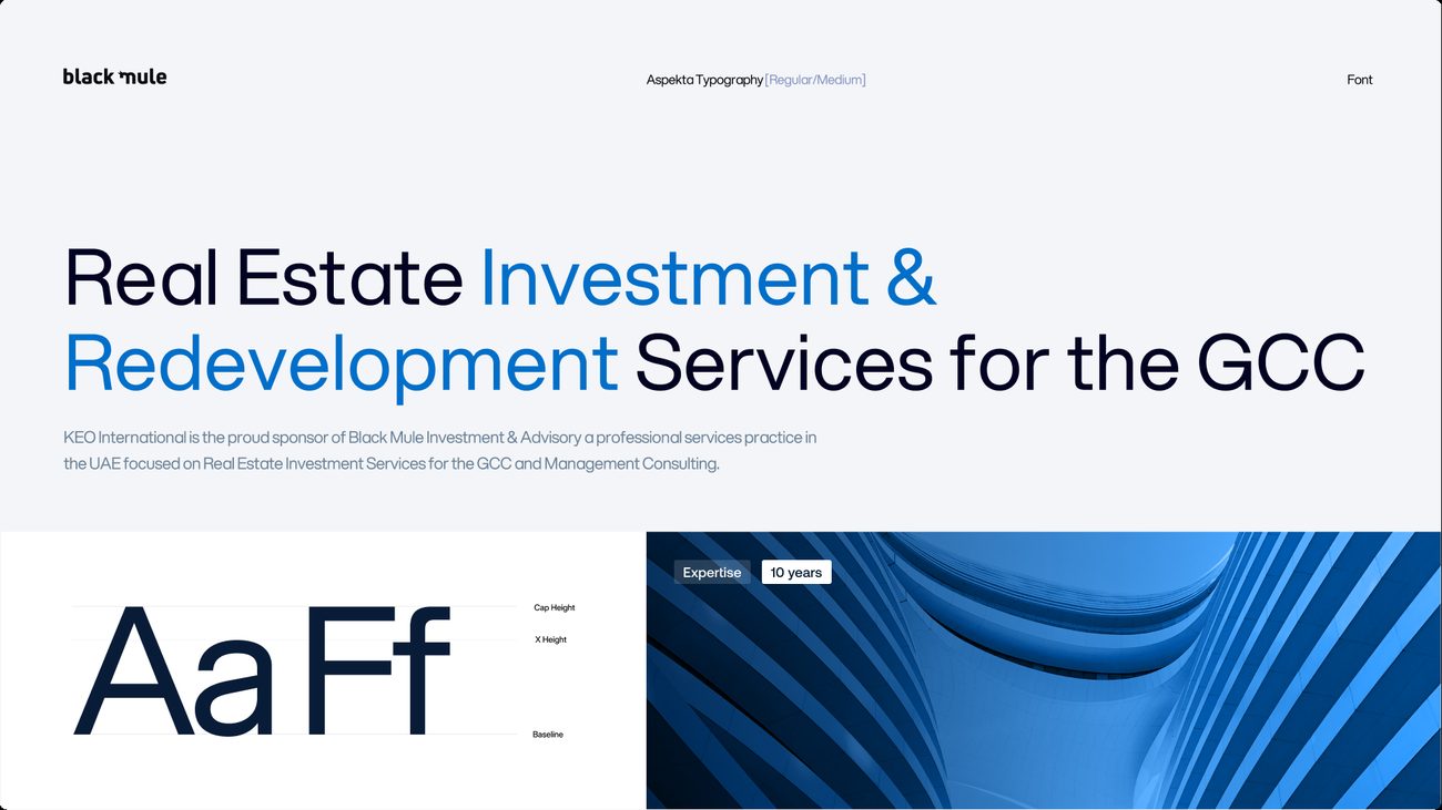
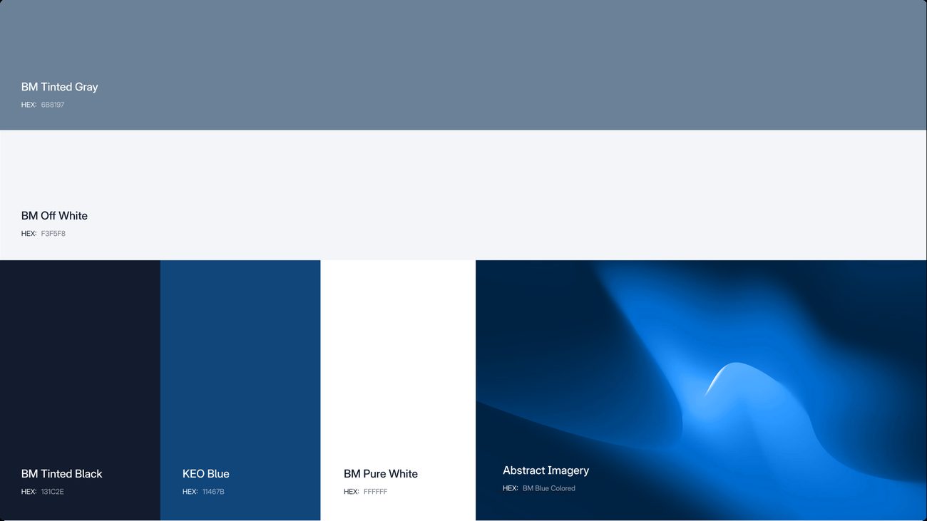
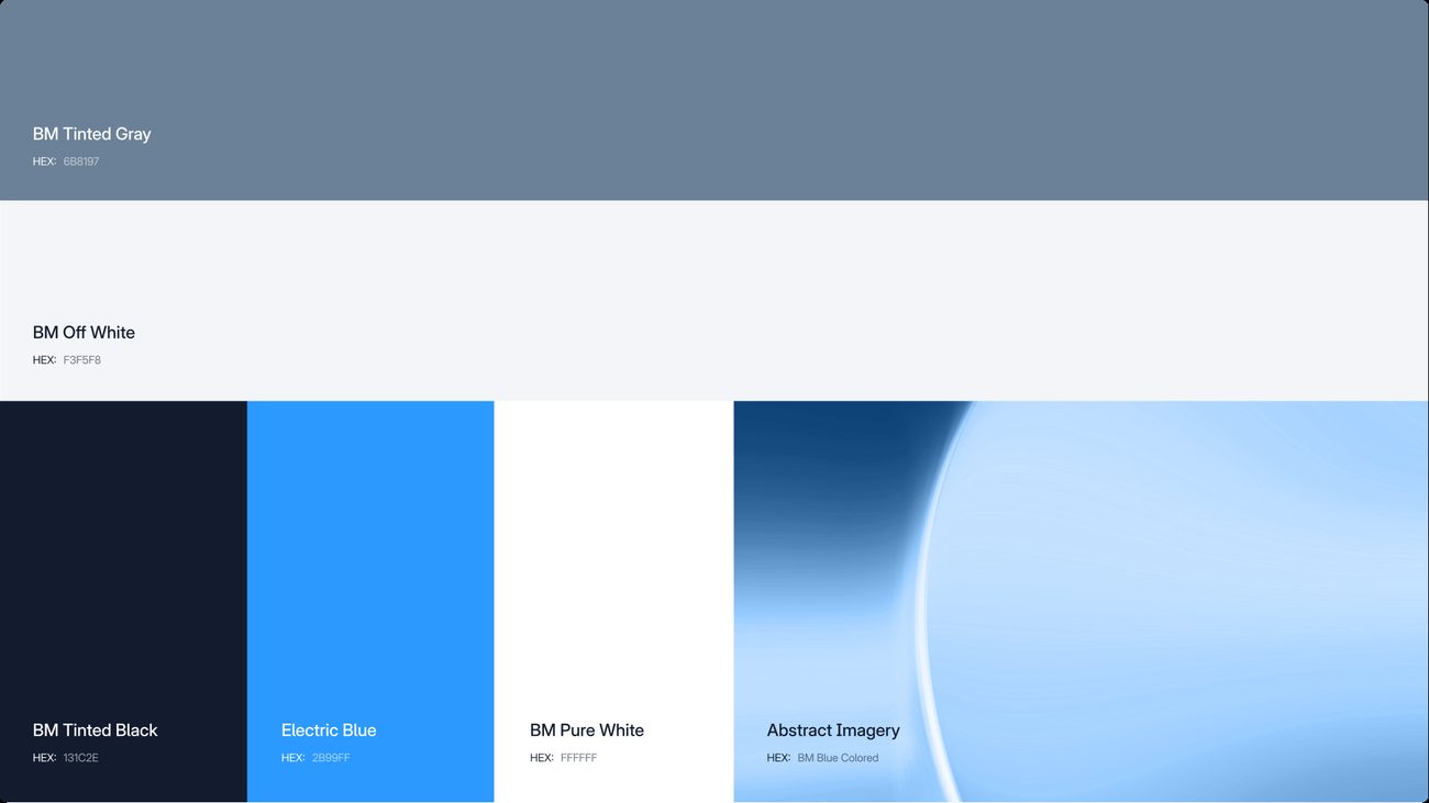
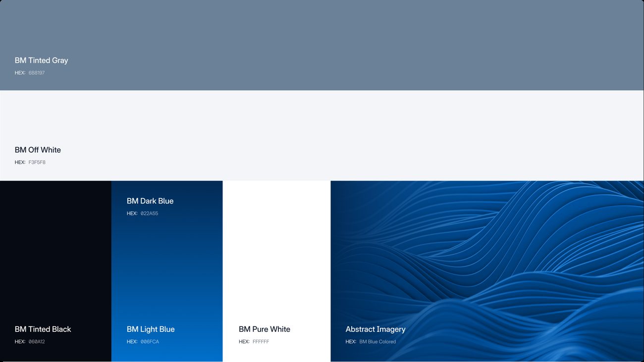
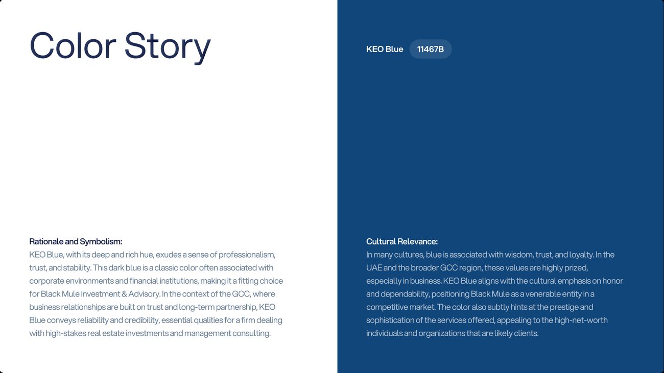
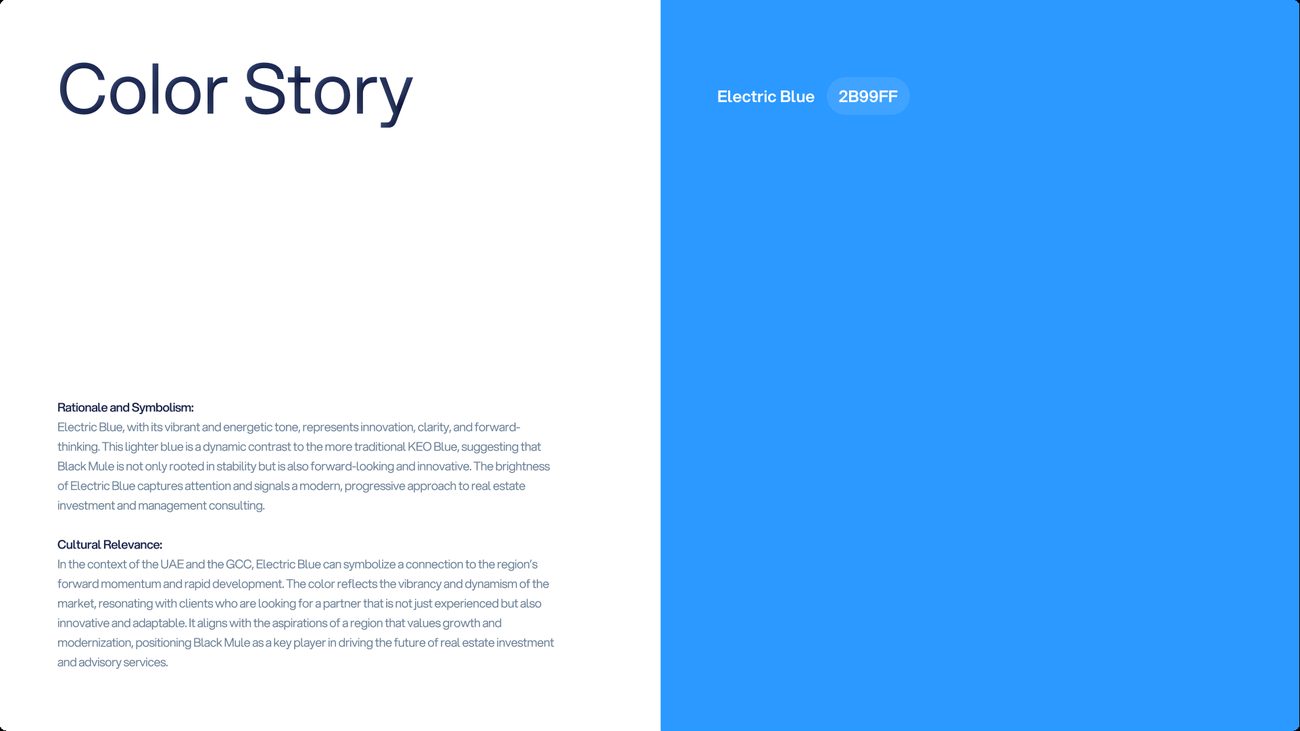
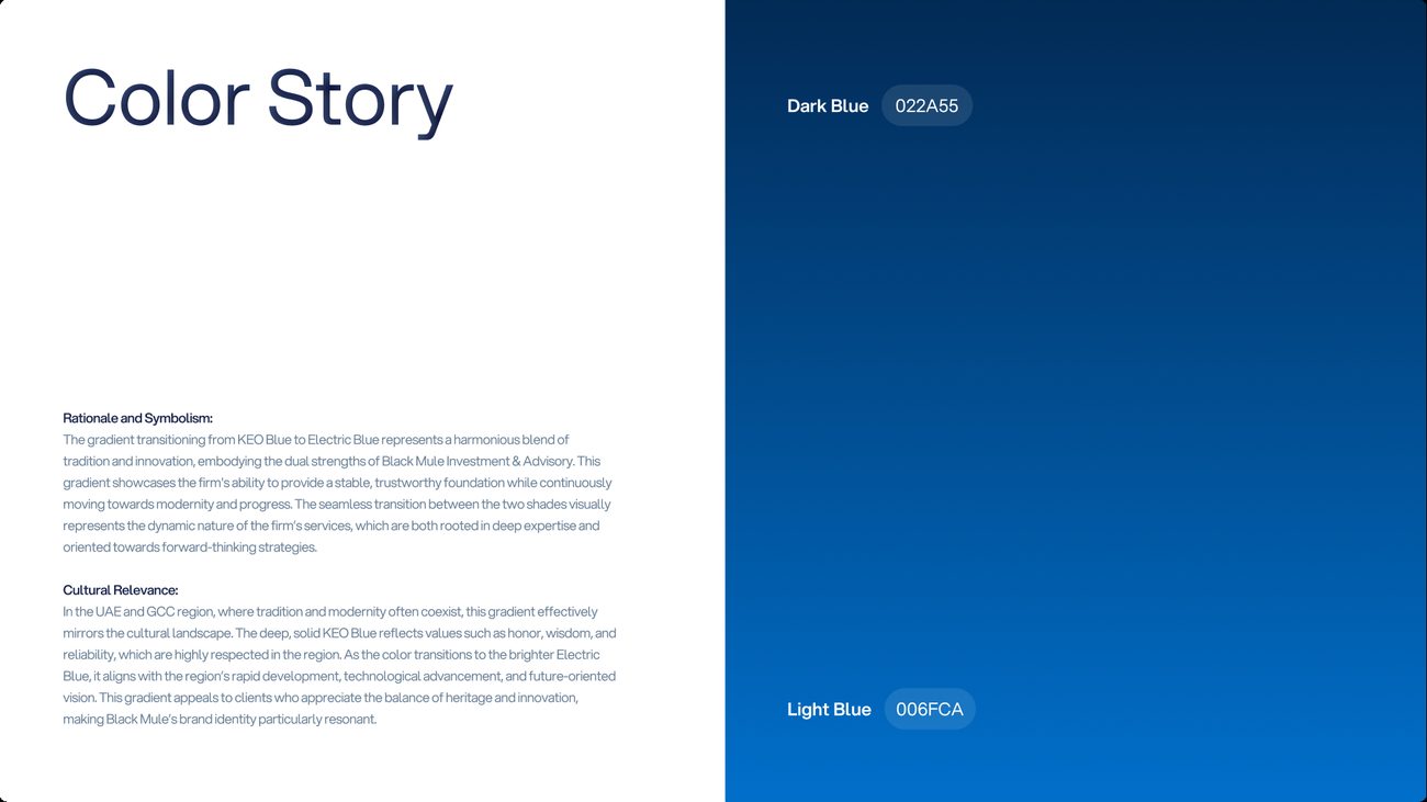
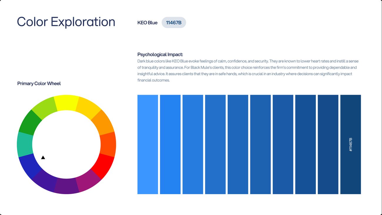
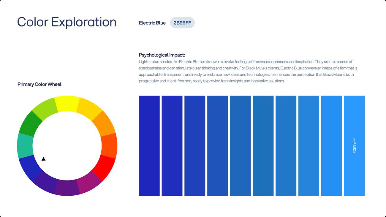
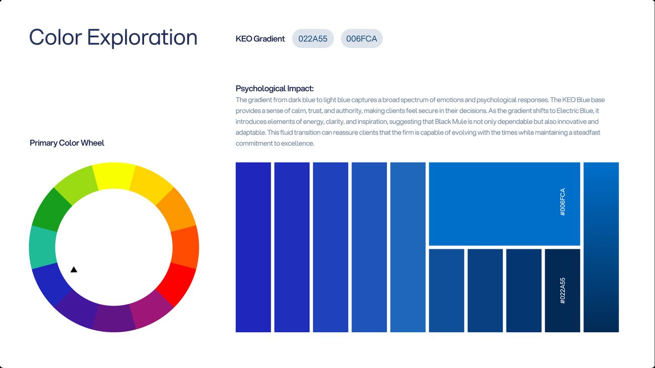
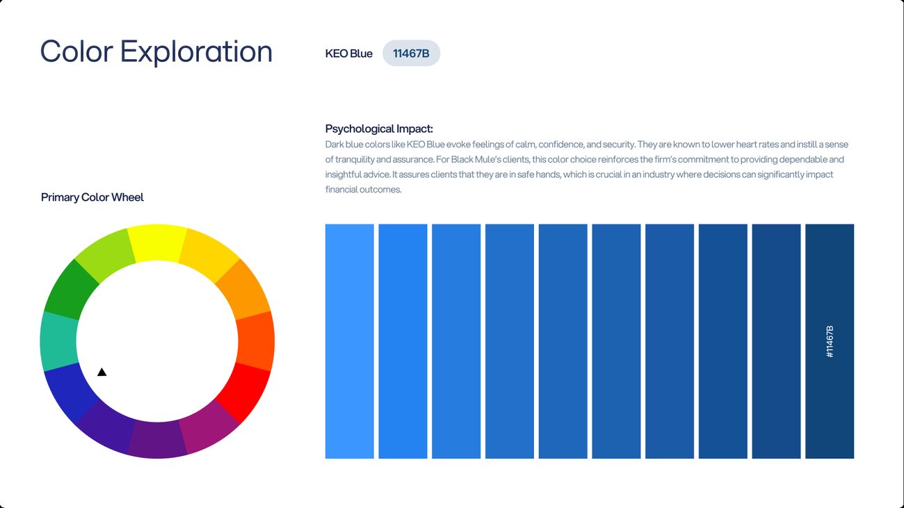
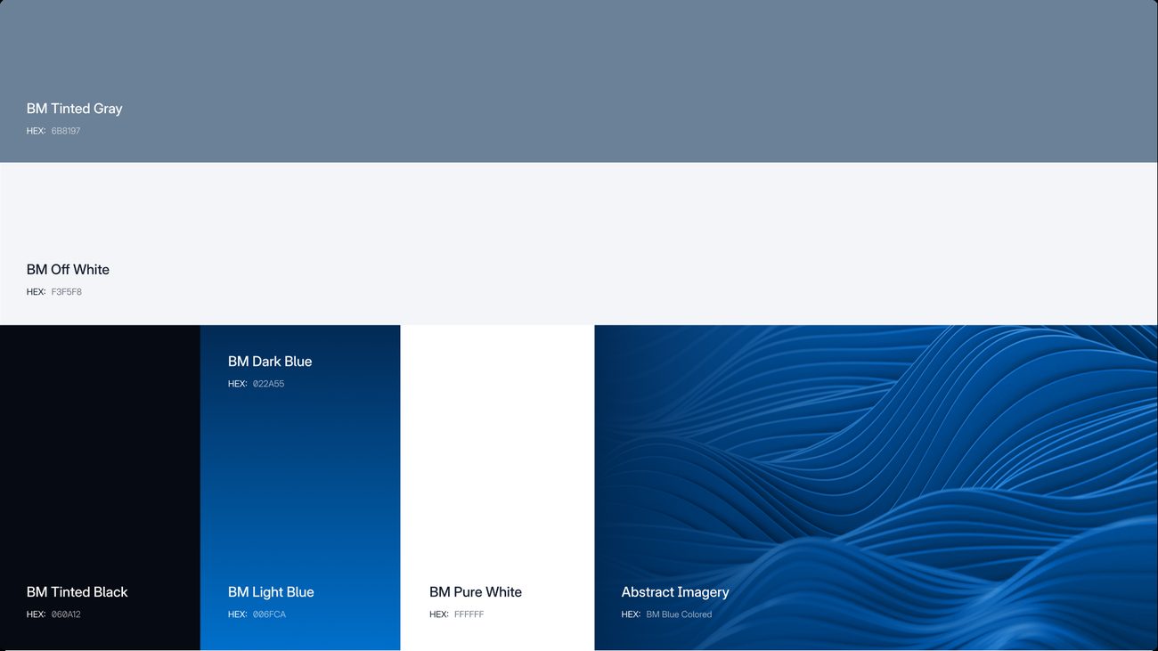
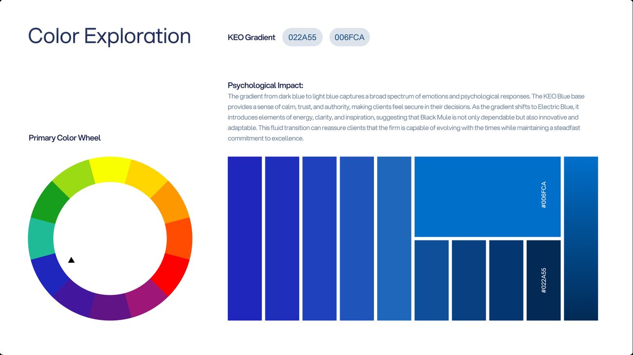
Concept 03’s layout system was set in three blues: KEO Blue, the parent company’s own; Electric Blue, a brighter step away from it; and a dark-to-light Blue Gradient between the two. Every board stayed identical, which left colour as the only thing being judged. Choose a blue and a surface to compare them.
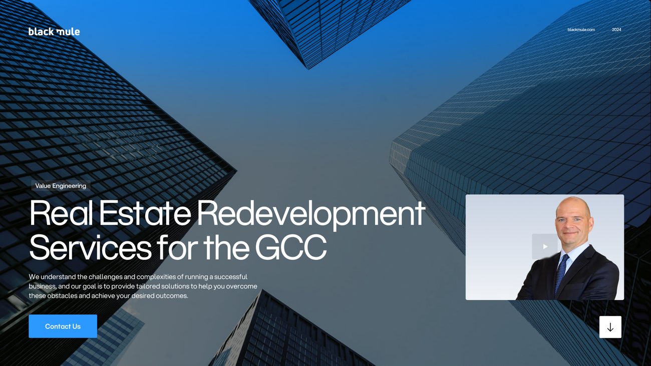
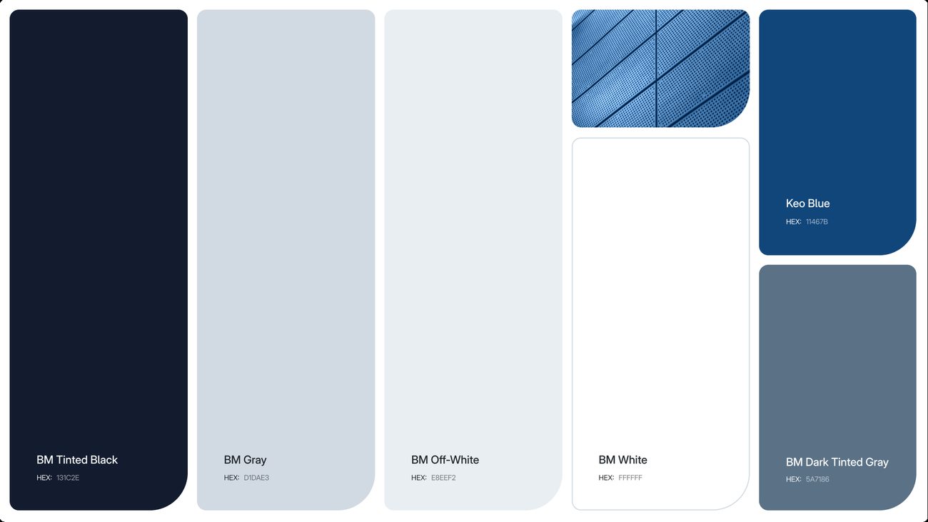
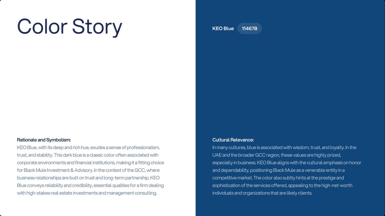
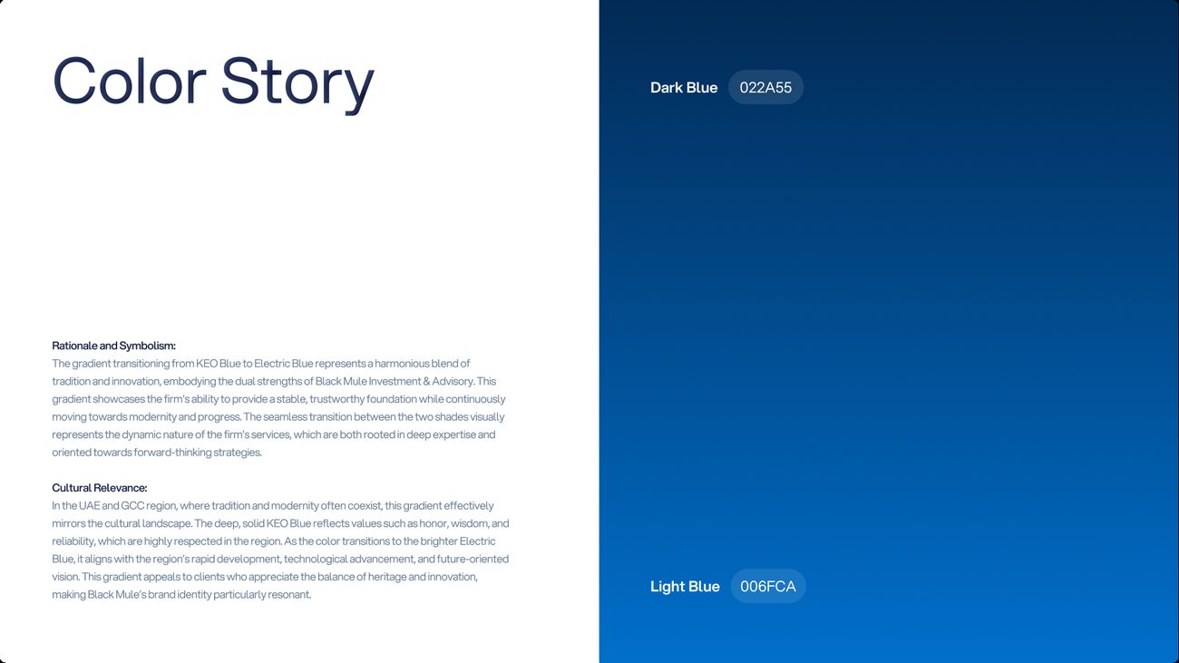
KEO Blue. The parent company’s own blue. Deep and settled, it signals trust and stability, the qualities a GCC investor weighs before committing to a long partnership, and it ties Black Mule visibly to KEO.
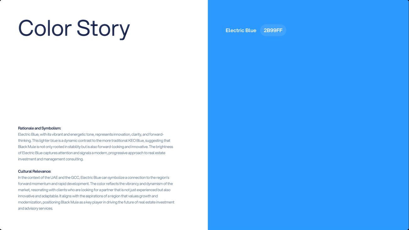
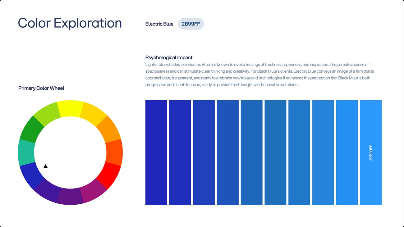
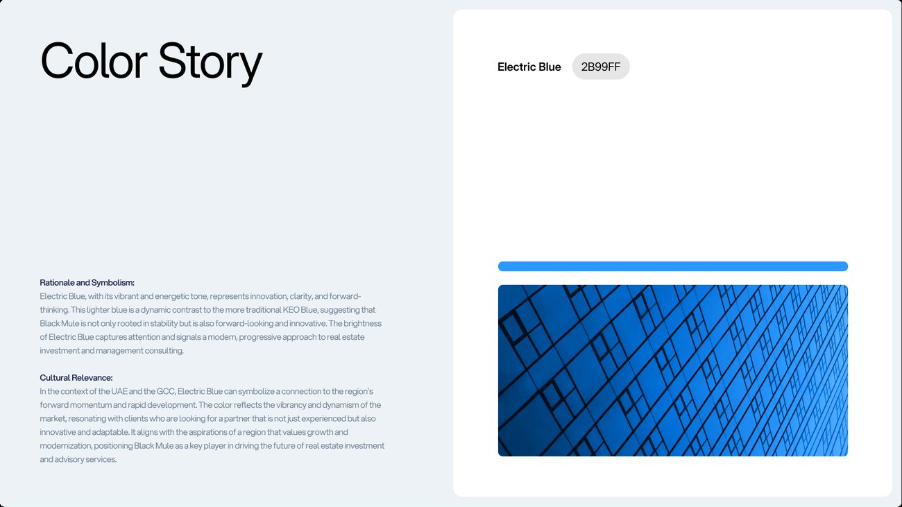
Electric Blue. A brighter step away from KEO Blue. It carries energy and clarity, and was put forward as the colour of a firm moving at the pace of the region’s development, with the parent’s credibility still behind it.
Blue Gradient. KEO Blue running into a lighter blue, built to hold both ideas at once: the parent’s weight at the base and the brighter blue’s momentum at the top.
From the colour rationale presented with each board, 2024.See all thirty boards side by sideHide the side-by-side
What went forwardBlue as the family. All three original routes came back in it for Round 03.
The blue, carried back across the original routes.
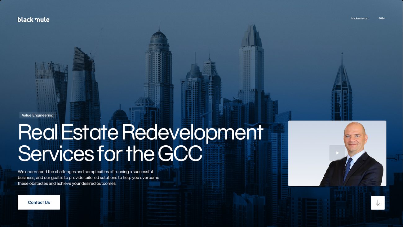
All three routes came back in the new colour family: the mule monogram in Electric Blue, the continuous-line monogram in KEO Blue, and the gradient system in the Blue Gradient, with only its website reworked. The three original ideas could then be read side by side again, in the colour the brand would keep. Drag across each board to see the concept before and after.
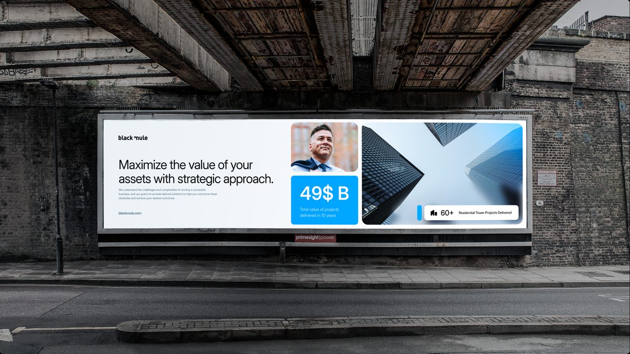
The mule monogram, in Electric Blue.
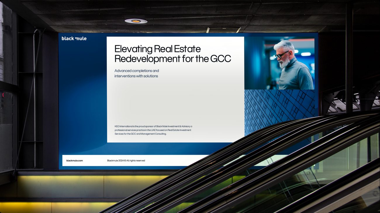
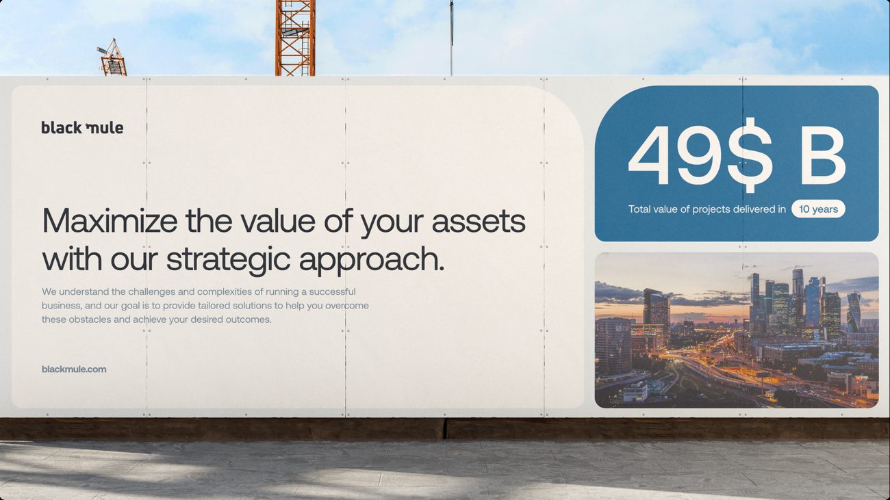
Concept 01 rebuilt in the blue family. The mule monogram and Inter Display stay; lime gives way to Electric Blue on every board, from the underpass billboard to the business card.
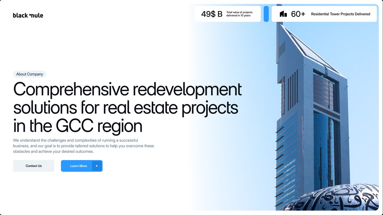
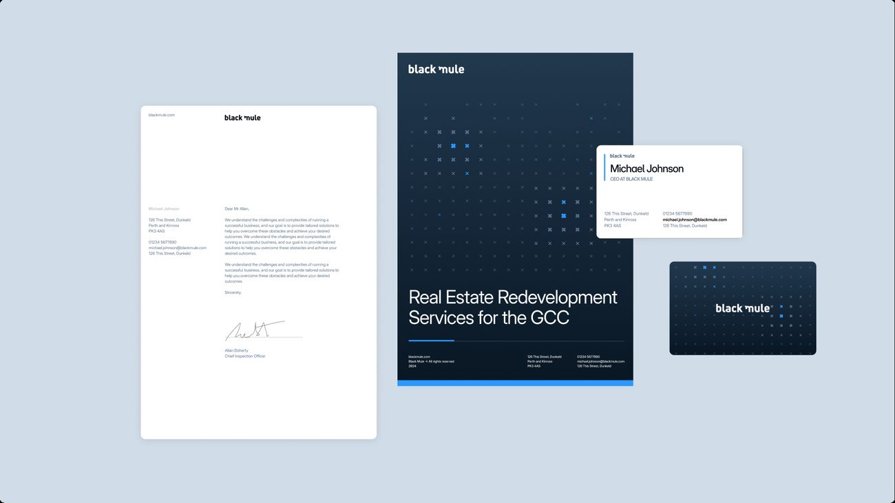
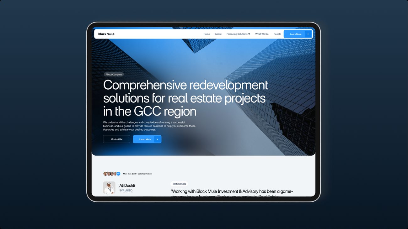
The continuous-line monogram, in KEO Blue.
Concept 02 rebuilt in KEO Blue. The continuous-line monogram and Aeonik stay, and the orange is replaced by the parent company’s blue, which moves the route from warm and bold to settled and corporate.
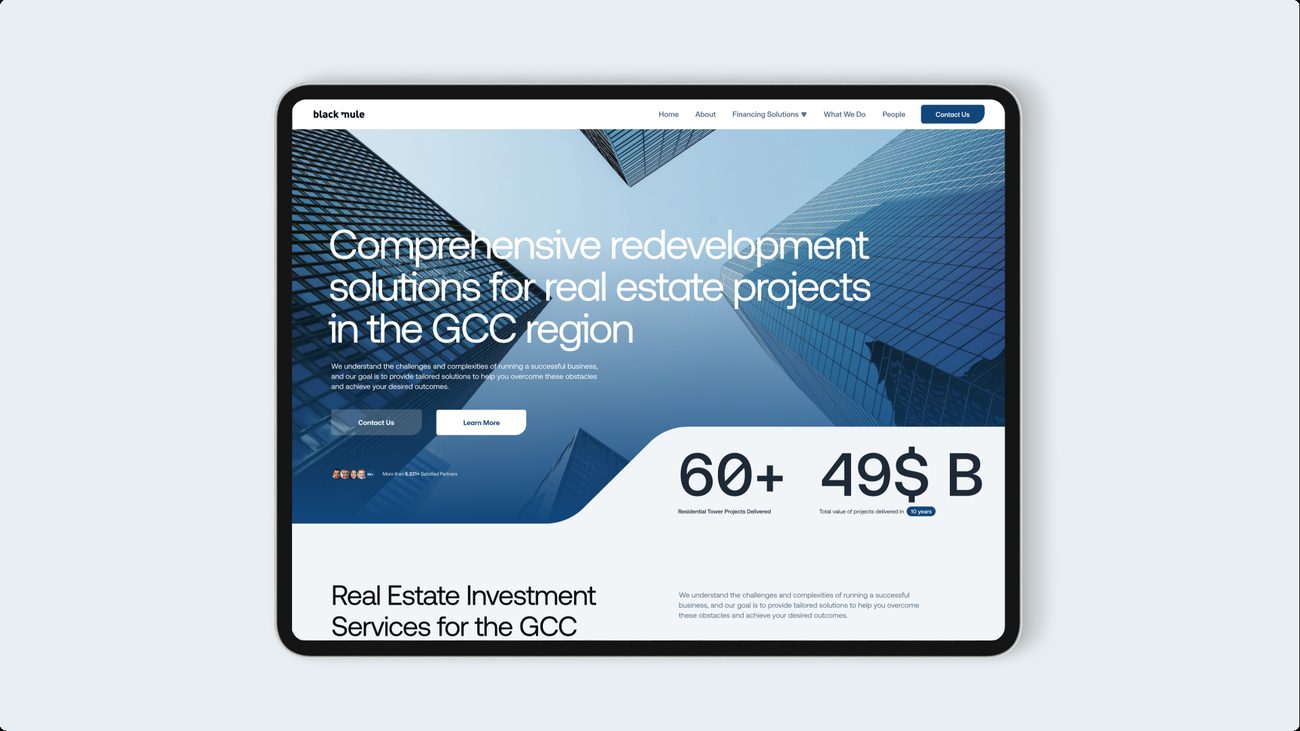
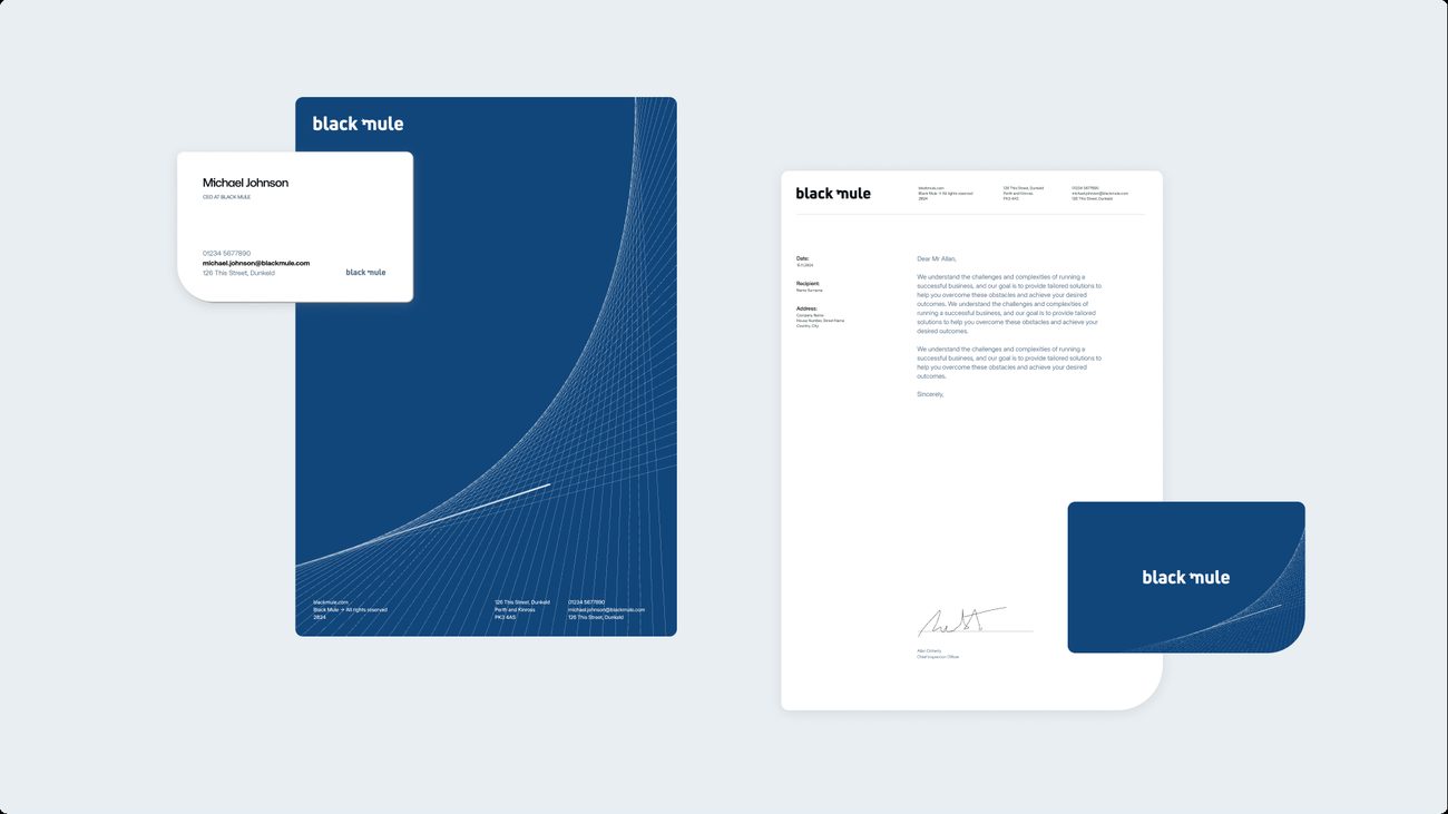
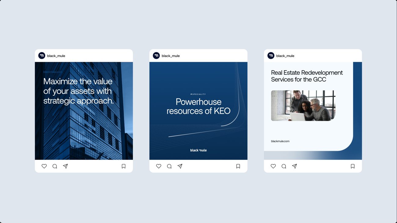
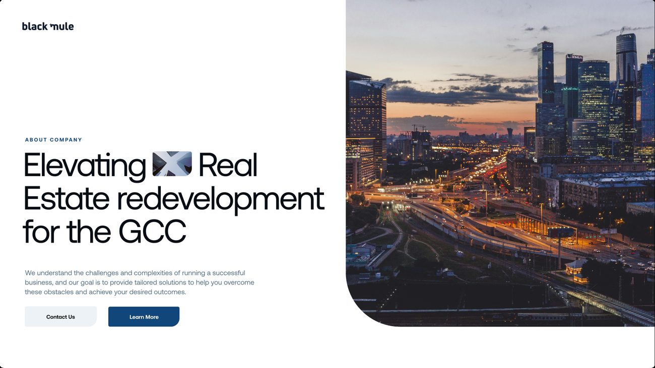


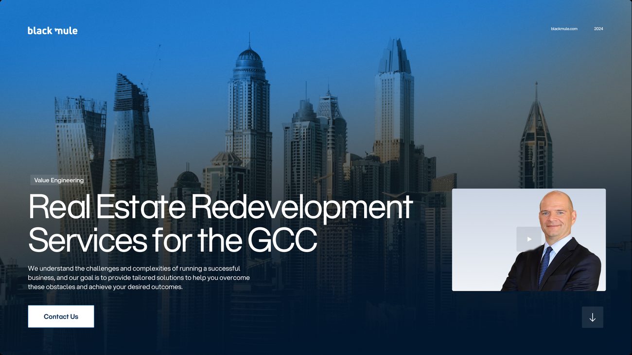
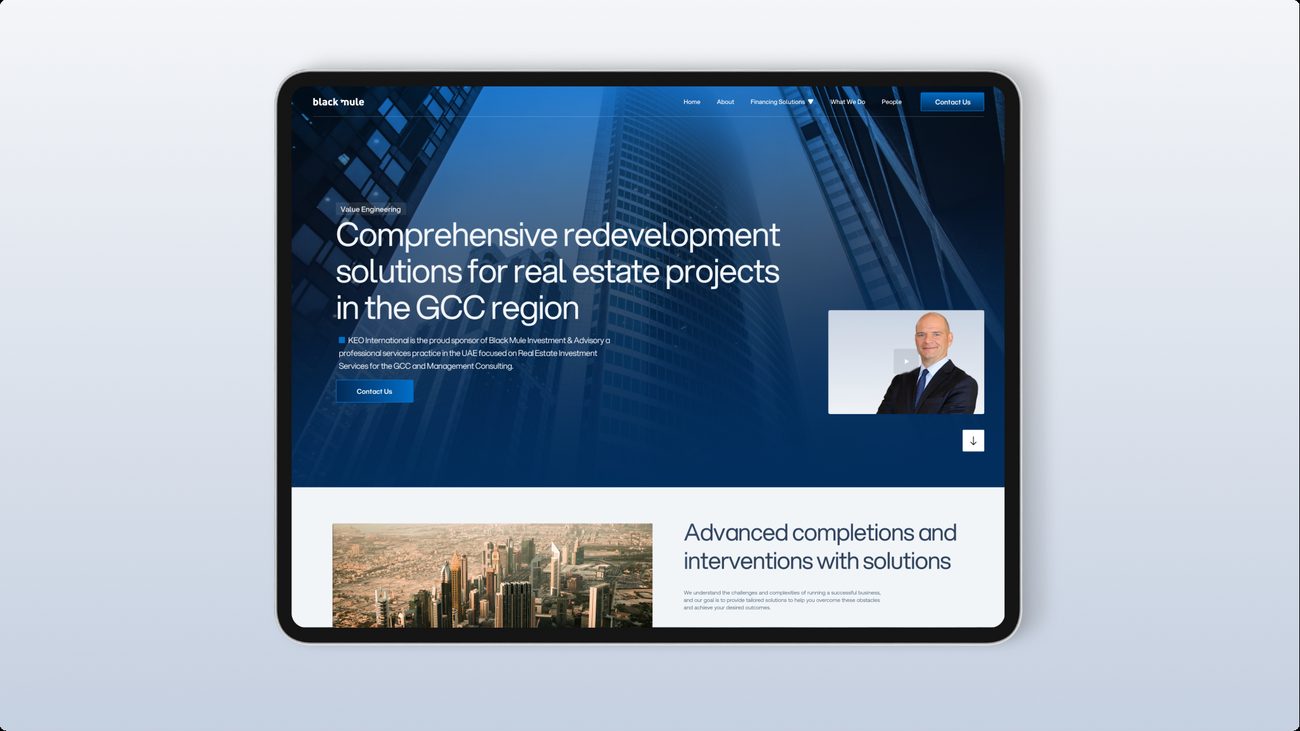
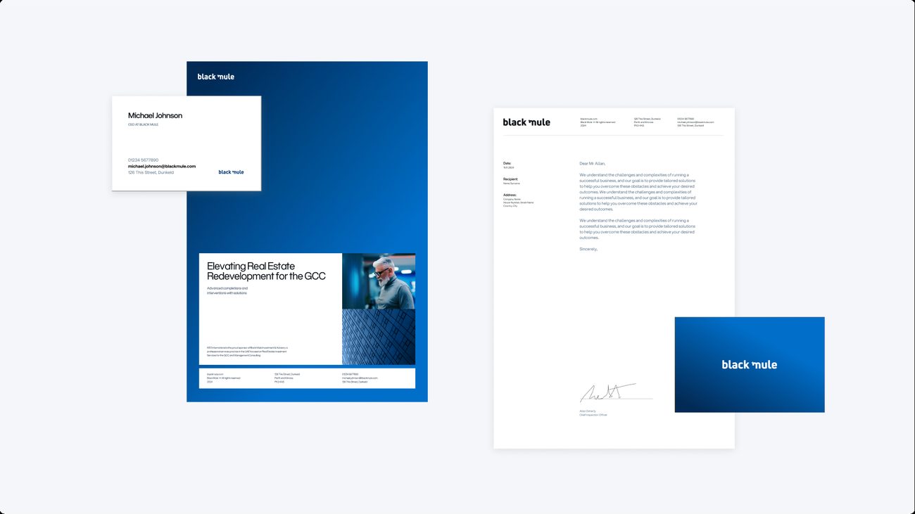
The gradient system, in the Blue Gradient.
The gradient system carried forward from Round 02 in the Blue Gradient, with the website hero reworked around a darker skyline. Every other board holds as it stood.
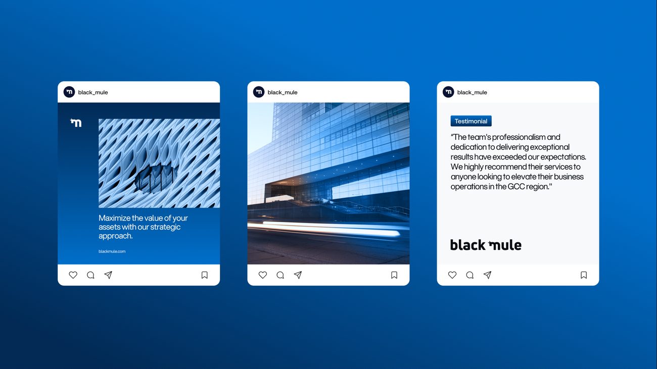
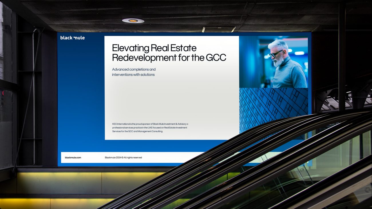
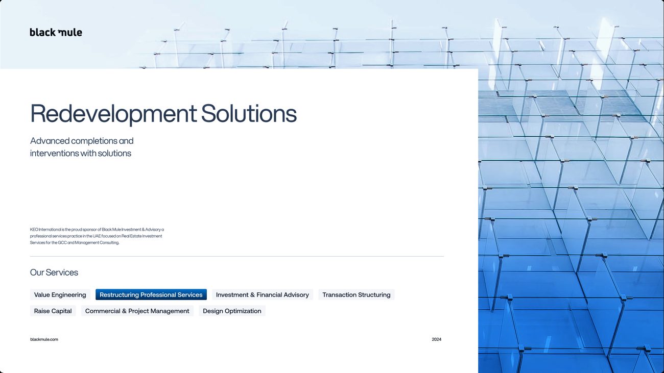
What went forwardThe mule monogram and Inter Display from the first route, Electric Blue from the second round, set on black.
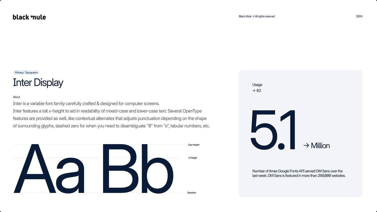
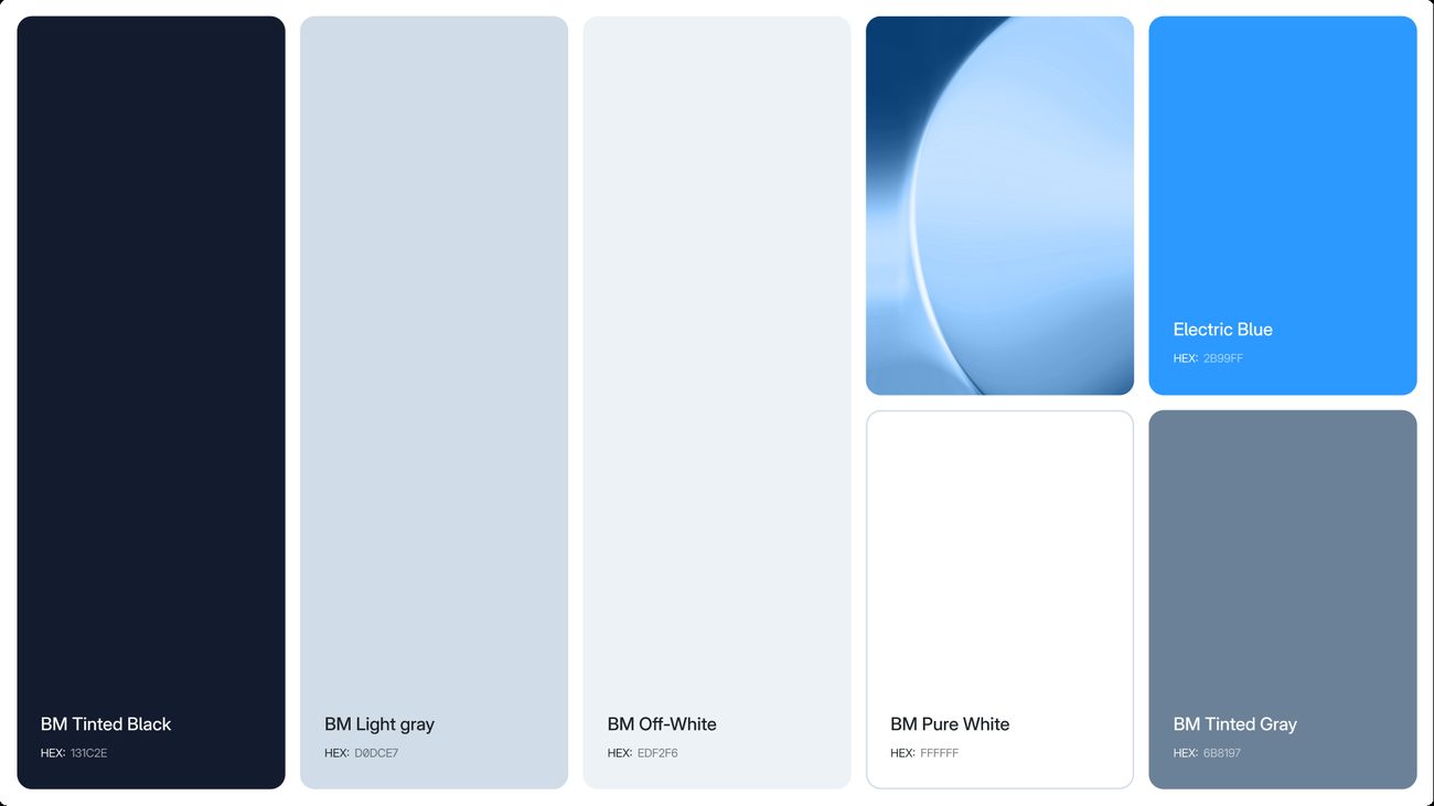
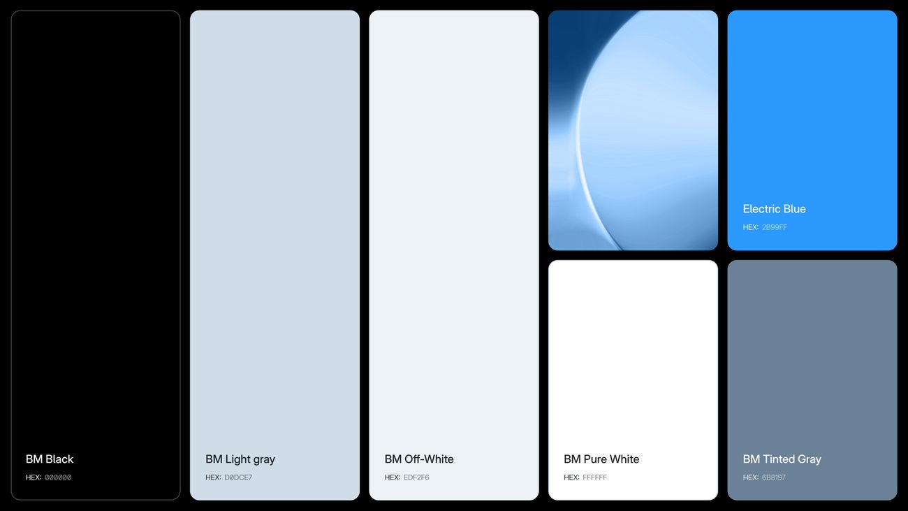
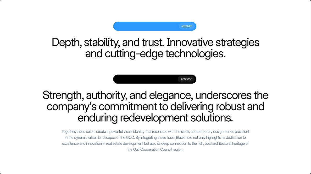
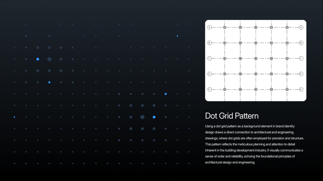
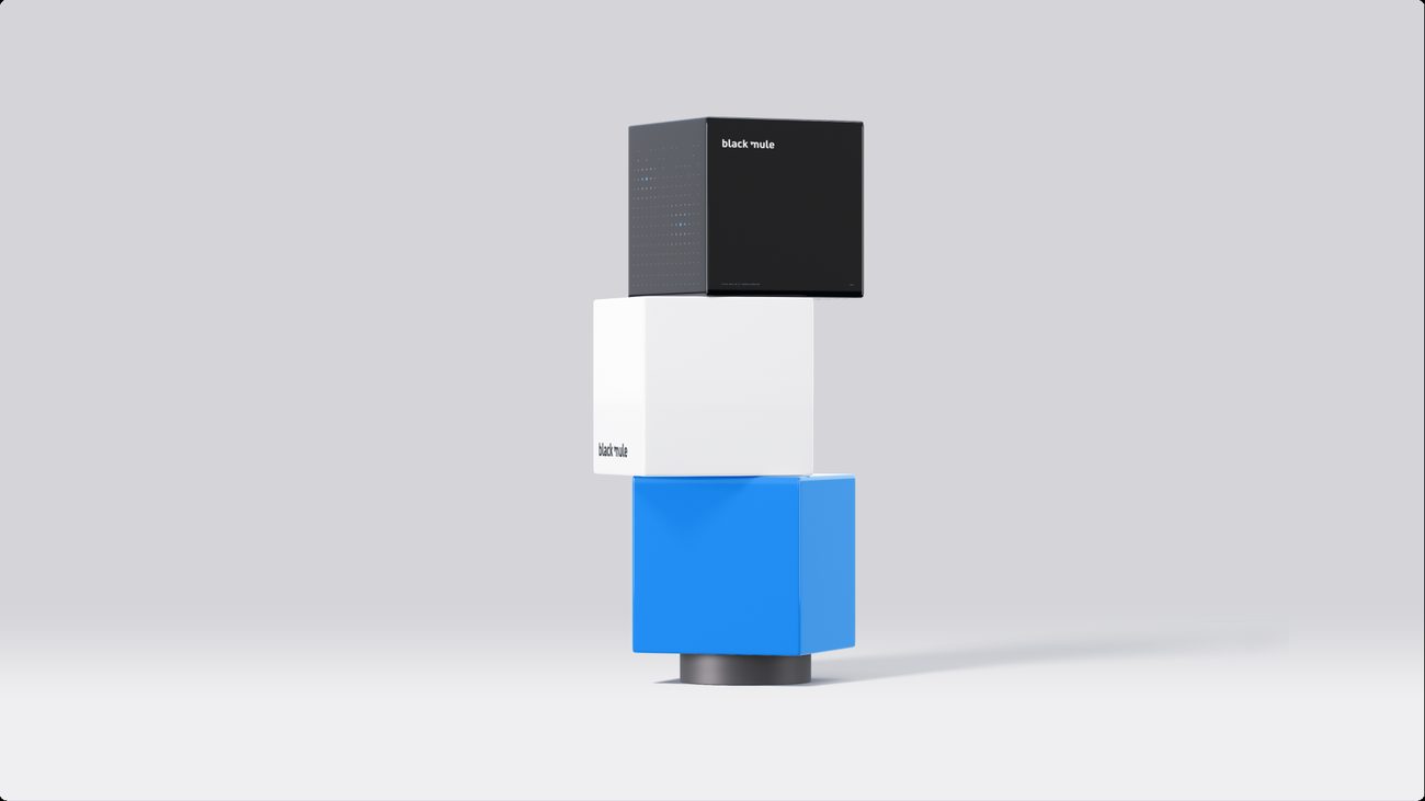
The selected system took the mule monogram and Inter Display from the first concept and set them on black, with Electric Blue as the accent. Black brings strength and authority, Electric Blue brings energy, and a dot grid borrowed from architectural and engineering drawings runs through web, print and outdoor, a direct line to a business that rebuilds stalled projects.
The Selected System
The mule monogram on black, with Electric Blue as the accent.
Four pieces, annotated.
The decisions behind the system, marked on the work. Hover or tap a number to find its note.
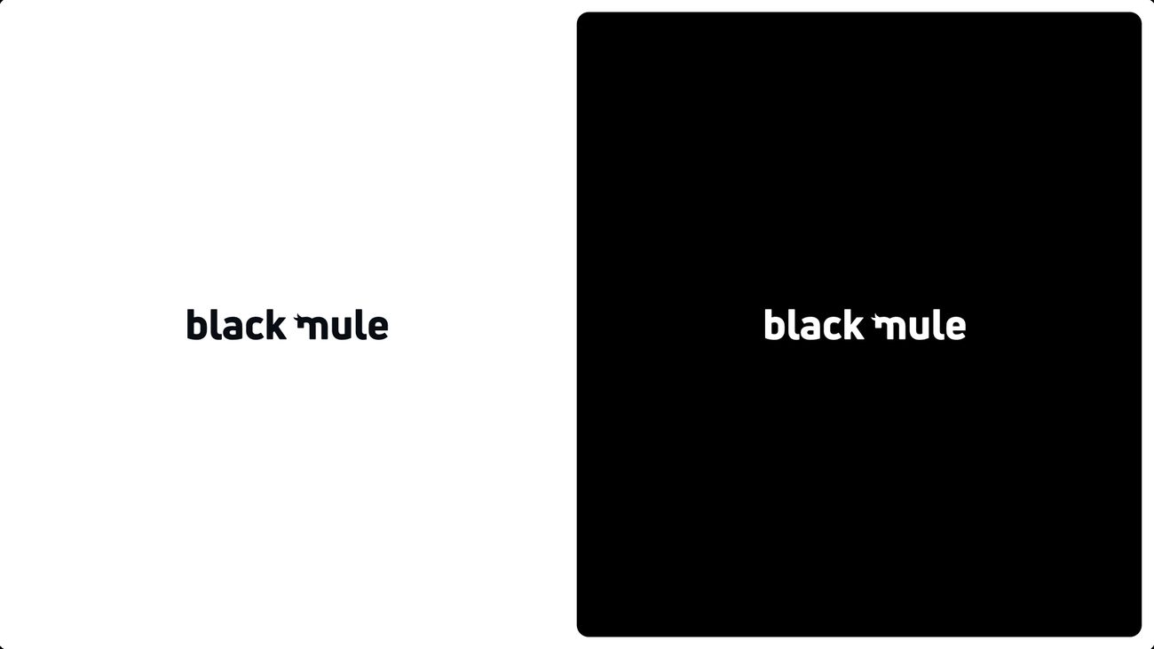
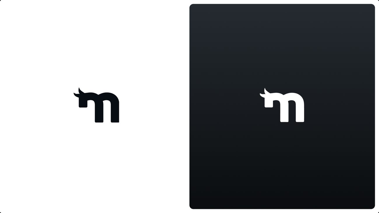
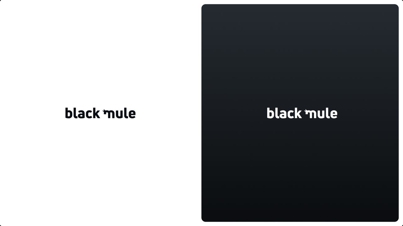
The wordmark, on light and on black.
- 01
The m of mule carries the mule’s ear, the one drawn detail in an otherwise plain lowercase wordmark.
- 02
Black became the brand’s ground in the selected system, so the wordmark lives reversed across web, print and outdoor.
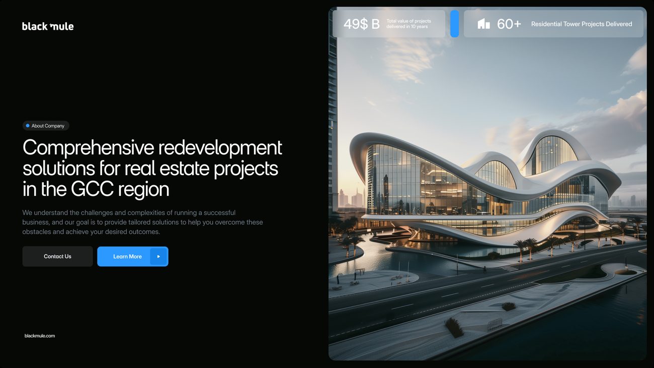
The opening screen.
- 01
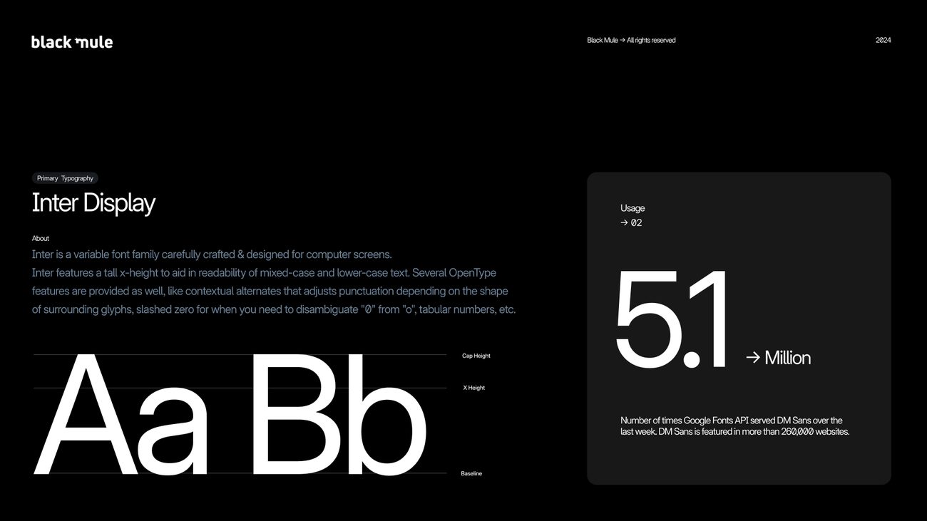
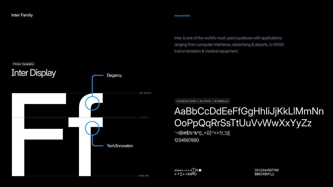
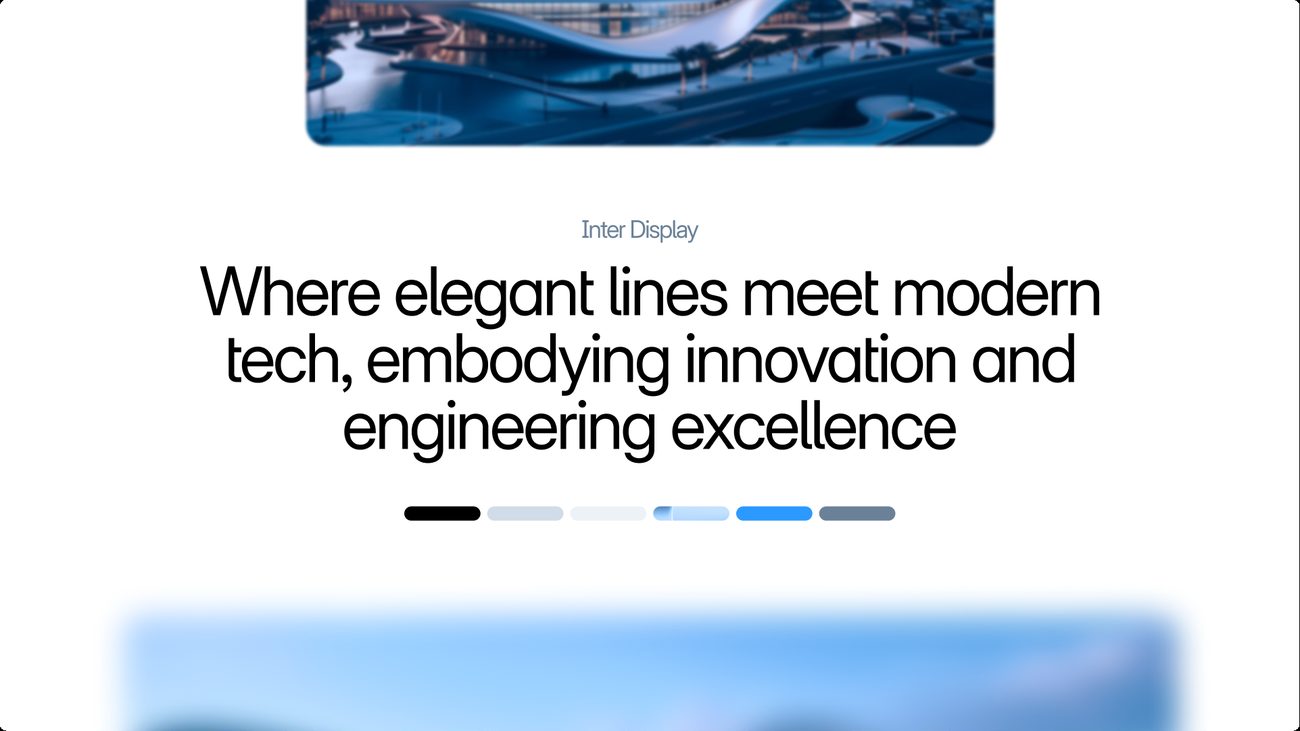
Inter Display carries the headlines, set large and plain.
- 02
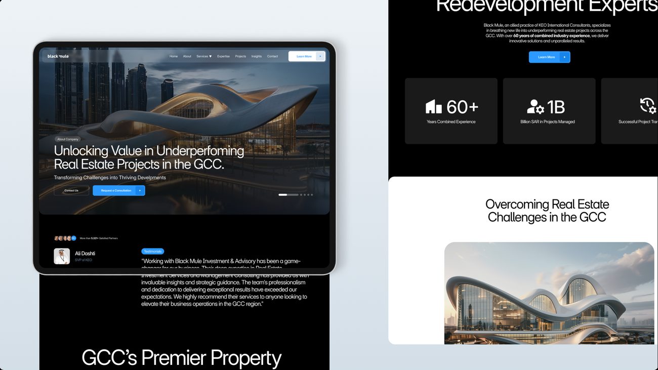
Electric Blue is held back for actions and emphasis. Almost everything else is black, white and grey.
- 03
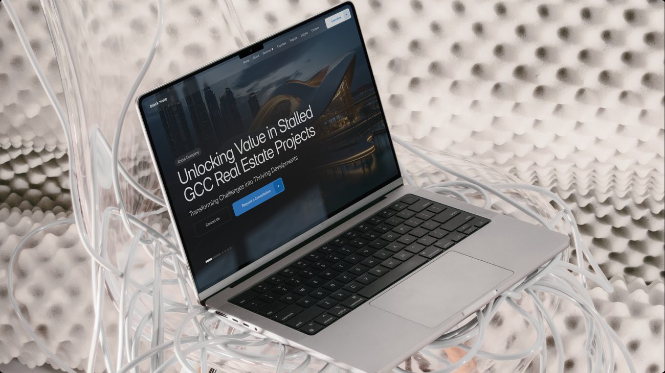
Proof first. Portfolio figures sit in the opening screen, answering the audit’s finding that Black Mule showed no outcomes.
- 04
Sculptural, finished architecture as the image language: the end state of a redevelopment.
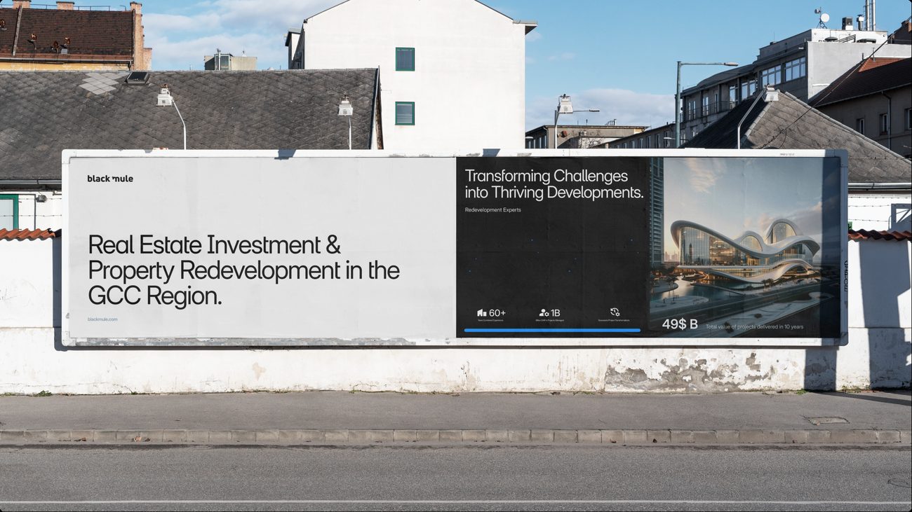
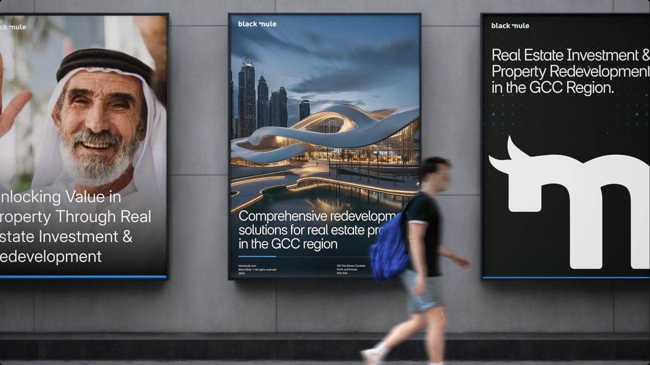
The street billboard.
- 01
The positioning in one line: real estate investment and property redevelopment, in the GCC.
- 02
Redevelopment Experts signs the piece, the line the strategy was built to earn.
- 03
Scale figures travel with the brand, from the website onto outdoor.
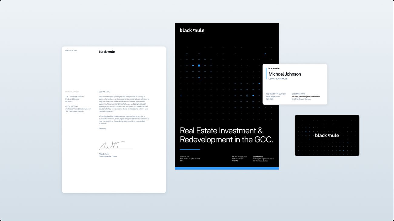
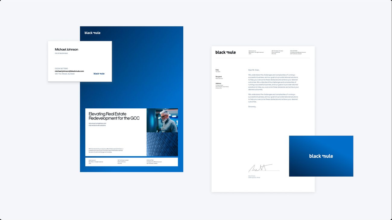
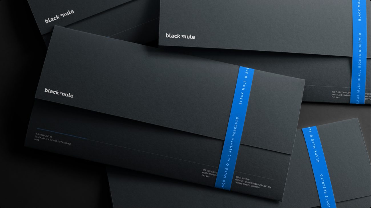
Folder, letterhead and cards.
- 01
The dot grid, borrowed from architectural and engineering drawings, runs across the folder and the card reverse.
- 02
A single Electric Blue rule closes the folder.
- 03
The letterhead stays white and quiet, carried by the wordmark and the type.
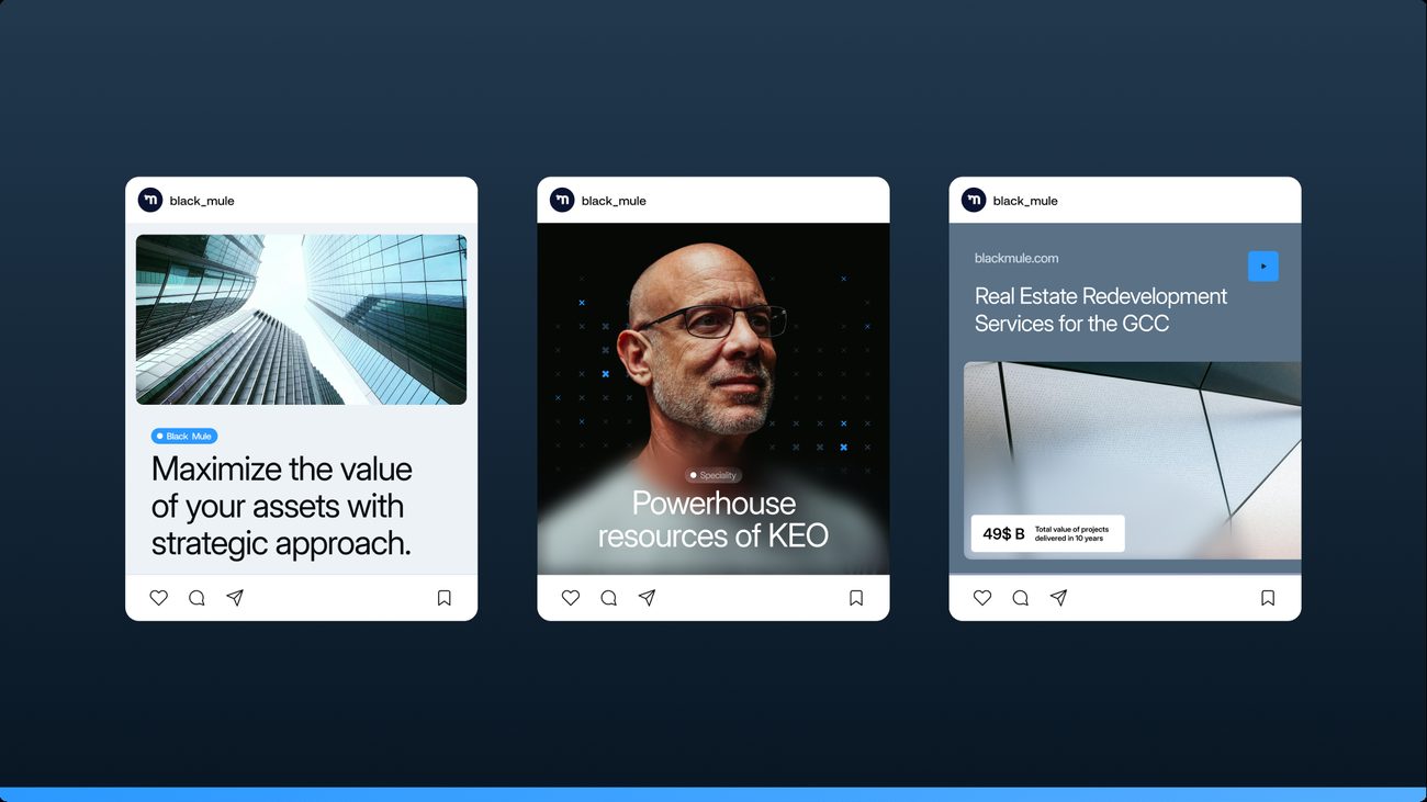
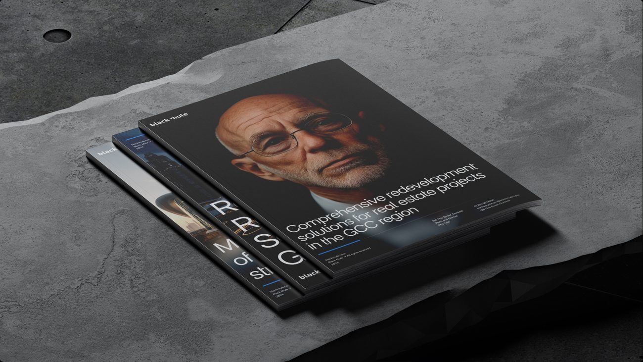
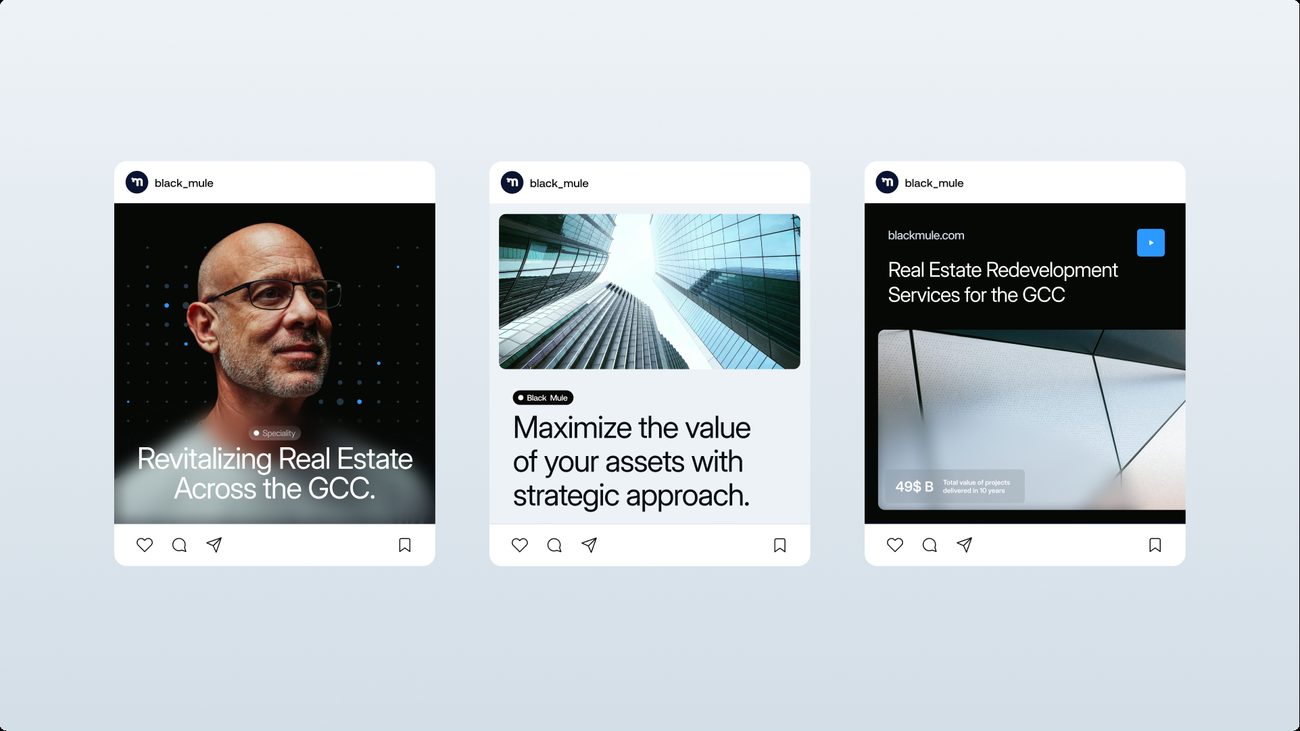
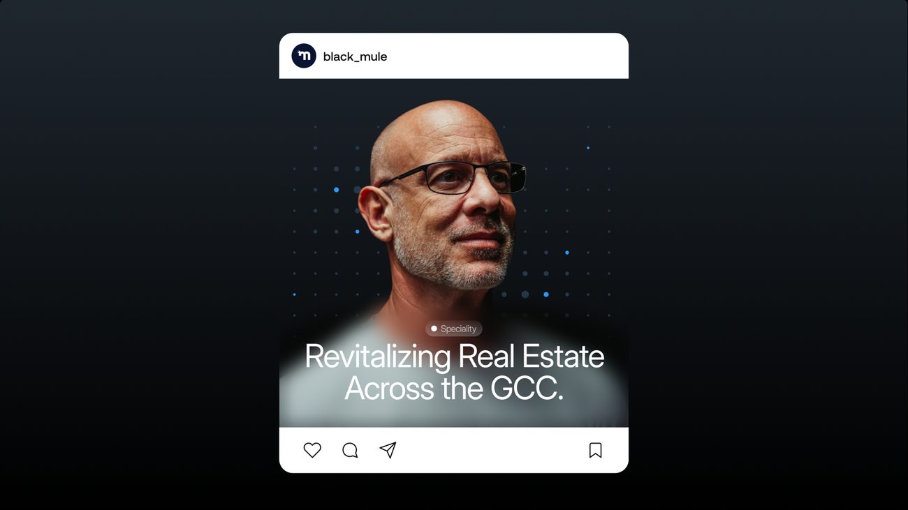
Twenty pieces across web, print, outdoor and social.
What We Handed Over
The documents and templates the team runs the brand on.
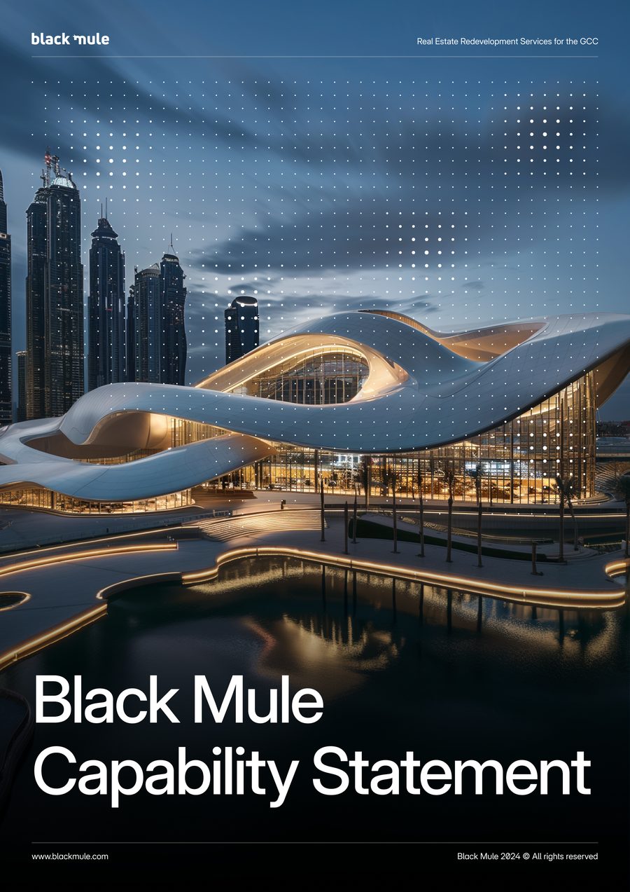
The identity went to Black Mule as a working set, after the competitive audit: guidelines that carry the strategy and the system together, a capability statement that puts the positioning in front of investors and partners and a master presentation template.
The platform and the system, in one document.
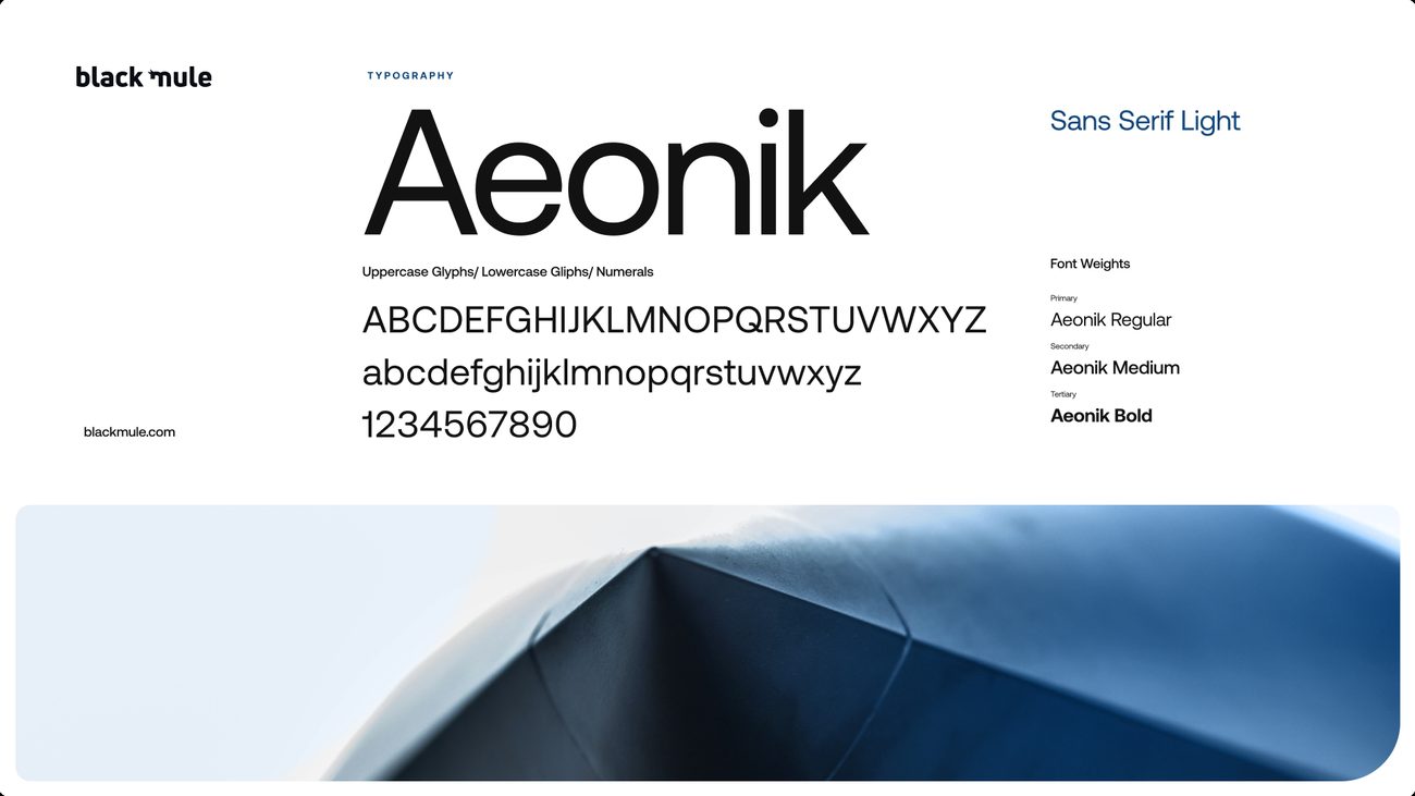
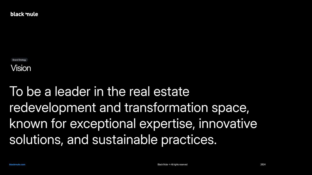
The guidelines open with the brand platform, from positioning and purpose to values, vision and mission, before the identity itself: the mule monogram, Inter Display, black with Electric Blue, and the dot grid, each with its rules.
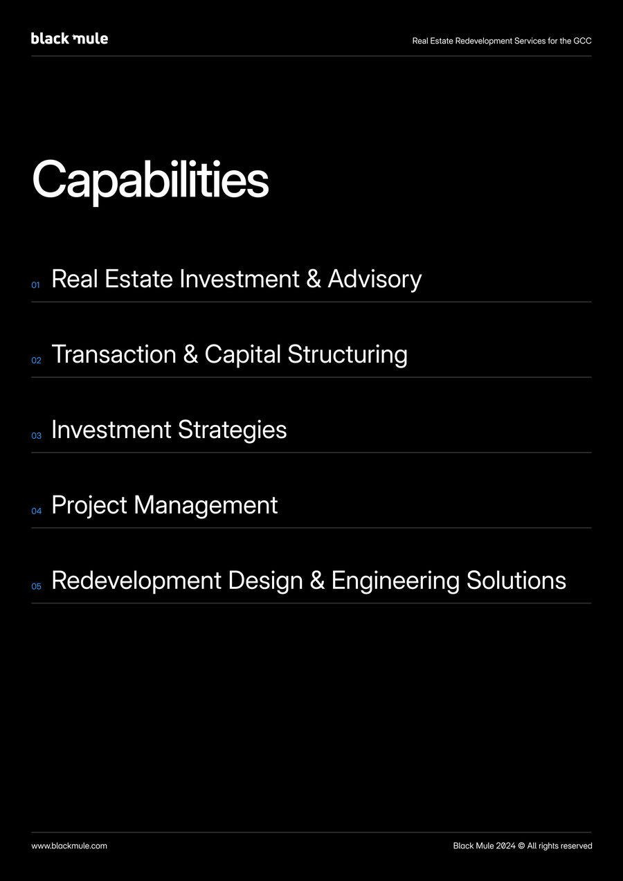
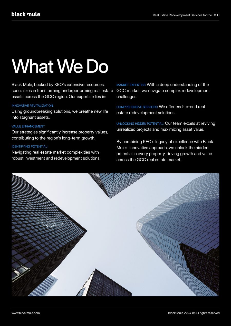
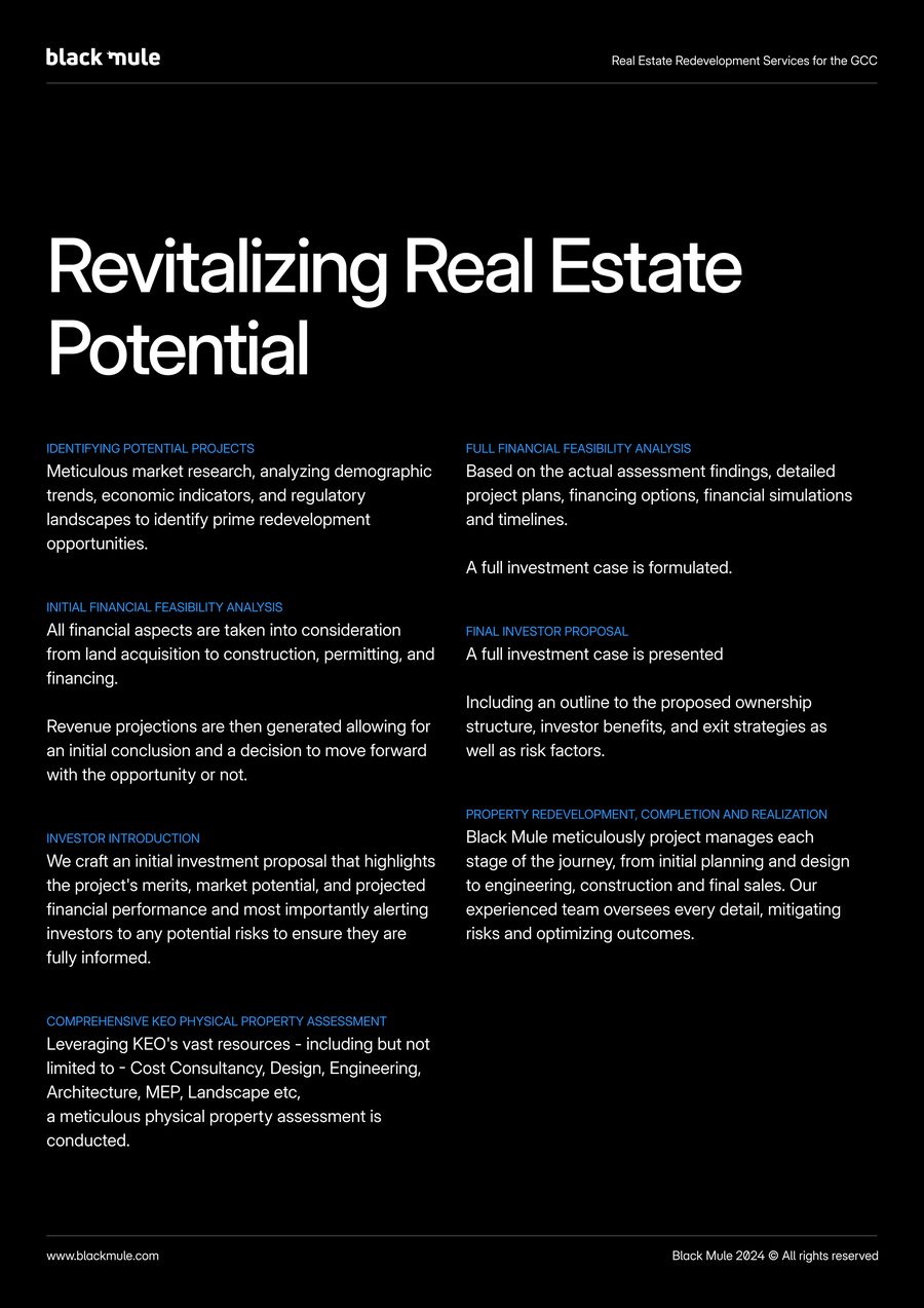
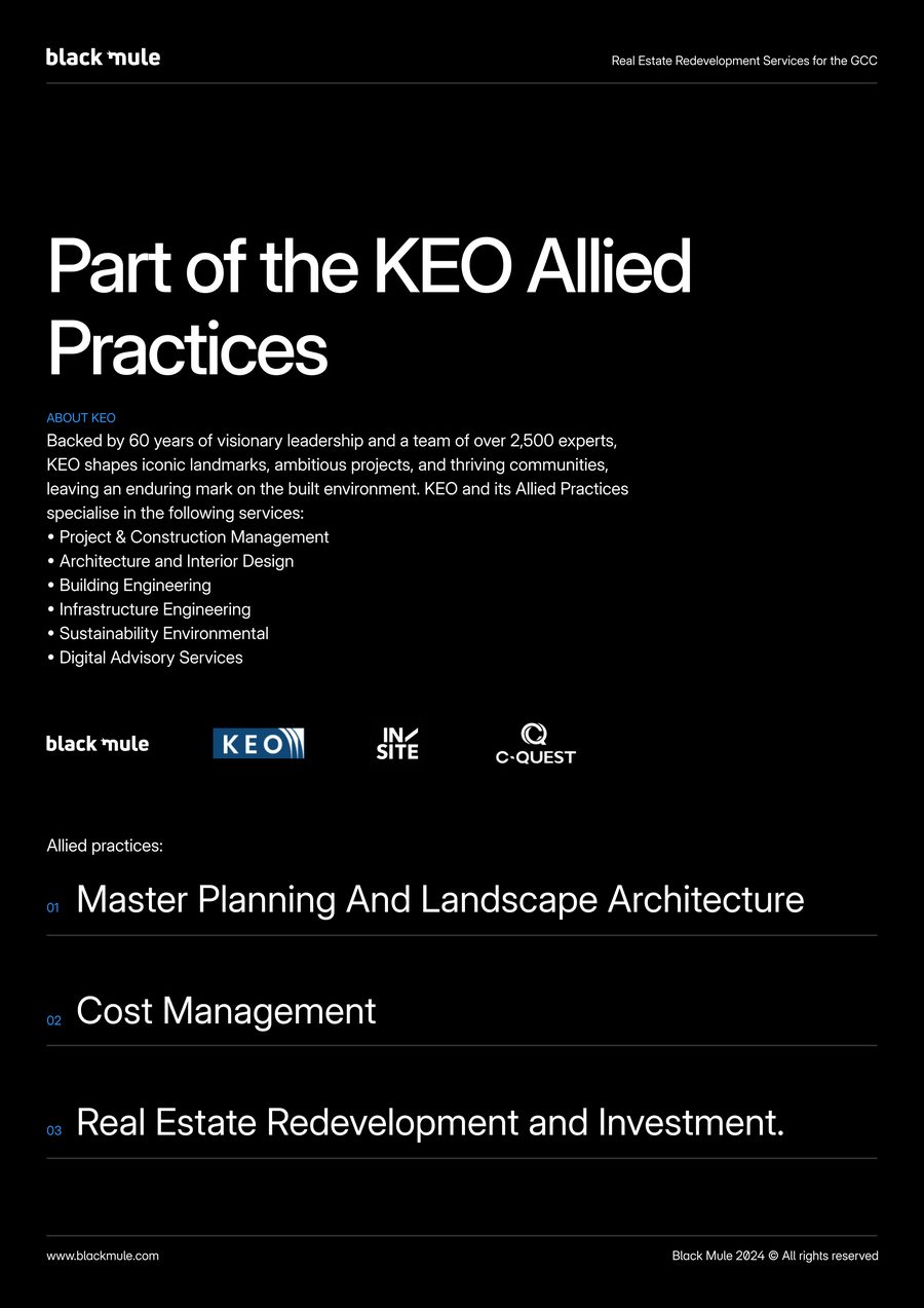
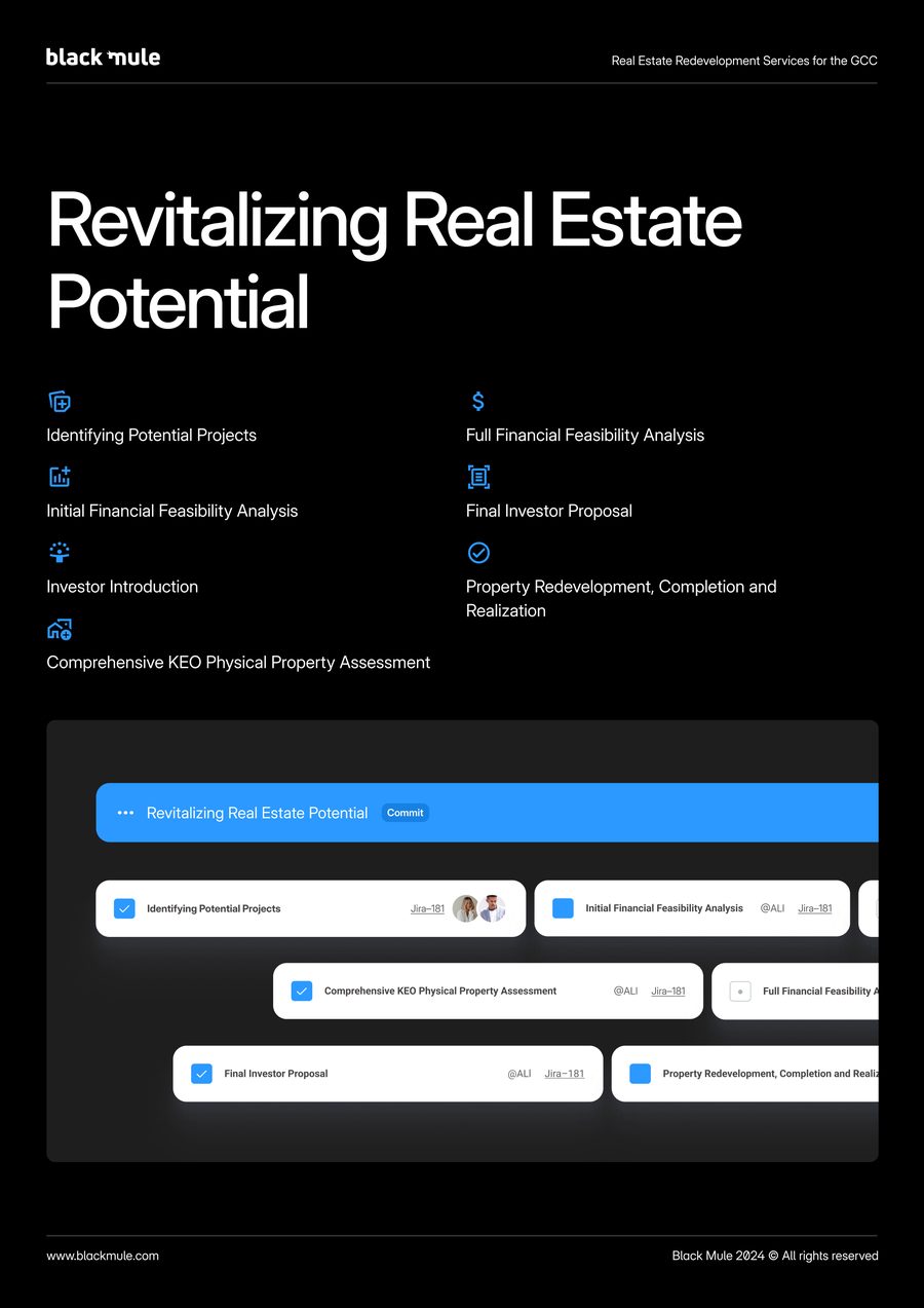
Ten pages that put the positioning to work.
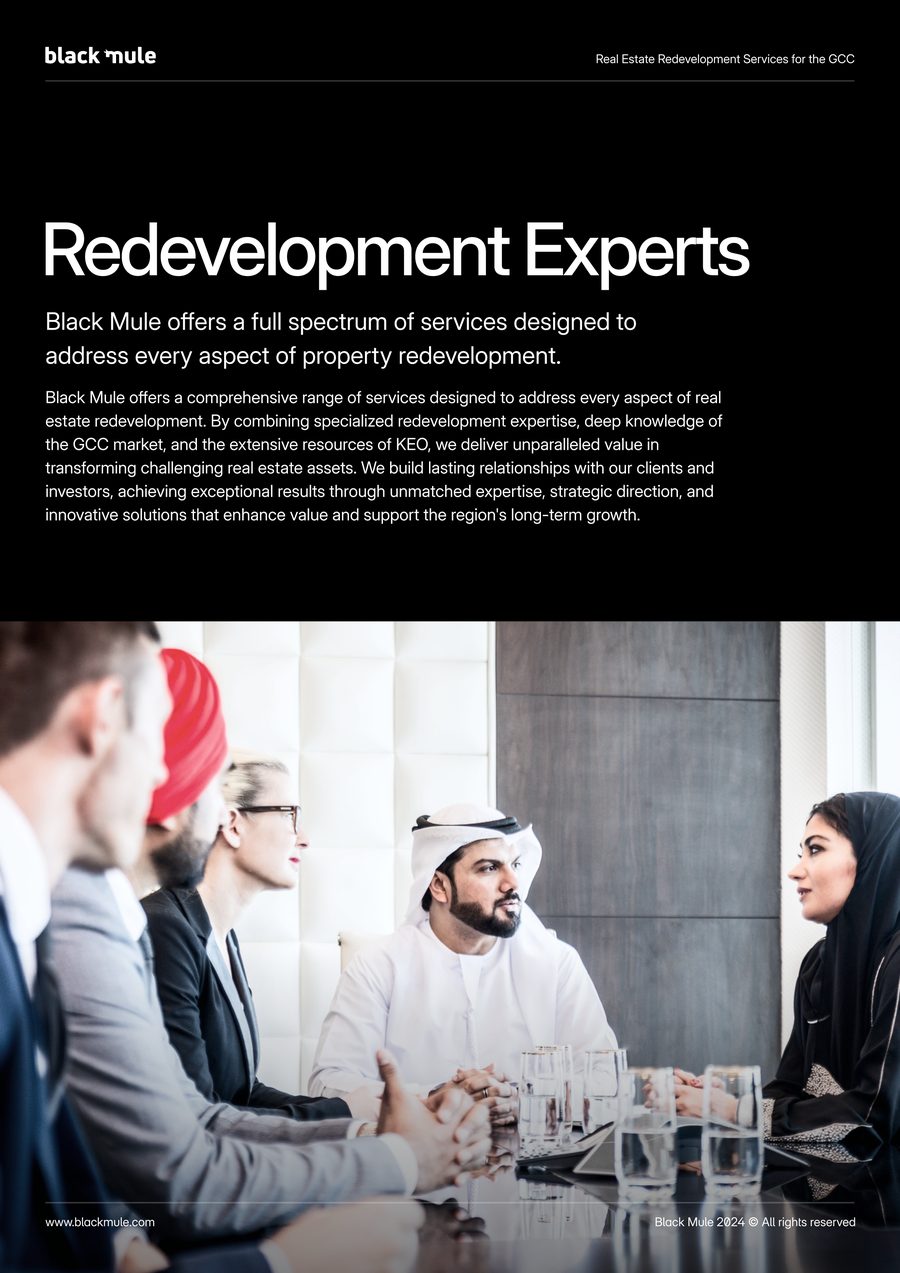
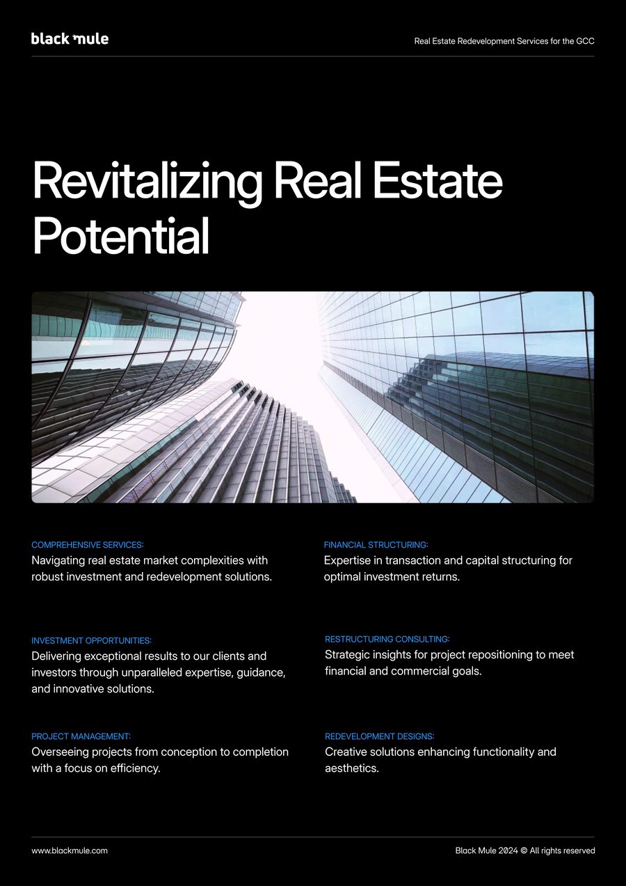
Redevelopment expertise, the service lines, the process from identifying a project to completion and realisation, and Black Mule’s place among the KEO allied practices, set on black with the dot grid running behind.
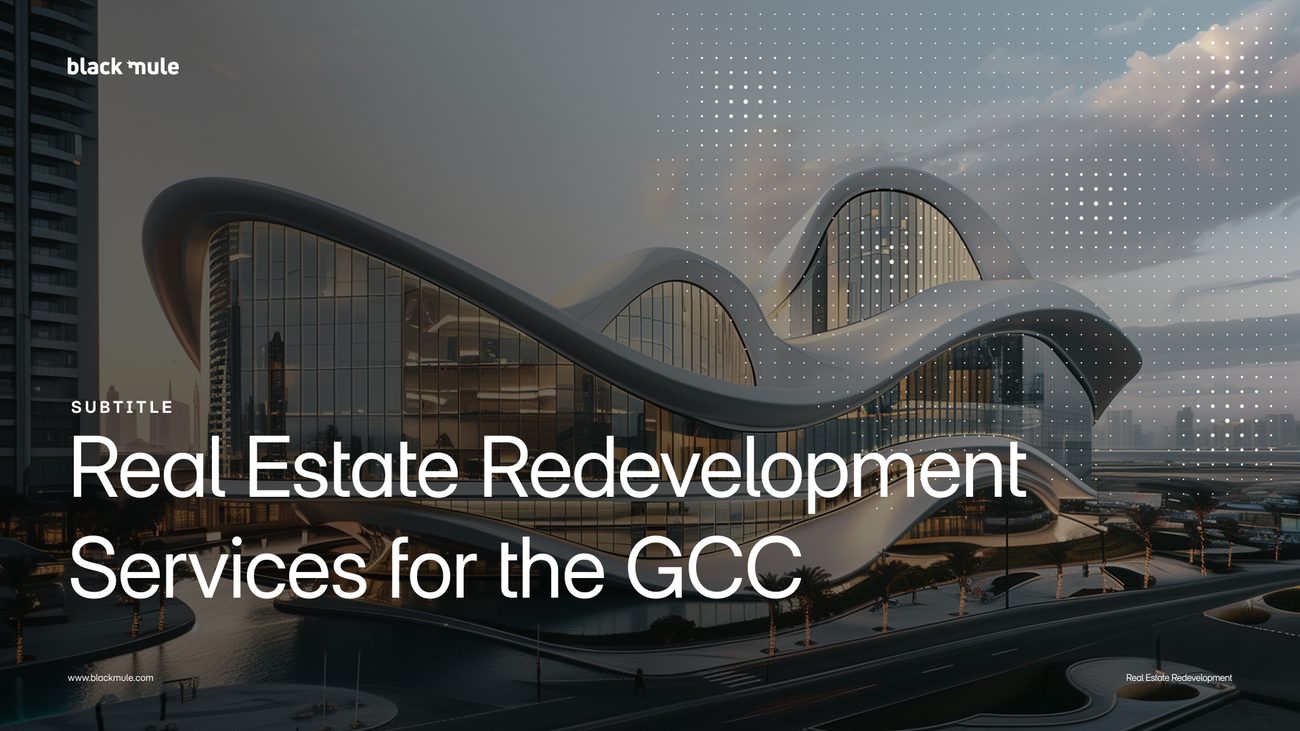
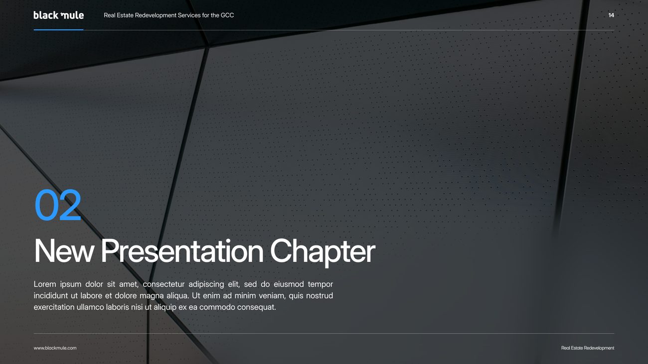
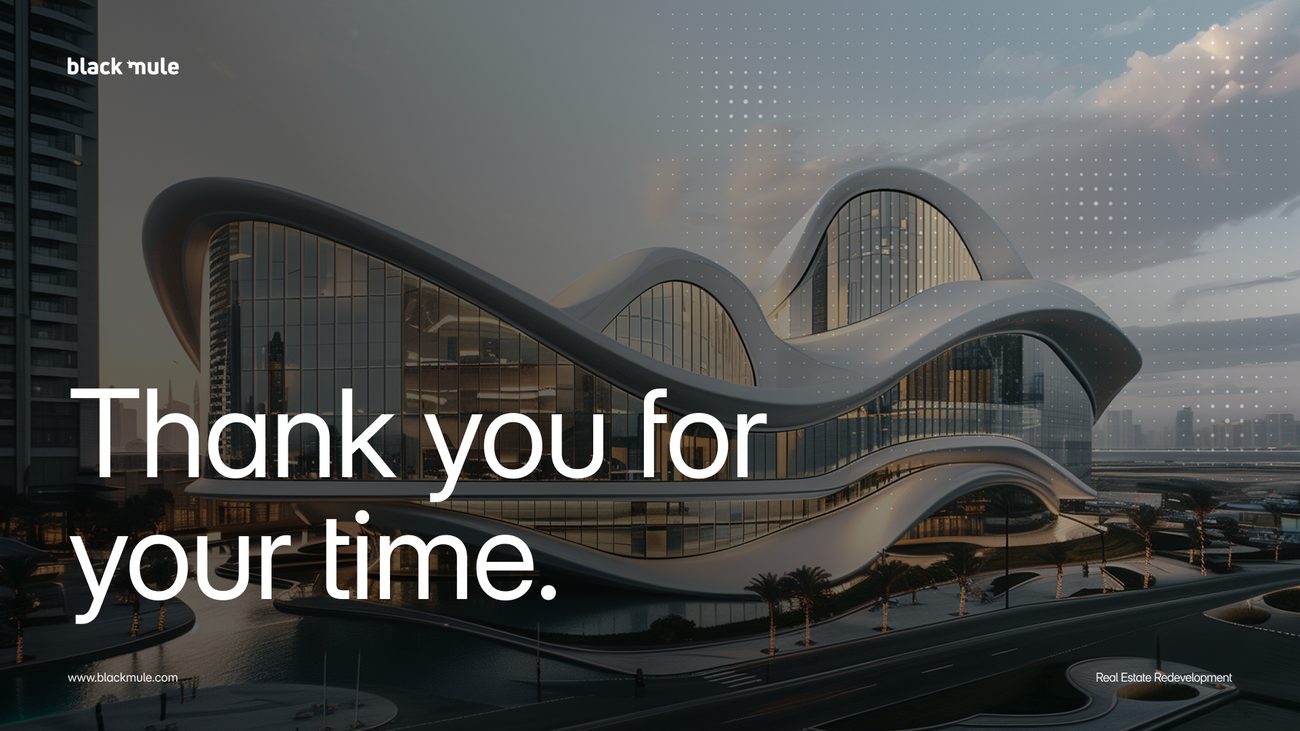
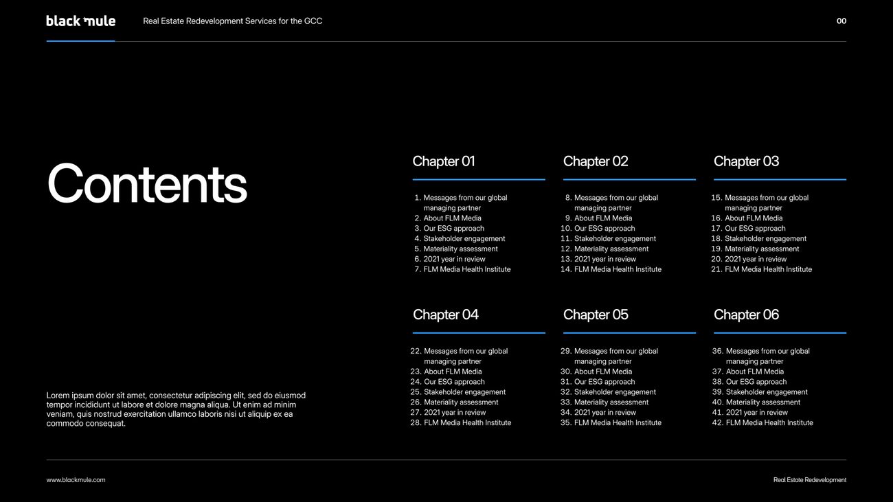
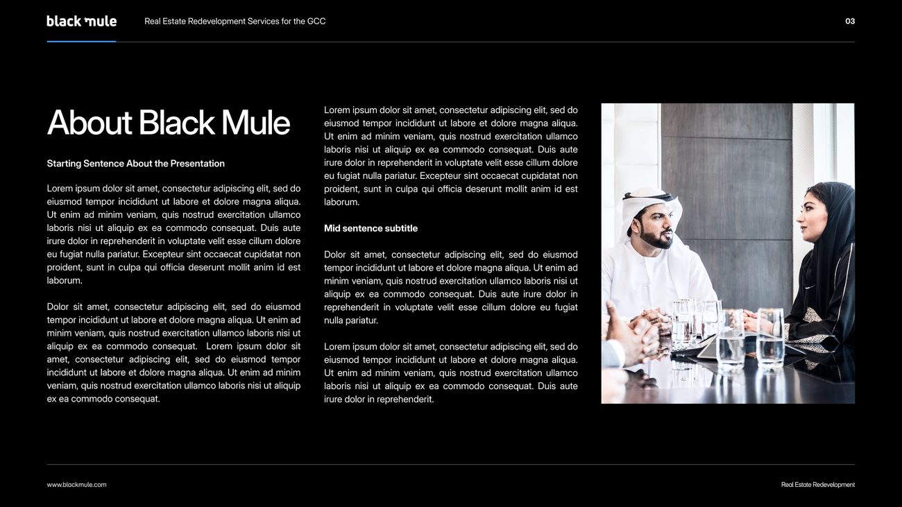
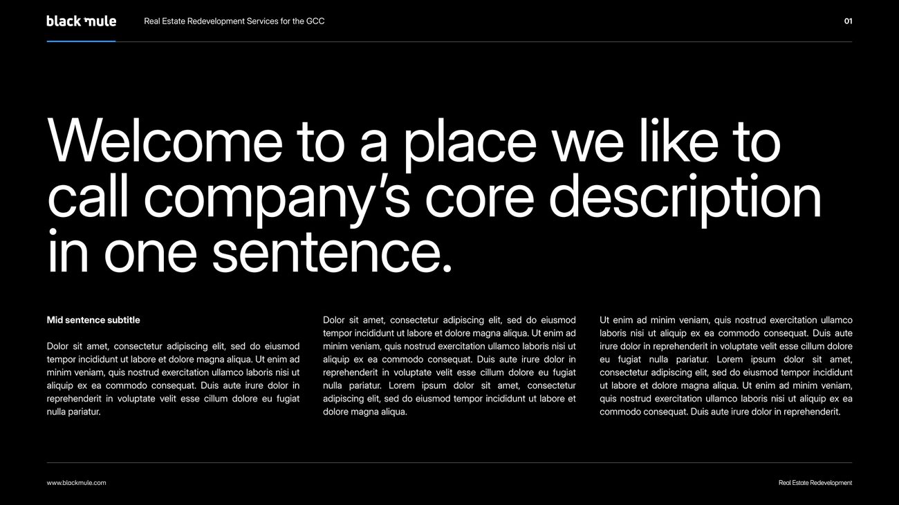
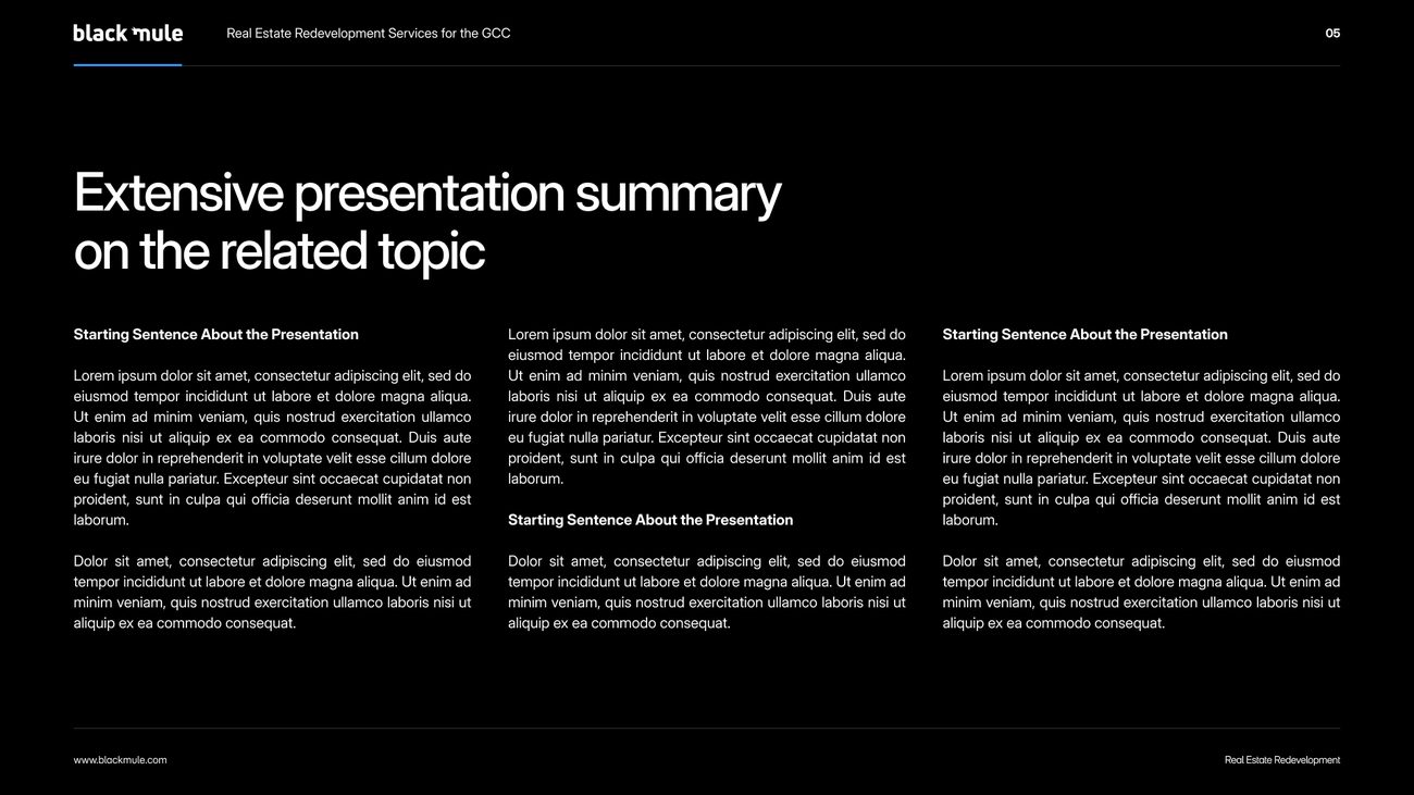
A master deck, built as a set of layouts.
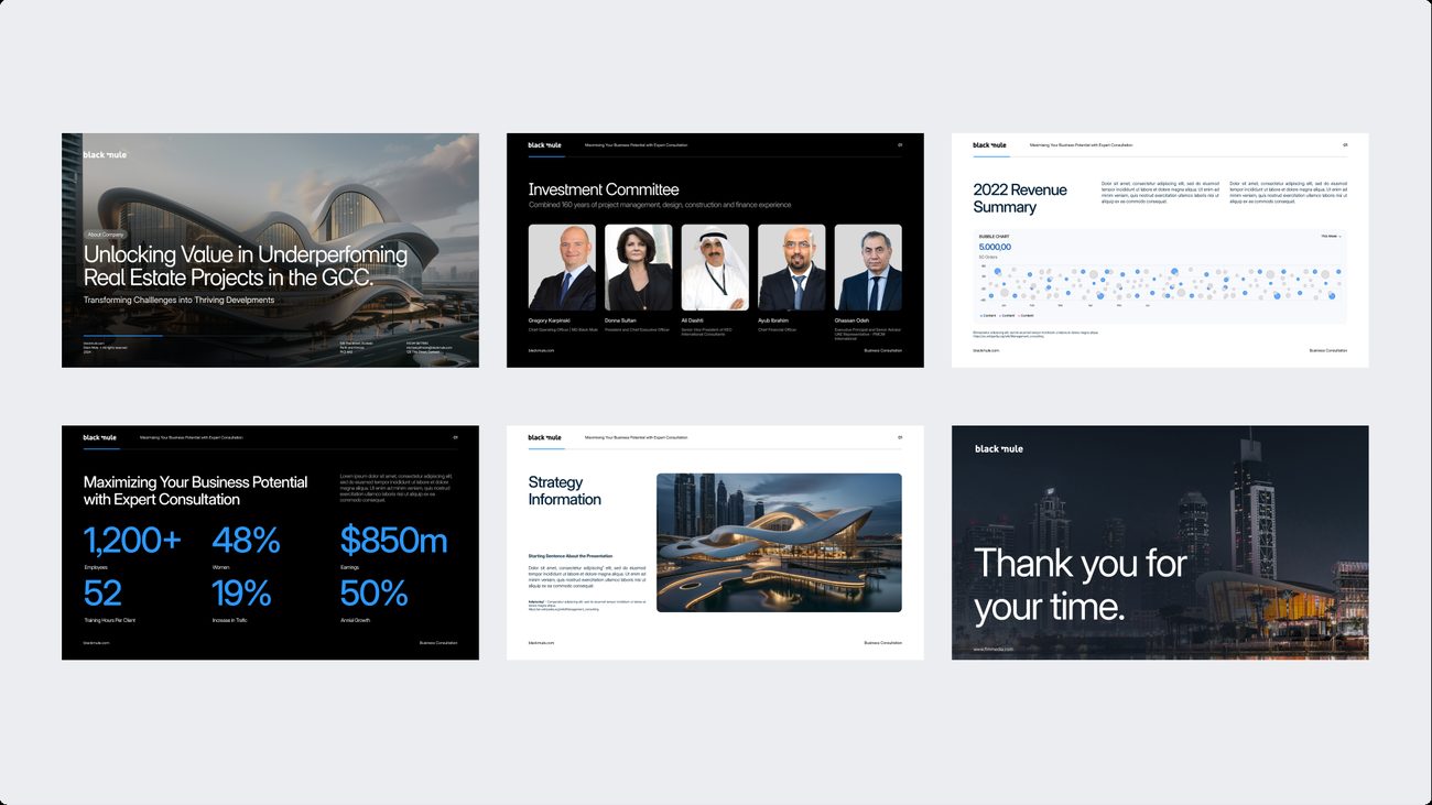
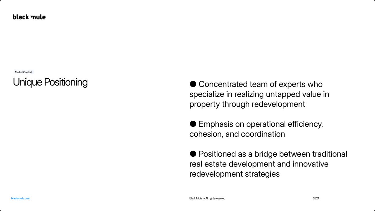
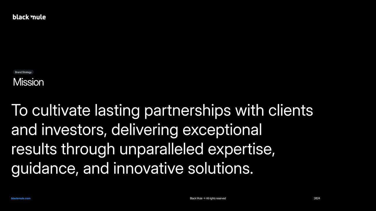
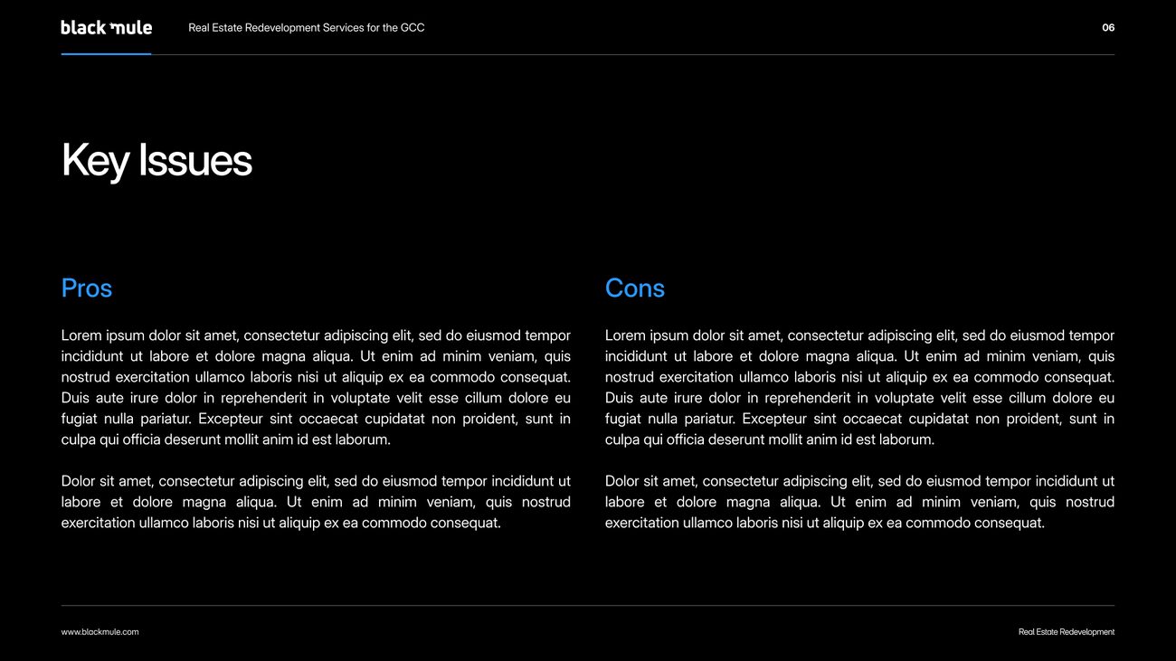
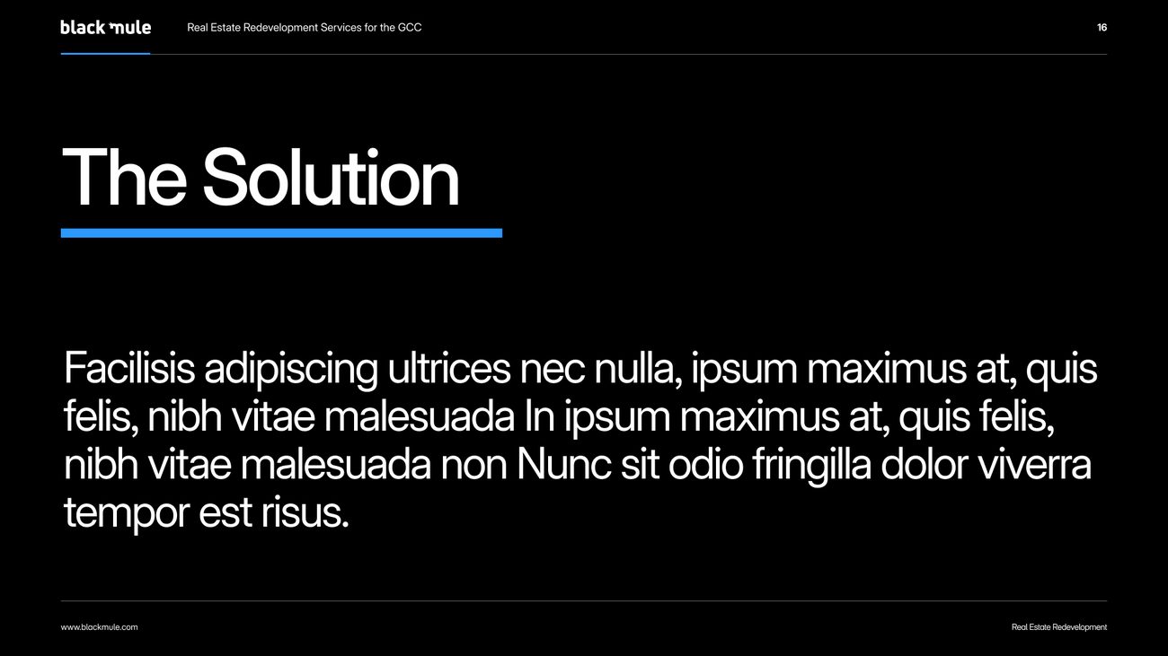
Cover, contents, chapter openers, narrative, analysis and close for project and investor presentations, every layout on the black ground with Electric Blue as the accent.
Where does your brand sit against the business?
Every engagement starts with the Brand Alignment Diagnostic, a fixed first step that scores your brand against the business and shows what to fix first.