
A new sports agency with genuine expertise and an ambitious vision — but a brand that couldn't open the doors they needed to walk through.
Pansports came to us with a clear ambition: to operate at the highest level of European sport. The team had the knowledge, the contacts, and the commercial instinct to make it happen. What they didn't have was a brand that communicated any of that.
In a market where credibility is everything — where the clubs, sponsors, and partners you're approaching make judgements in seconds — their existing visual identity and pitch materials were actively working against them. They looked like a new agency. They needed to look like the obvious choice.
Breaking into elite sport requires social proof before you have it. Every pitch meeting started at a disadvantage — their materials didn't convey the level they were aiming to operate at, making every conversation harder before it had begun.
Their existing brand communicated "new agency" when every signal needed to say "established specialist". The gap between how they presented and how they thought was significant — and it was costing them in every meeting.
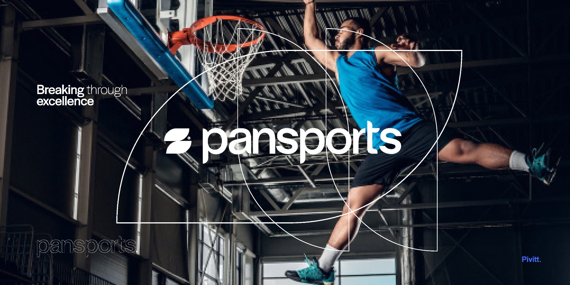
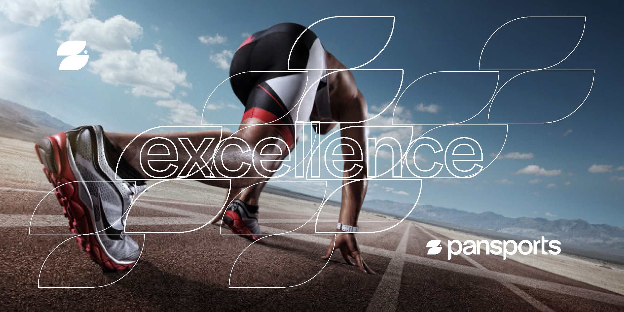
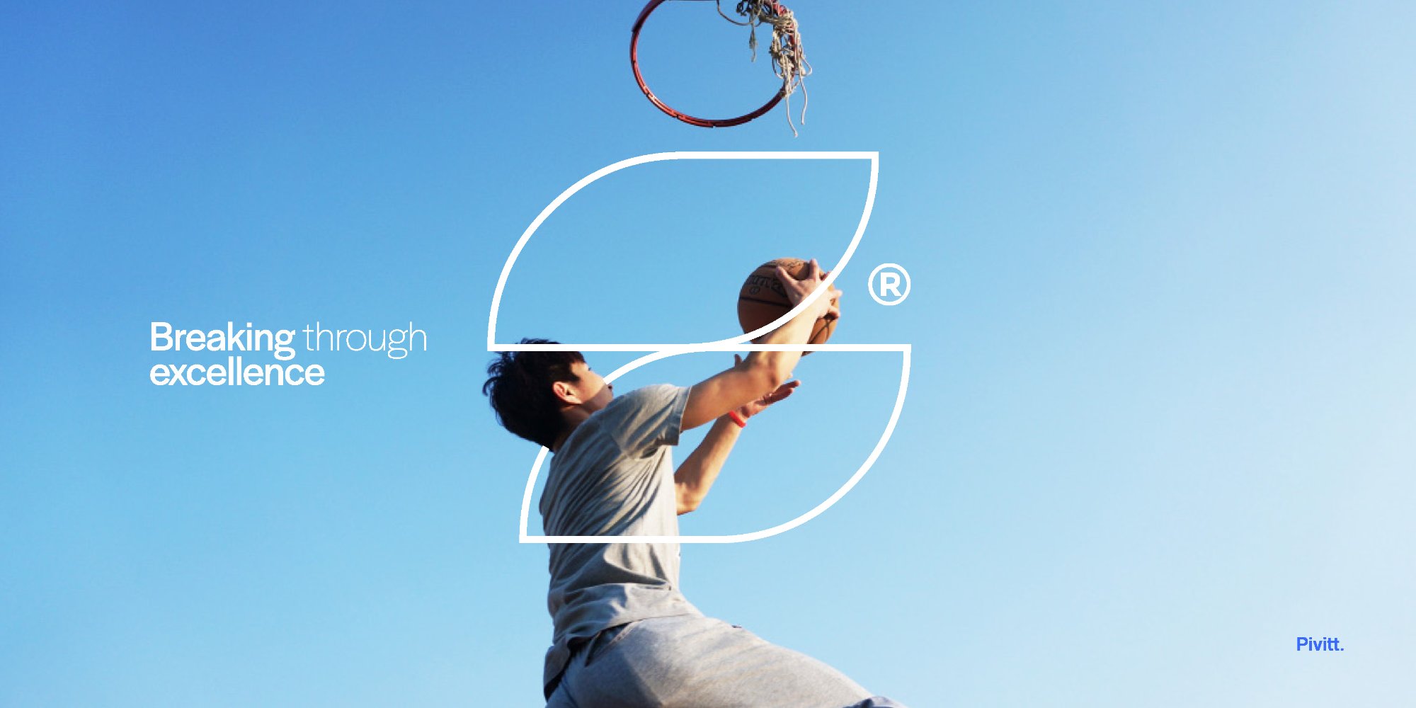
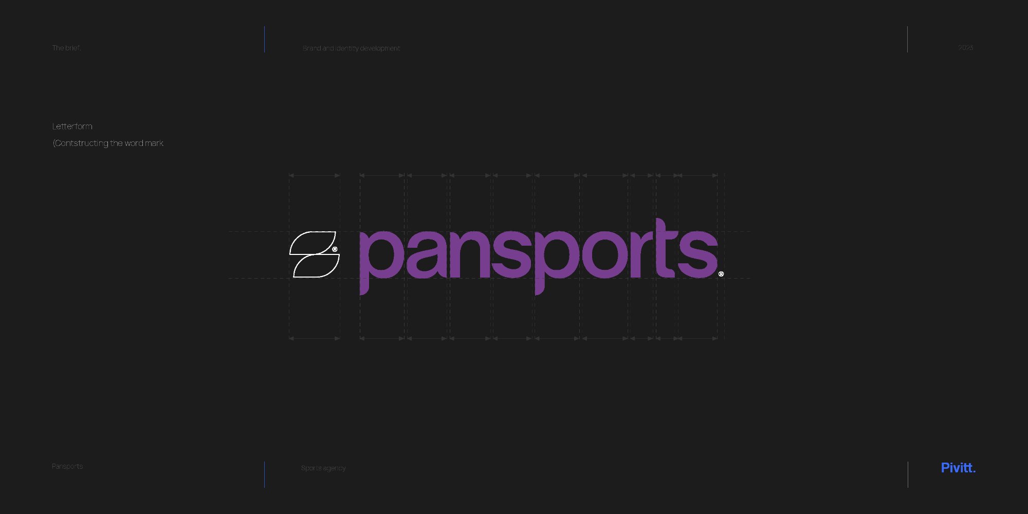
The logomark was developed from the letterforms of Halyard Display — the P and S of Pansports resolved into a single, dynamic symbol. Constructed across a precise grid, it needed to hold at any scale from pitch deck to stadium board.
Multiple directions were explored across both the mark and the wordmark before arriving at the final system. The construction pages below show the rigour — not decoration, but structural thinking.
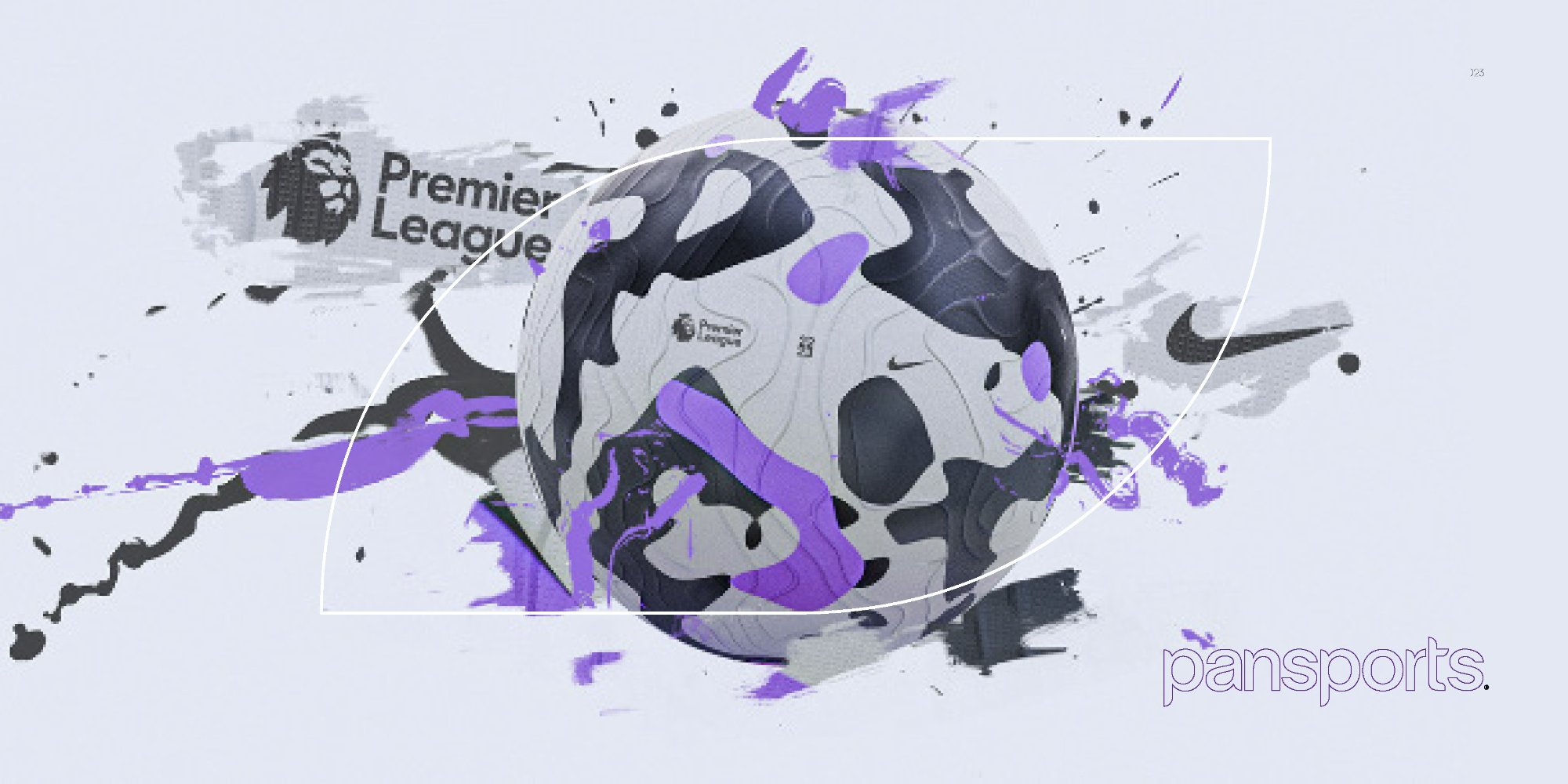
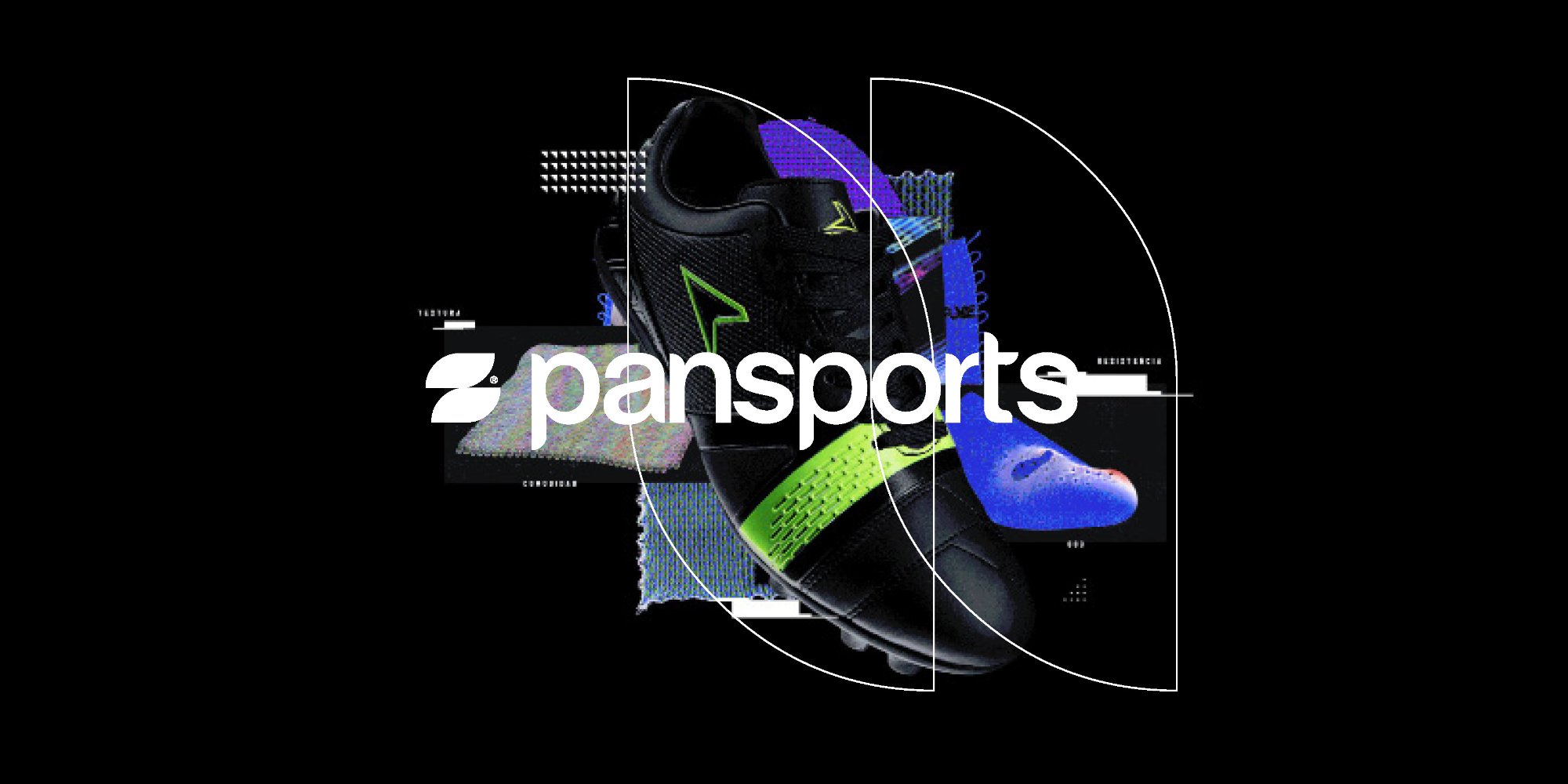
The identity had to work at athlete-scale and stadium-scale simultaneously. Here it is across campaign imagery, sports content, and category collateral.
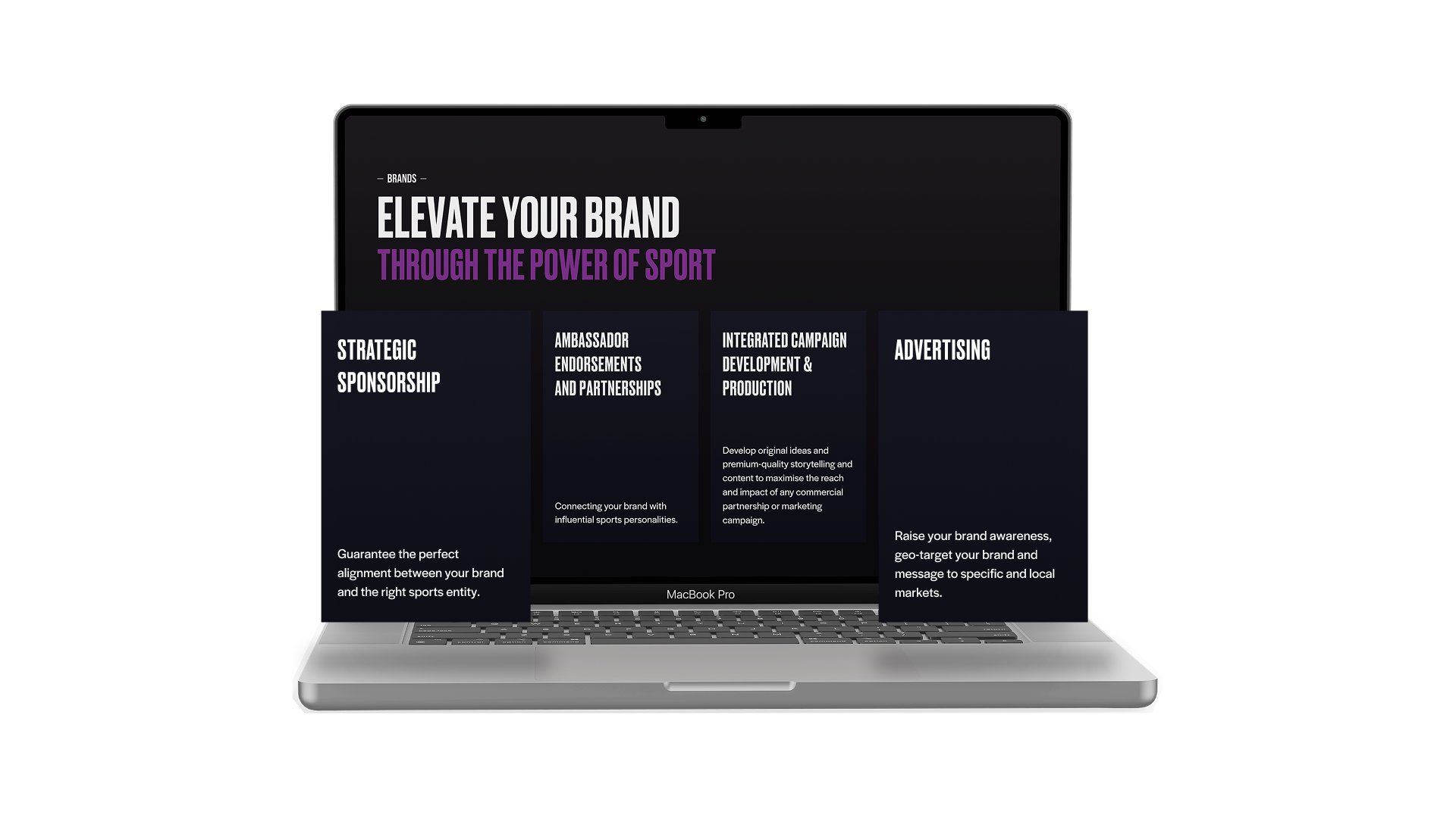
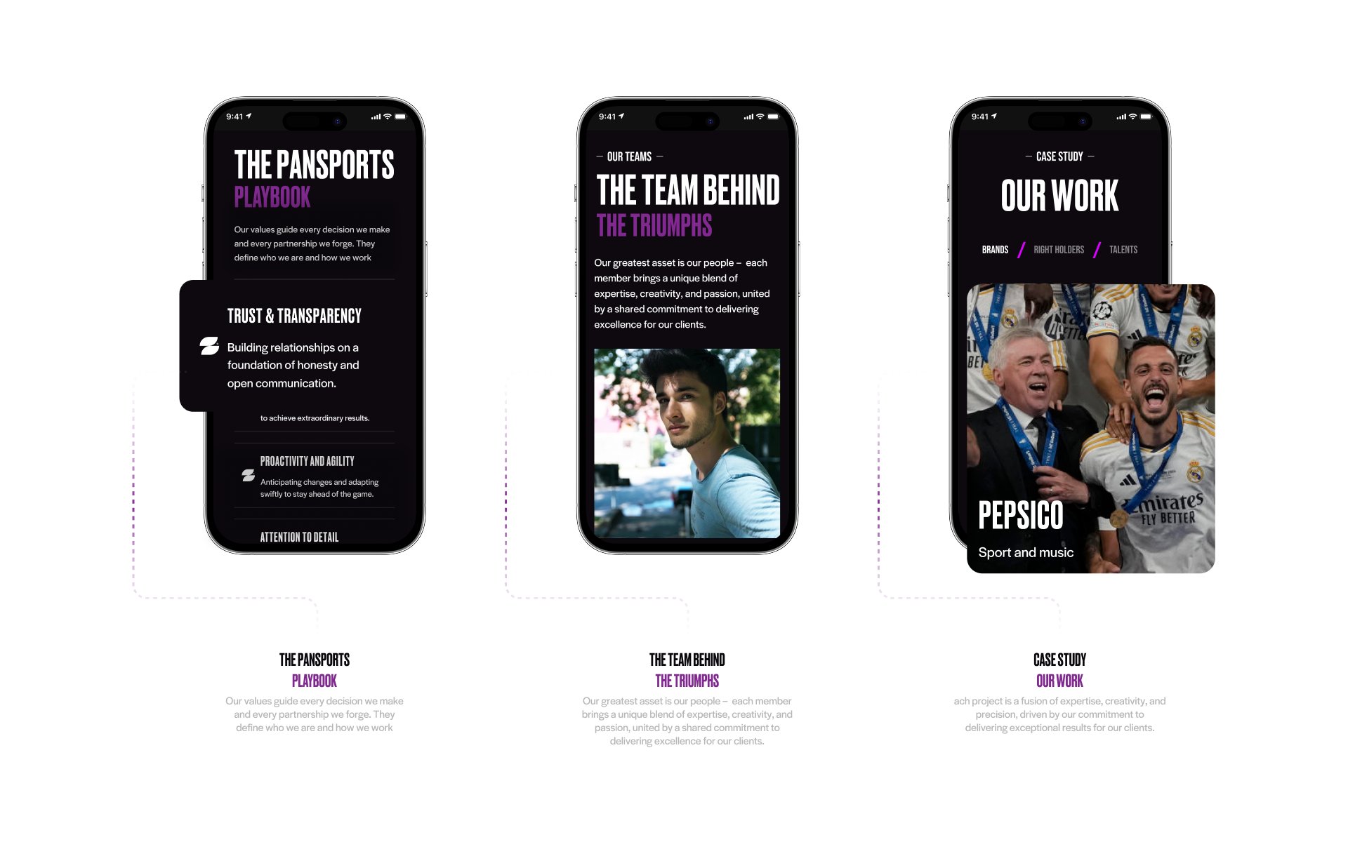
In sport, the brand does active commercial work. A pitch deck from an agency that looks the part gets read differently to one that doesn't. A website that communicates authority changes how the first call goes. We built every touchpoint to do that job.
The messaging architecture was built around proof and precision — stripping out anything vague and replacing it with specific language about what Pansports delivers and for whom. The identity followed: premium without being generic, authoritative without being corporate.
The website was designed as a business development tool — not a portfolio. Every page was structured to answer the question a club or sponsor would ask before agreeing to a meeting.
30 minutes. No pitch. An honest conversation about where your brand is and where it needs to be.